rhetoric // april 19 class by tyler galloway

in class
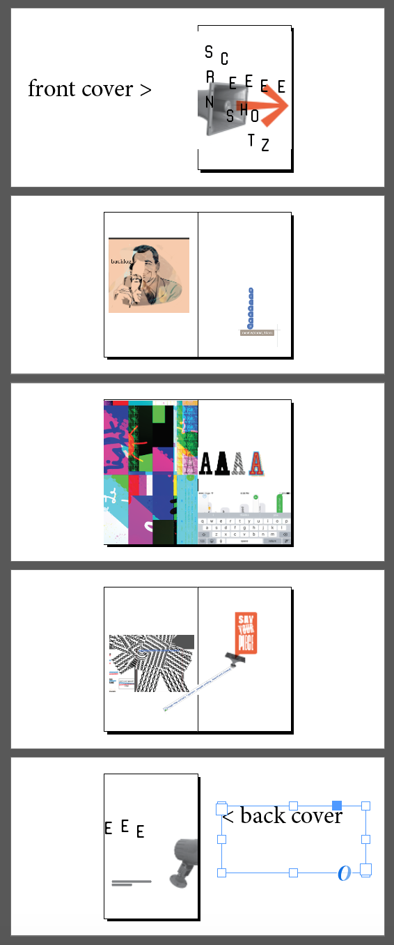
work time and desk crits on posters in progress. you should have a full-sized, black and white tiled print on the wall for input, along with color studies.

seniors are doing degree project presentations during class today. you are free to watch as much of those as you want. just come and go very quietly and respectfully. do not leave in the middle of anyone’s presentation, and if you come in during a presentation, stand at the back until they are done, and then find a place to sit.

if i do not connect with you during class, i will try to leave post-it note comments on your poster at a minimum. if you don’t have any feedback, shoot me an email with your design attached and i will do my best to respond via email before monday’s class.

soooo, my link for the propaganda reading was a bit messed up because i just re-upped the link without checking it and the site had changed. no discussion over that reading, due to obvious confusion i caused. we’ll read from that site for next class.


new work for next class
read the “core concepts” section from the propaganda critic website. note that it is multiple pages, including
propaganda is everywhere
bots
sockpuppets
who decides what you see?
social media and fake news
you are the product
rise of the fake audience

also, do a quick skim through the section on “decoding propaganda”, which also includes multiple pages on various techniques propagandists use.

on your poster, continue with minor iterations, trying out size relationships, color tweaks, typefaces, language choices, and re-working type and image as needed to make your craft as excellent as possible.

rhetoric // revised due date, deliverables, and crit by tyler galloway

deliverables
one printed poster, 24” x 36” – any production trickery [non-traditional shapes, finishes, etc] to the print needs to consider how mass production would impact that production process.

24” ×36” pdf file, saved in “high quality print” mode, downsampled to 150 dpi, emailed to me.
filename: lastname_firstname-socialPoster.pdf

all required blog posts:
- your initial [supposedly final] written message and fact, from one of the first class sessions.
- 50 iterations from the morphological analysis
- 15 iterations and 5 media approaches or visual examples
- top two or three final directions
- audience and context goals

a blog post with your poster image. this is for critique below.

physical or digital turn-in of any additional elements you’ve made in addition to your poster.


due date
noon, friday, april 26. either pinned to the wall in 101 or stacked very carefully on the library table.


critique
due by 5pm on sunday april 28:

written critique, delivered as blog comments [or email if comments are not allowed] to three students above you in the blog listing on the course website. if you are at the top, circle back to the bottom of the listing. example: haley critiques jessica, sherry, and katie.

please address the following:

play the cynic – does the message seem compelling? do you care about it?

how effective and memorable is the use of rhetoric? does this have a good “twist'“ that invites your participation in understanding the image, as well as an “aha” moment with a good payoff?

how well does it do the things that a poster can do – catch your attention from afar, draw you in, give you satisfying up-close details?

how expertly-crafted is the image- and type-making?

rhetoric // april 15 class by tyler galloway

at this point in your process, you should have a focused message you want to communicate to your audience. we are assuming they know about the topic and are willing to listen to what you have to say. how does your visual/verbal statement and supporting fact give them critical new information that might help them start to have an opinion on the topic?

beyond a single message and a sense of who your audience is, you should have 2–3 visual directions you are pursuing. you should be looking at both compositional variations and media you are utilizing [digital, analog, photography, illustration, collage, model-building, etc].

in class
review poster iterations as a group. have 11 x 17 prints ready, color preferred if you have that in process. discuss revisions as needed. 

discuss context of poster – where will your poster live? where can something this large live that will allow it to do its job properly? what kinds of areas does your audience frequent where this communication can intervene in their lives at the right place and time?

new work for next class
read: the first three sections of “propaganda” – introduction, common techniques, and logical fallacies

read:cultural catalysts, cultural agency” by max bruinsma

blog: write your specific goal for your audience and context in this project. consider the questions from class today [written above in the context area] and give additional details about the type of person you are trying to communicate to. what is their relationship to the issue? why do they already care or not care about your topic? are they closely associated to your topic or is it more distant for them?

make: black and white print or tile of your poster at actual size – 24” x 36”, along with color versions scaled to fit on 8.5 x 11 paper. have mounted to the wall for next class.

rhetoric 4 by tyler galloway

in class
small group crit over 15 new iterations and media approaches. discussion over additional supporting messages, media, and contexts. determine a final direction or two, and begin work on variations of those directions (or single direction). continue to consider the following:

  • media used in your rendering approach. there are hundreds of ways you could generate your imagery and typography for this. what are the meanings inherent in your media choices as it relates to your audience?

  • brevity of the message. what all is really needed to make your point?

  • a compelling "hook" to draw the viewer in, and the payoff of your statistic.

  • the role composition can play in creating a reading sequence – what is seen first, second, third.

new work for next class
continue working on variations of your final one or two ideas and commit to a final direction. at this point, your iterations should be formal [compositional play, details of rendering approach, etc] and the content and rhetorical approach should be pretty well set. make good use of your classmates for input during class time. perhaps showing someone new to get a first read from them.

blog: post your top two or three ideas you hope to pursue. 

rhetoric 3 by tyler galloway

in class
small group crit over 50 iterations. select top three.

new work for next class

  • develop 5 more iterations based on your top three ideas – 15 ideas total. mock-up 11×17 prints to hang for next class.

  • in rendering those 15 ideas, work out at least five different media approaches – photography, model-making, diorama, collage (analog or digital), drawing, construction, vector, painting, or any combination thereof. please try to create a quick and dirty mock-up using those means. if you are not able to visualize it easily, find a reference image to print and pin up next to the idea. include typography as well.

  • blog: post 15 new iterations and five media approaches.

rhetoric 2 by tyler galloway

in class

  • review reading.

  • group share of visual examples.

  • small group crt [groups of three and a group of two] over messaging and facts. decide on a solid final message and fact by the end of your discussion.

  • review of morphological analysis process. link to original lecture is here!

  • brainstorm on possible signs to use.

  • set up morphological analysis – 5×10, 6×8, 7×7 [signs × tropes], or similar, using a large sheet and post-its or paper+tape.

new work for next class

i will be out of town at a conference on friday, so no class. progress is still due [below] and i will also make a new post for friday. work wherever you want but know that there will be new work expected between friday and next monday.

  • minimum 50 unique ideas due. seriously.

  • blog: final written message and fact. photos showing your 50 iterations – shoot in groups of 5 or 10 ideas per image. ensure quality and decent lighting, please.

also, this personification!

Thanks to ForApplevideo and EveryAppleAd for the footage! Credit goes to them except I put the 15 vids in order! (Plus 1 bonus video "I Can Do Anything"). ==============================================15. Party Is Over 14. Meant For Work 13. Referee 12. Group 11. 10. PC Innovations Lab. 9. Genius. 8. Choose A Vista.

rhetoric 1 // lecture, project brief, reading by tyler galloway

in class


new work for next class

  • determine a range of message options and supporting fact[s]. one message = one sentence. work off of the idea that your audience has heard about or knows some basics about the issue, but could benefit from some facts. what do you feel needs to be said?

  • bring at least one poster book from the library as additional research. have examples ready to share with class.

  • read this excerpt on wit, from the super fun book "a smile in the mind", for next class. thank you!

comm theory crit format by tyler galloway

this crit will be a criteria-based written critique. as you likely know, it's very time-efficient. first, before next class, save and post a jpg of your final communication model to your blog. also, print your final 11x17 and email me the press-ready pdf named according to specifications.

pin up your work in an organized fashion in 102 by noon. during class, you will be assigned two other projects for which you will provide written feedback. go to your classmates' blog [found here on the right sidebar], locate the post, and leave your critique as a comment. since we are working in pairs, simply copy-paste your comments to the second blog. 

take about 15 minutes or so for each peer. take a look at their work firsthand on the wall before writing about it – don't just look at the blog image. address issues we have been discussing – first, do you have a clear sense of the basic concepts at work? does the model accommodate multiple scenarios? if it is meant to be specific, does it have sufficient detail to warrant its specificity? is the labeling and relationships among components clear? can you make comparisons between different information areas and understand the macro/micro view? etc, etc

keep in mind that your critical commentary will count toward your class participation grade. 

comm theory // 2 by tyler galloway

in class
comm theory lecture 2 plus some work time and desk crits.

new work for next class
have a definite conceptual direction pinned down:

  • how specific or narrow your model is

  • what all the basic components are

  • what the details and labels are

and work out three formal possibilities for that same content. we should be able to identify all of the same components, labels, and details but the three visual representations of that content should vary as widely as possible. 

comm theory project sheet and first lecture by tyler galloway

your next endeavor, hot off the virtual press! due friday march 29. a quick turnaround so you’ll have to work efficiently.

comm models lecture 1, right here!

homework
for march 22 class, have solid progress on this project:
- a sufficiently focused concept that indicates your priorities for how communication happens today
- a clear set of components labeled within the model [communicators, message, distribution, etc]
- five or more sketches for how this can be visualized

be ready to discuss the message cycle from near the end of the davis reading. 

modes of persuasion // learning summary by tyler galloway

to summarize what you’ve learned from this project, you will address the following points, based on the primary learning goals for this project:

how did you use text and image to generate a sense of pathos and why?

how did you use text and image to generate a sense of logos and why?

how did you use text and image to generate a sense of ethos and why?

regarding process, what role did research play in determining the most effective content? why do you feel your chosen content areas are the most effective choices?

each student will have about 3 minutes to present their work, showing examples for their zine, followed by 3 more minutes of comments from peers, as needed/desired.

this will be preceded by a short round of written commentary using your peers’ blog post of their zine images.

modes of persuasion // 5 by tyler galloway

in class
work time and desk crits.

new work for next class
finalize 'zine ideas and print two copies for crit, which is next class.

email me your pdf before march 15 class, set in readers spreads (the way it looks when the viewer flips through it, not how it needs to be printed out for assembly, which is called "printers spreads"). make sure you have the proper file name as designated in the “deliverables” section on the project 2 sheet.

blog post due by friday march 15 before class: professional-quality photos of your final work – cover and at least three spreads. these can either be context shots (keep background clutter fairly minimal) or seamless shots in the analog studio, nicely lit. this is to help you prepare more work for potential internships and generally be on top of project documentation.

in a separate blog post, pick one mode of persuasion and write a brief statement about how that mode can be used in both a positive and negative way by graphic designers. 

indesign booklet printing, going to konica by tyler galloway

in indesign

file > new

page count should be in multiples of four.

check “facing pages”.

5.5 x 8.5 is the folded size [half of an 8.5 x 11 sheet]. this is for ease of printing. you can trim down if you want, or experiment with different page sizes. ultimately, it will be printed on letter or tabloid paper.

set up your margins, columns or whatever.

once your zine is all laid out, it should look something like this in indesign. yay!

when you are ready to print, select file > print booklet. it’s all the way at the bottom of the file menu.

booklet type should be “2-up saddle stitch”. saddle stitch is a fancy name for stapling.

you will want to come back to “preview” here in a bit, to check how the layouts are flowing onto your page size.

from here, select “print settings”.

zines3.png

in “print settings”, select the konica.

select “fiery features” in the middle drop-down menu.

within “fiery features”, make sure “duplex” is selected, and it’s set to “right and left binding”. this will make the document print two-sided and it will flip the print left-to-right on the two sides.

hit “print”.

back in the “print booklet” dialogue, select “preview”.

use this to confirm that you are printing on the right paper size and that it’s oriented properly. notice the light blue page numbers that indicate how the reading order shifts to “printers spreads” for proper printing and folding of the final document.

scroll through the document to make sure all of the printers spreads look good.

hit print!

fold and staple, sew or otherwise bind that puppy together and rejoice in your new creation! congrats!

zines5.png

modes of persuasion // 4 by tyler galloway

in class
zine-making workshop!
casey holden to discuss print center requirements for zines.

quick tutorial on analog zine-making and “print booklet” feature and page setup in indesign.

using the materials you were asked to bring in – a boatload of signifiers, adhesive, scissors or xacto – and the konica in photocopier mode, put together an 8–12 page zine in 1.5 hours. this will require some serious rapid-fire work and very nice sharing of the copier, but you can do it! look at the considerations below, before you start your design onslaught. i will review your zine by the end of class as proof of process.

here's what we should be considering:

  • what is the overarching message you are trying to convey? can you articulate that simply?

  • are the simple visual statements you are making adequately specific? do they constitute the equivalent of a sentence, as opposed to a phrase?

  • what is the role of sequencing in this work, and are you taking advantage of the medium?

  • is your form-making up to par?

  • are you busting your bum to make this great? either yes or no – a tepid answer will produce a tepid result.

later in class…
discussion of "ethos". what can it mean for this project and your subject matter? 

discussion of photographing/documenting your final work – seamless vs context shots vs digital flats.

begin "ethos" ideas. possible brainstorming session?


new work for next class

make: continue “logos” and "ethos" development. aim for 3–5 visual statements using your statistics, making sure you are following tufte’s principles and goals for data graphics. be clear about your purpose, show the data, make viewers think about the data and not how you made the graphic, don’t distort the data, encourage comparison, label directly whenever possible, and so on.

next class will be desk crits and work time. i’ll be looking specifically for these 3–5 ideas, sensibly sequenced, thoughtfully designed and impactful/insightful in their content.

modes of persuasion // 3 by tyler galloway

in class
group review of your "pathos" ideas. discuss 'zine / booklet content development, concepts, and deadline. this is a super-fast project, so what needs to be done to keep you moving and iterating? 

lecture over information graphics.

begin "logos" ideas. 

new work for next class
read: edward tufte's "fundamental principles of analytical design"

prepare: gather a large set of signifiers [individual words and images operating at the level of “word”], scissors and/or xacto knife, cutting mat, glue stick and/or rubber cement and/or tape. we will be making lightning-round zines during next class.

make: continue "logos" development.
before randomly searching around, think about what statistics would make a compelling case for your issue. what would you want to know? what things could be compared to create context or insight? [examples: salary disparity in u.s. vs england, gun deaths vs car crash deaths].
do your best to make the information visual, not just fancy typography. show the data. but first you have to find data to show. remember to share your source for credibility. 
bring as many examples of logos as you can to next class. 

resource: a lot of interesting work on interactive information graphics in "the 100 best infographics [interactive]" from siege media. the above screenshot is from "every active satellite orbiting earth" from that article. 

resource: this article, "the most misleading charts of 2015, fixed" from quartz, is a great read and great lesson in accurate representation of data.