typography 1
kansas city art institute // sophomore 1 // 2016
in the first of four typography studios for students in the graphic design program, students will engage in inquiry-based exploration of the fundamental qualities of typography. development of questions about typography — what it is, its boundaries, functions, history, and tools will be followed by research and making as a means of demonstrating growing knowledge on the subject. through this active learning process, a solid knowledge base will be tailored to each student’s interests and abilities relative to typography. this will inform thinking and making in other studios as well as continued typographic education in future type courses.
view online course documents: course syllabus // daily blog
course notes
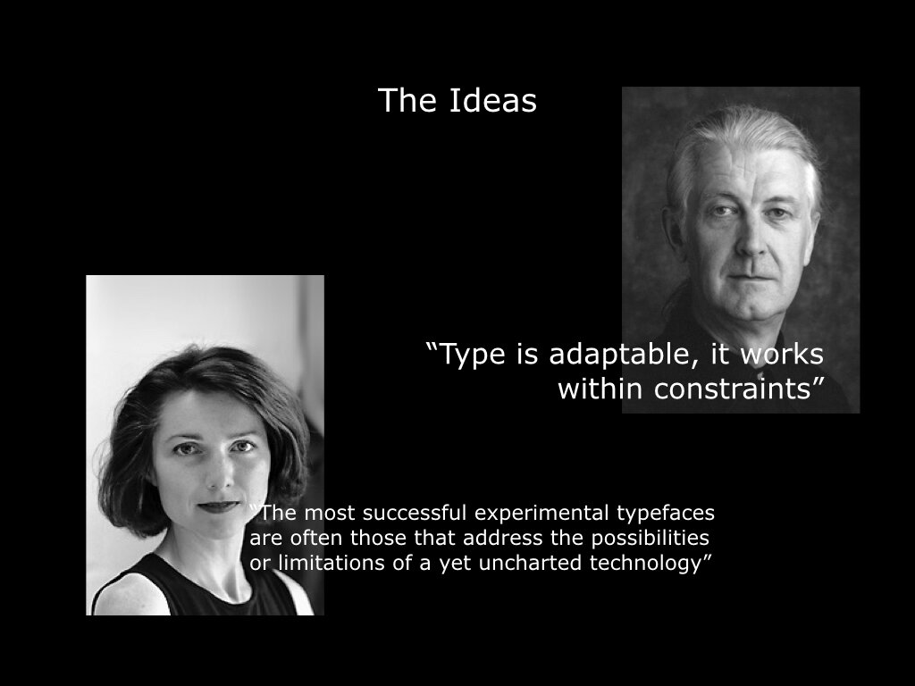
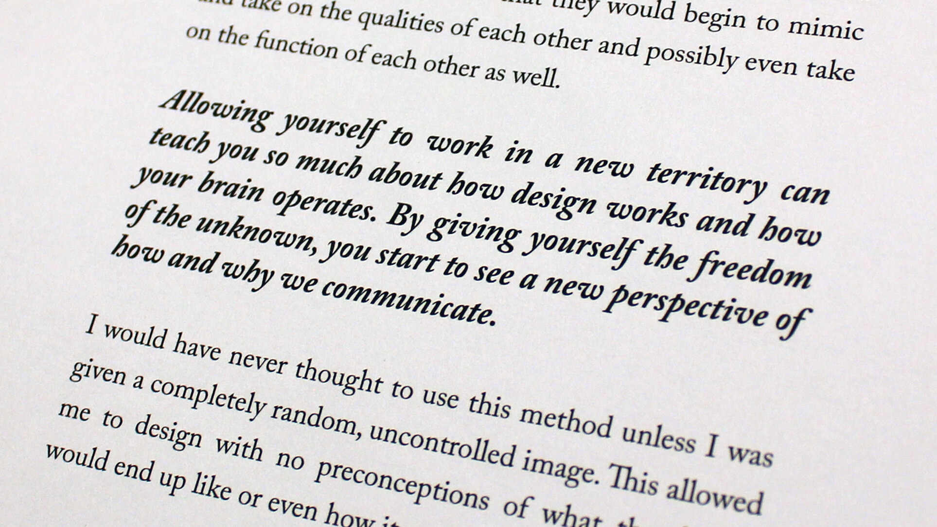
this course is probably the biggest pedagogical and theoretical risk i’ve taken as a professor. rooted squarely in postman and weingartner’s “teaching as a subversive activity”, the students’ first official foray into type-centric study had them working through the things they wanted to learn about typography, asking lots of questions and teaching themselves with guidance, encouragement and critique from me. because education comes with its own massive set of expectation – mainly, that teachers ought to dispense knowledge – this approach was met with confusion by most and outright rebellion by a select few. i’ve presented on the results, which are both promising and problematic within a larger, more traditional educational structure. this approach, however, is heavily informing our new curriculum development and through it we hope to produce more curious, critical, self-starting, and self-educating students.
OBJECTIVES
[you will be graded on how much/well you...]
learn how to learn about typography
develop your ability to ask effective and relevant questions
develop and utilize a vocabulary for talking about typography
increase in your skill in observing, classifying, and generalizing your knowledge about typography
visually demonstrate typographic ability in creating effective and engaging communication
visually demonstrate typography’s various roles within culture
collaborate and build trust among students in a studio atmosphere
increase skill in craft — attention to detail, making/building, and professionalism of final objects
COURSE STRUCTURE
daily fun and adventure!
semester-long independent inquiry into typography [mondays]
semester-long “application” time to address typographic issues from other courses as needed [wednesdays]
learning summaries due every three weeks – open format
process documentation through your kcai blog
learning summary 1
students were asked to compile and present their learnings to peers every three weeks. my hope was that even as students looked over each other’s shoulders regularly, this would formalize the peer-to-peer teaching and students could absorb, at least on a basic level, a wide range of typographic knowledge.


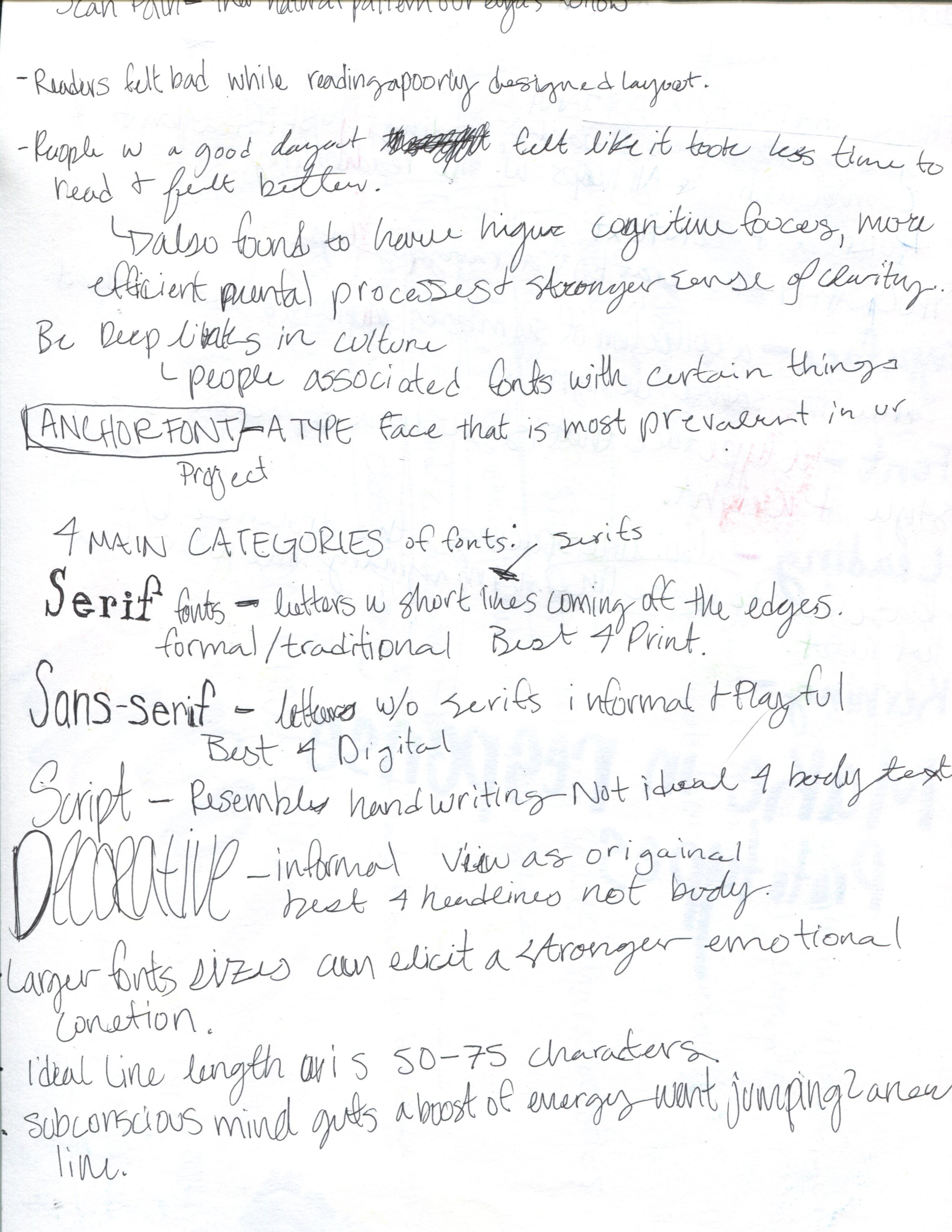
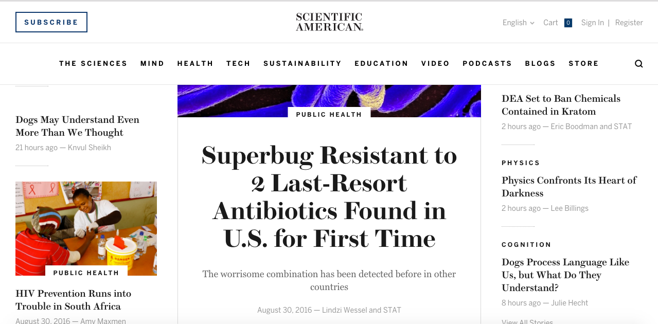


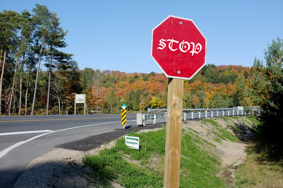


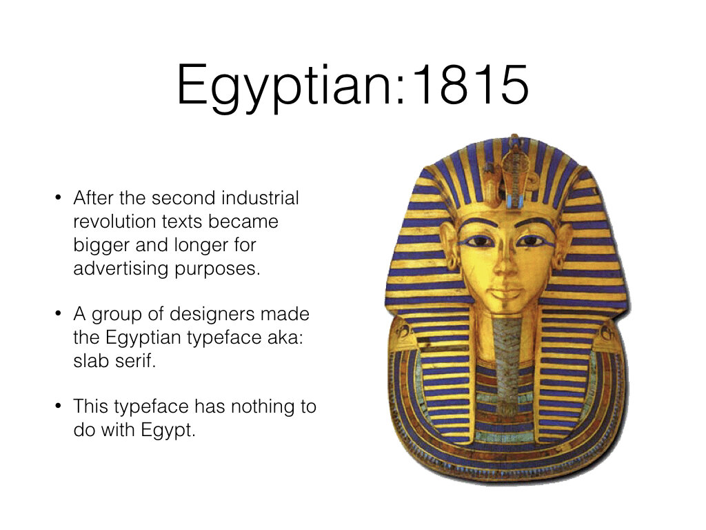
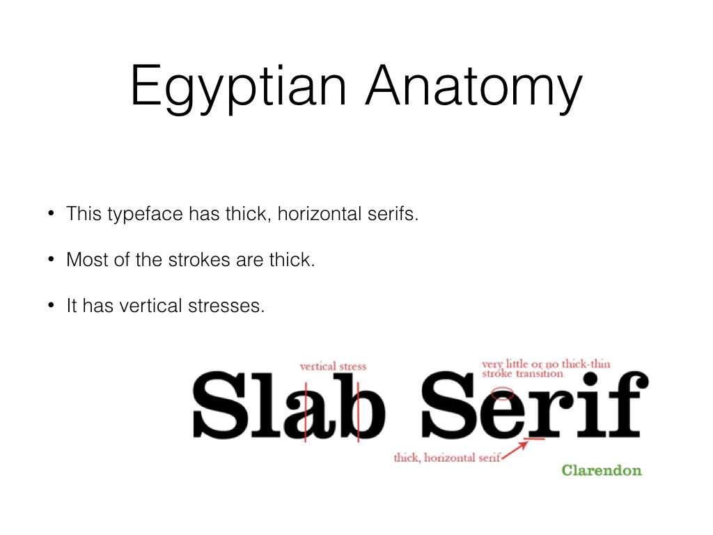
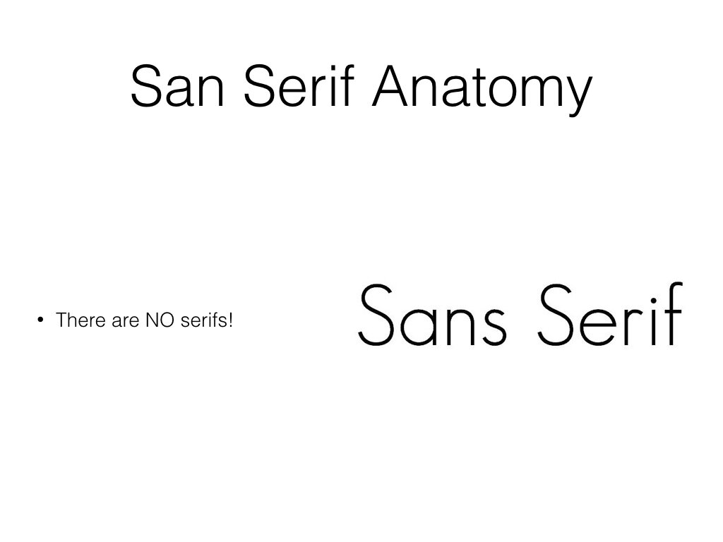
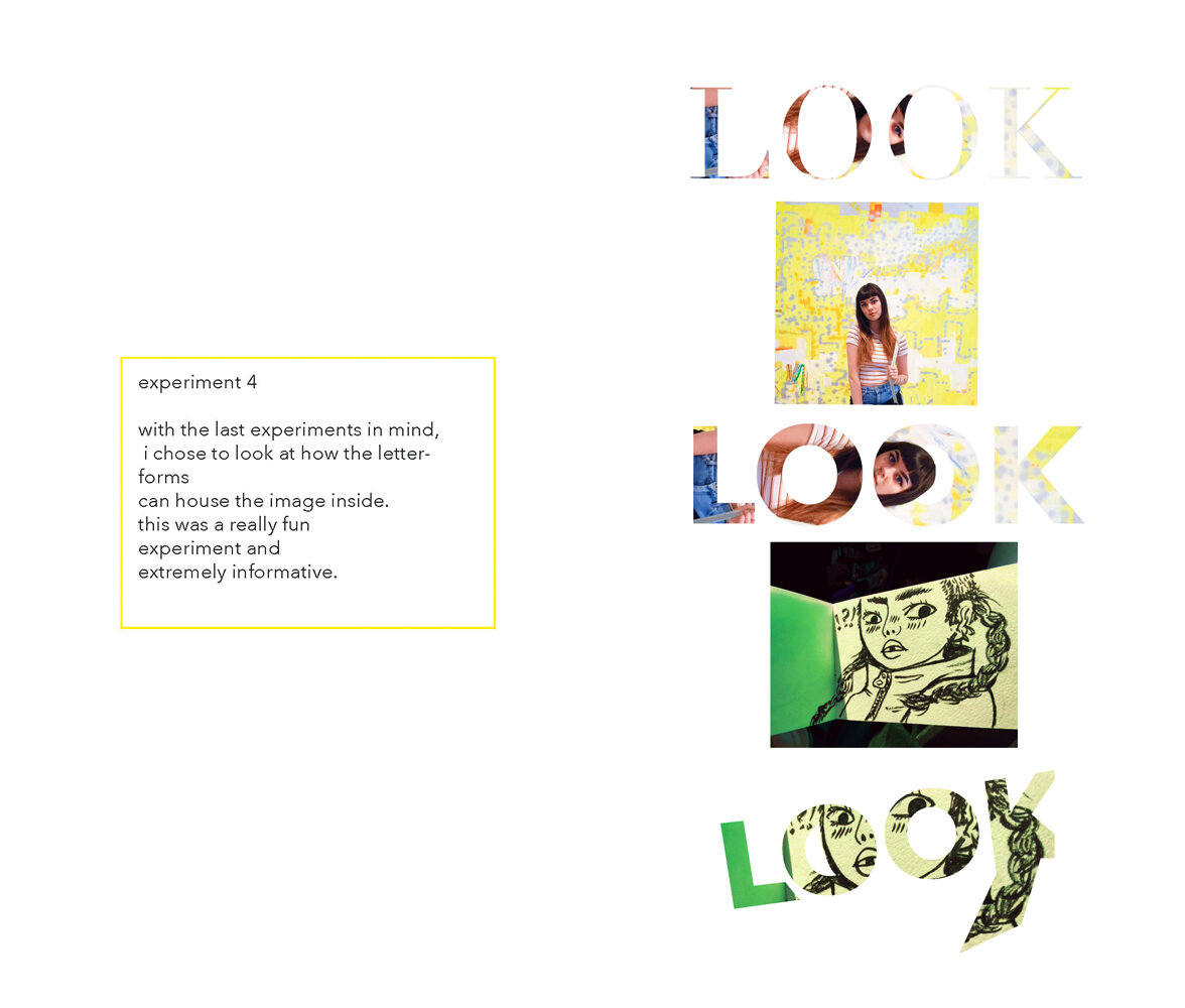
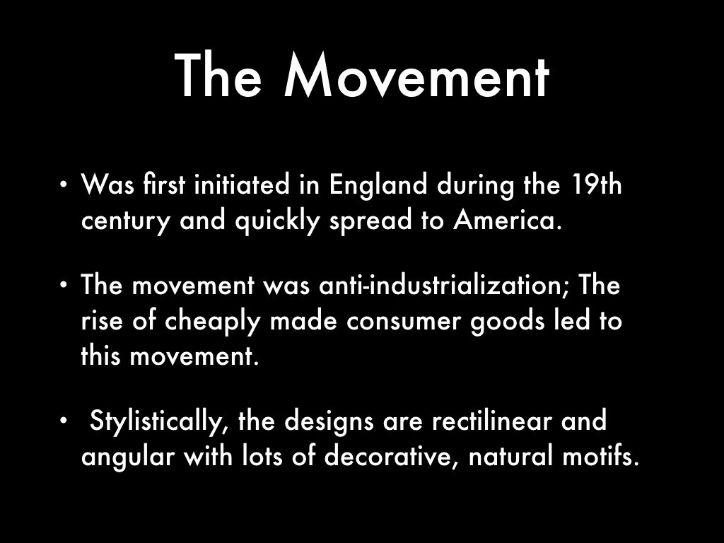
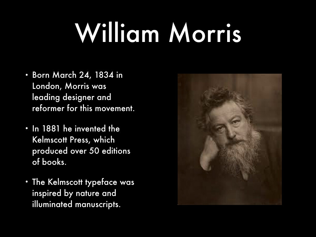
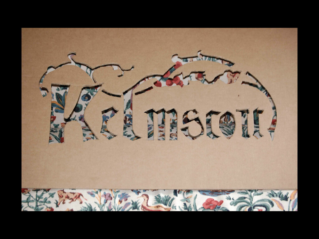
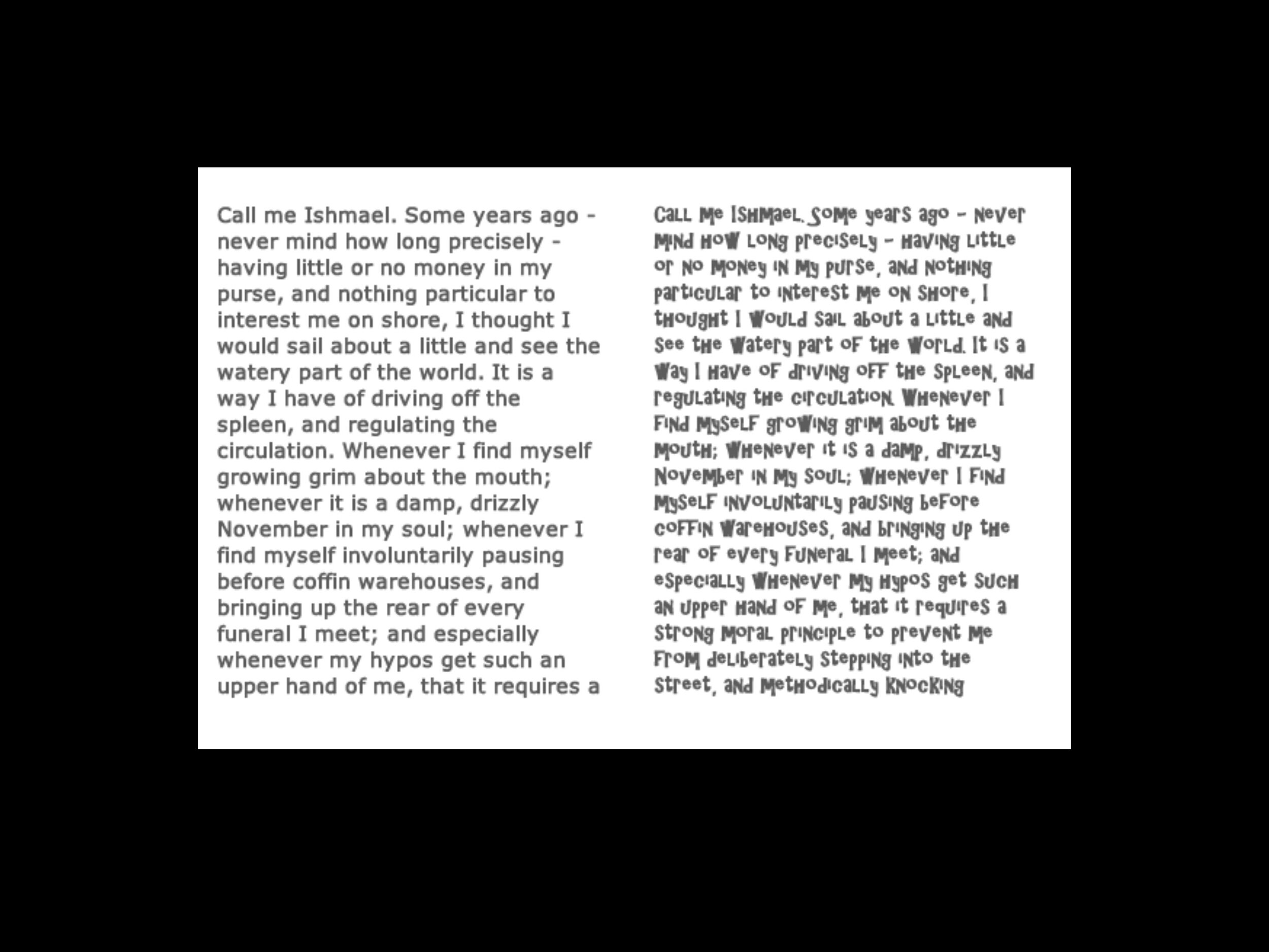
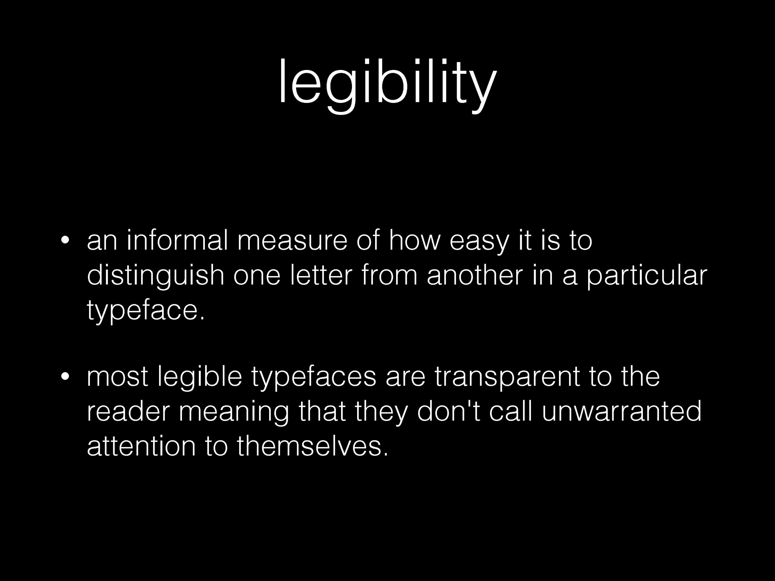
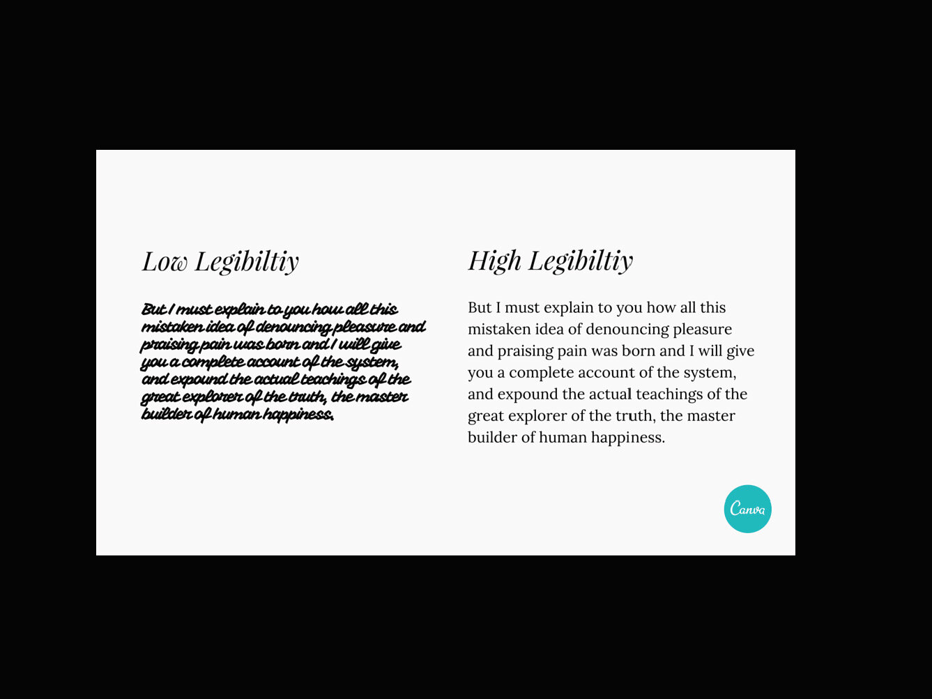
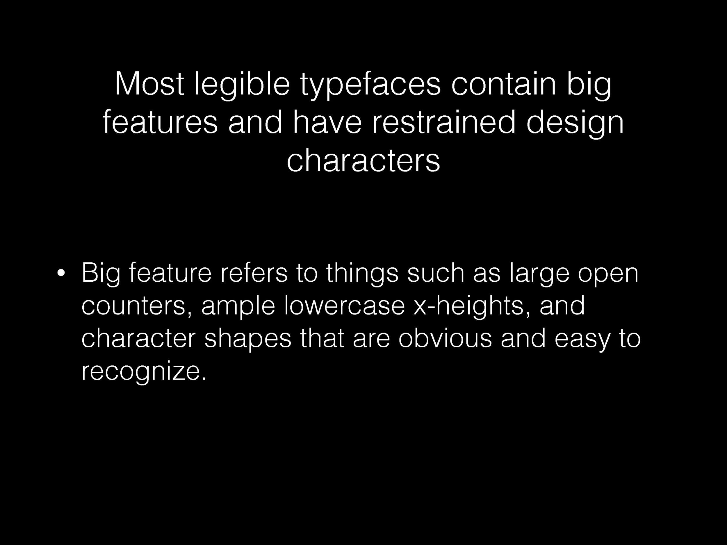
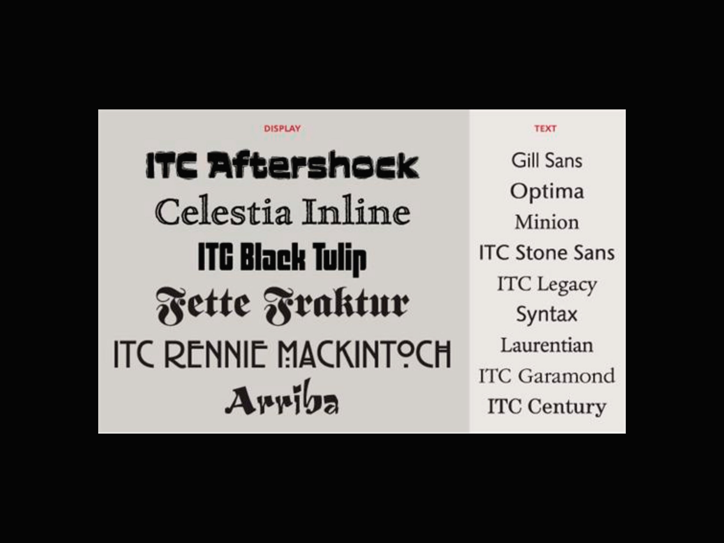
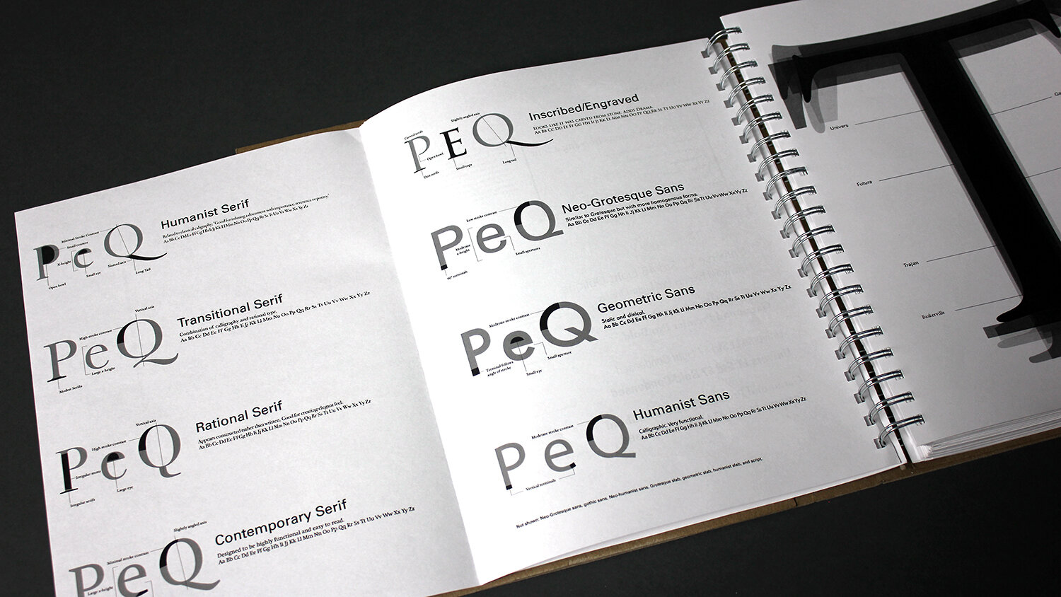
abigail crawford – examining the impact and meaning conveyed by different typefaces, including credibility in contexts where it is necessary. the examples from “scientific american” and the stop sign experiments are especially effective in her discovery of the connotative power, and sheer legibility, of typeface choice.
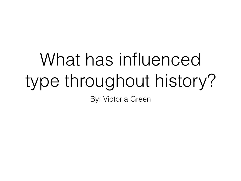
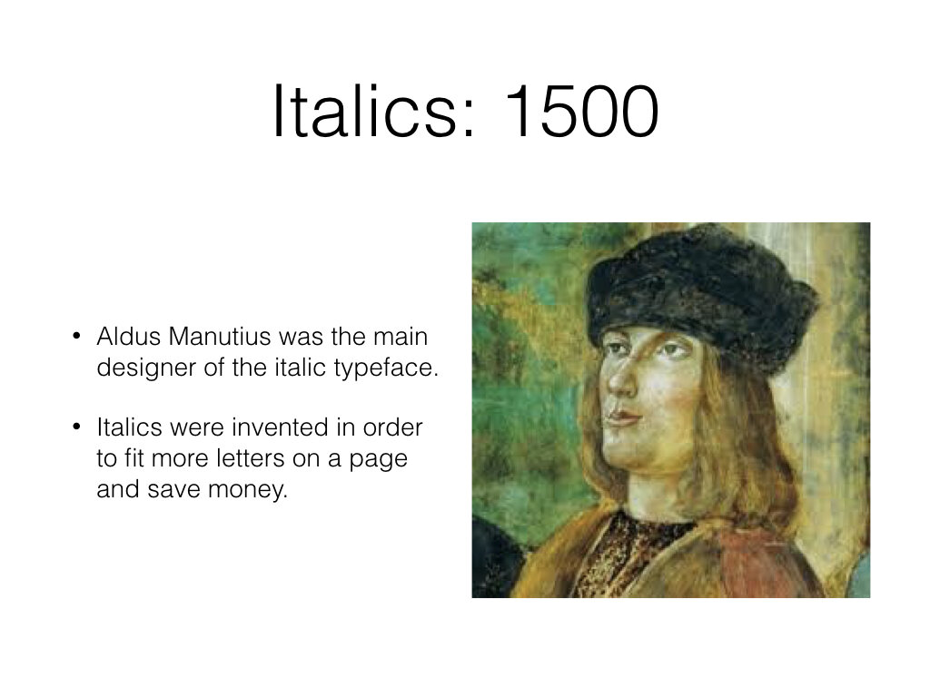
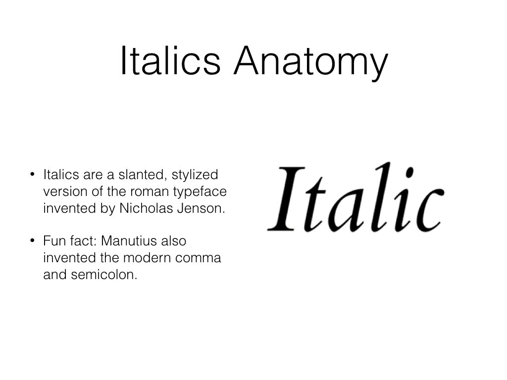
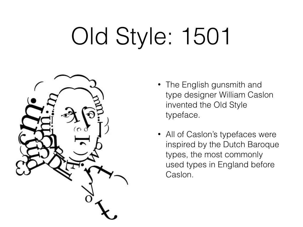
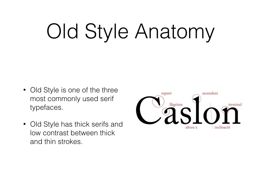

tori green – an art history and graphic design double major, tori immediately dove into the origins of typography and typeface design. her title slide is a strong example of the preferred “question-led” process. all images were found online.
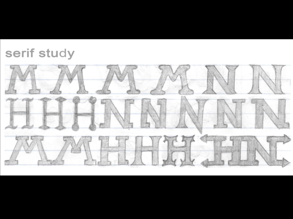

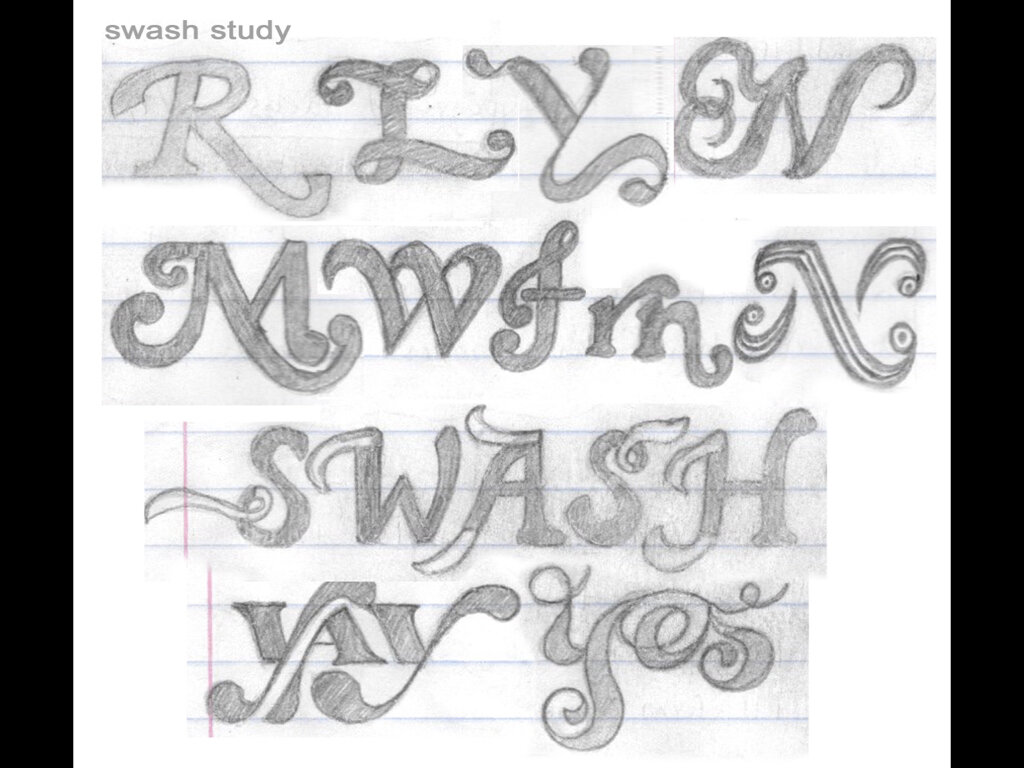
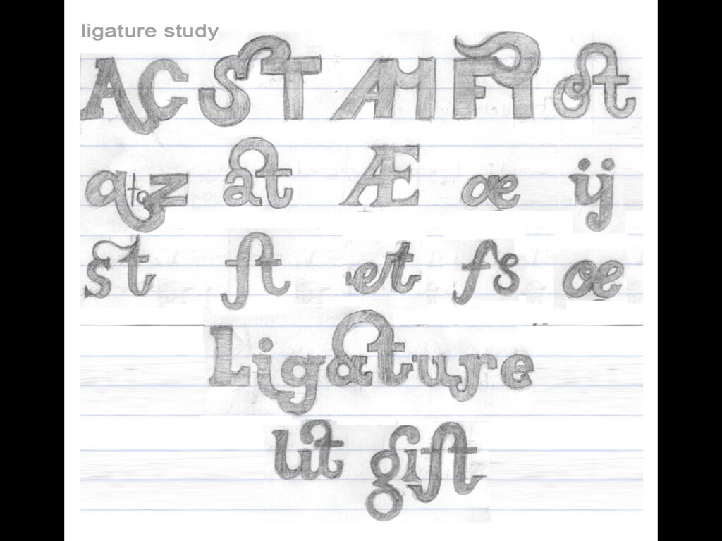
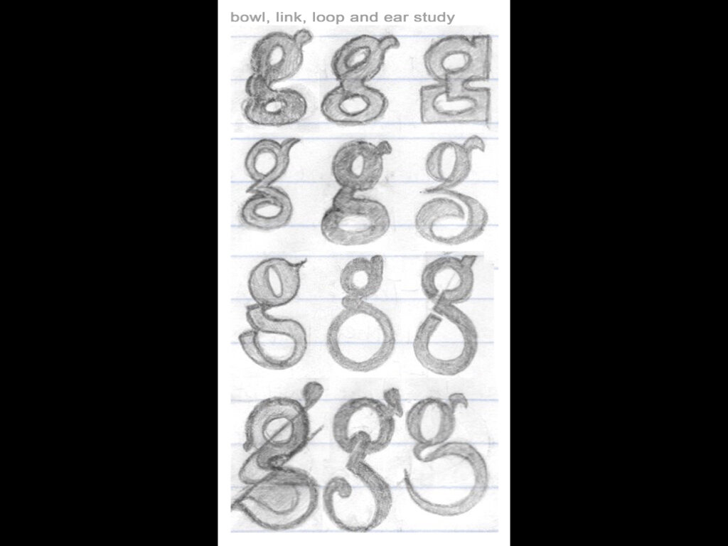
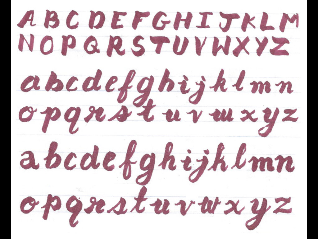
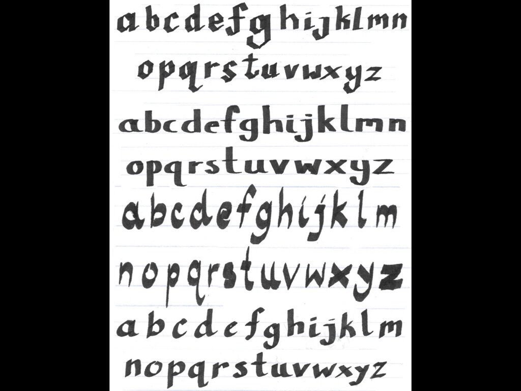
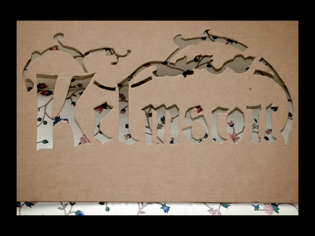
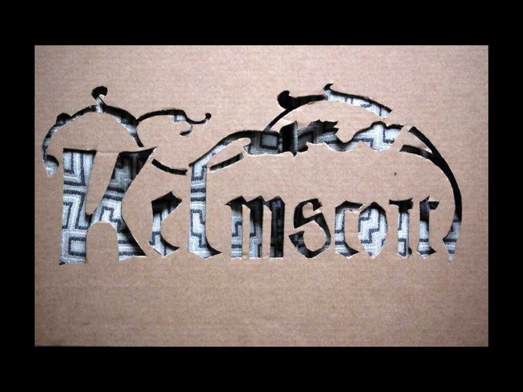
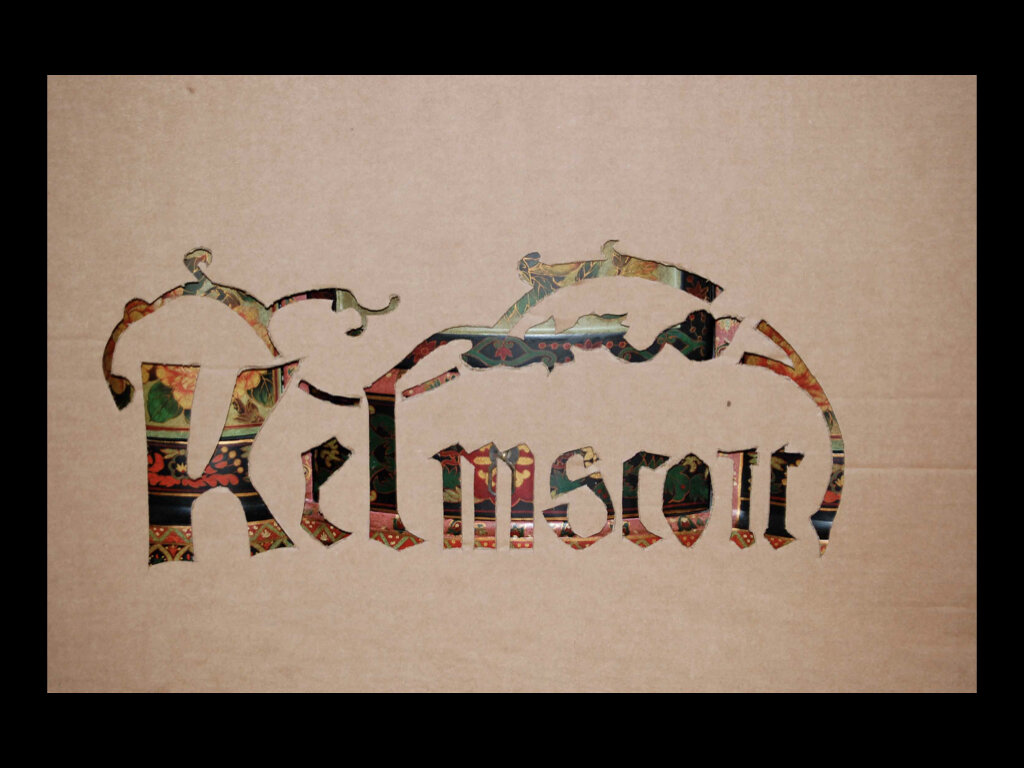
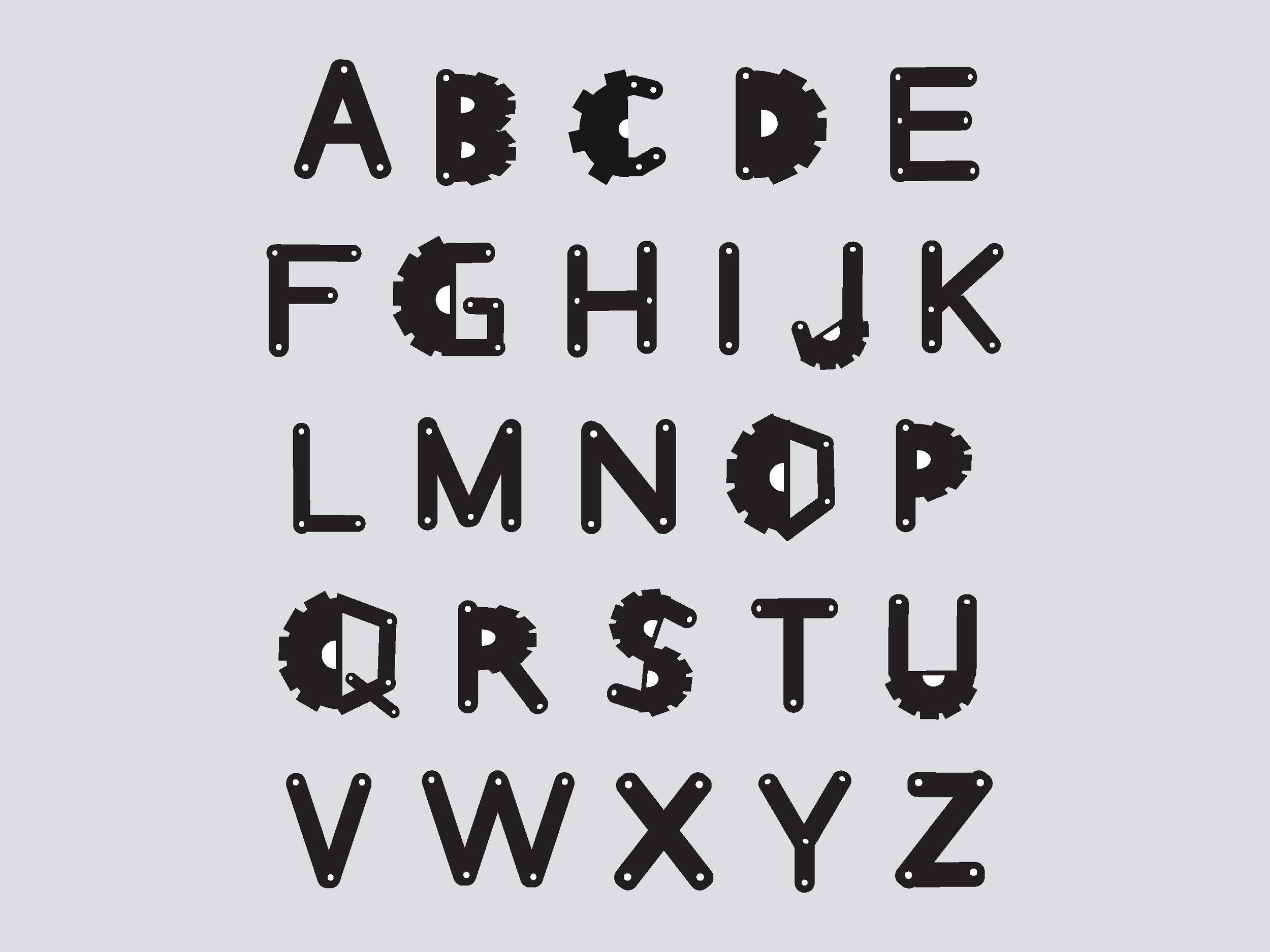
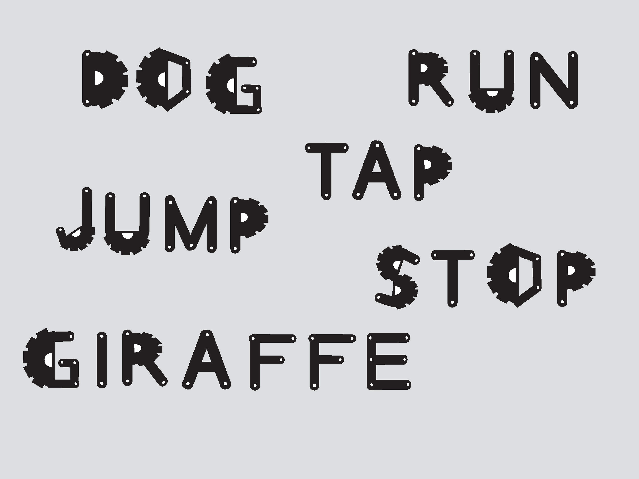
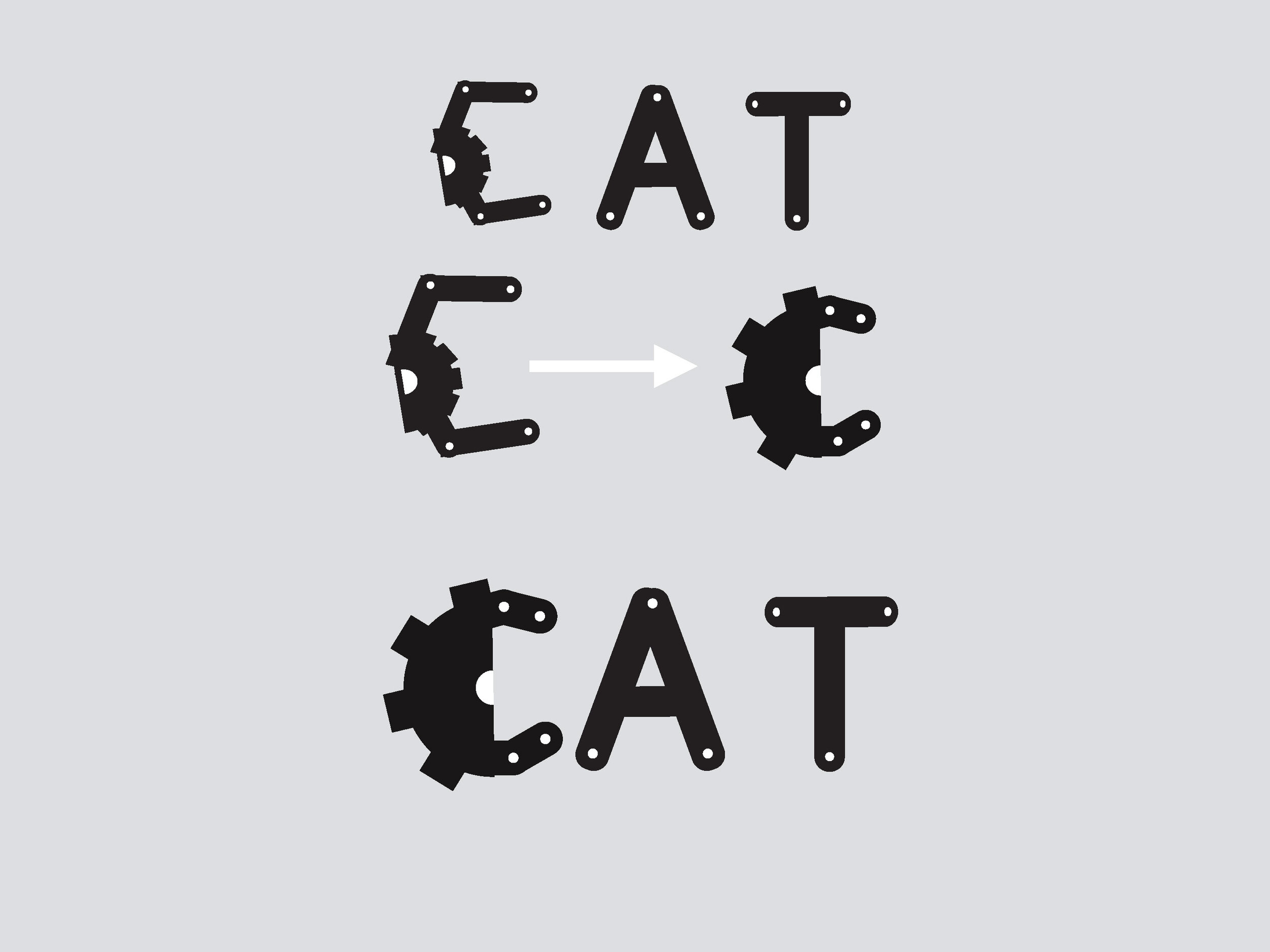
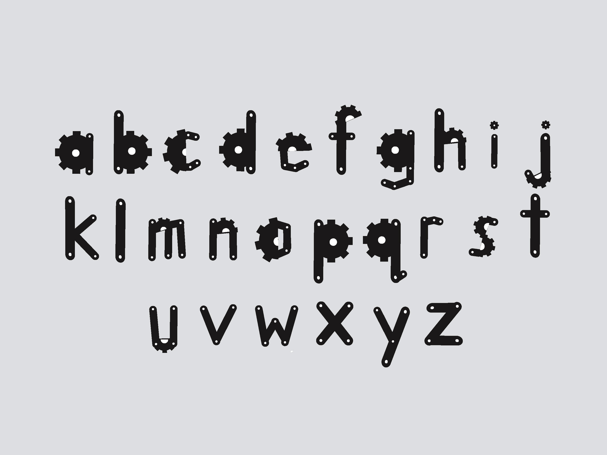
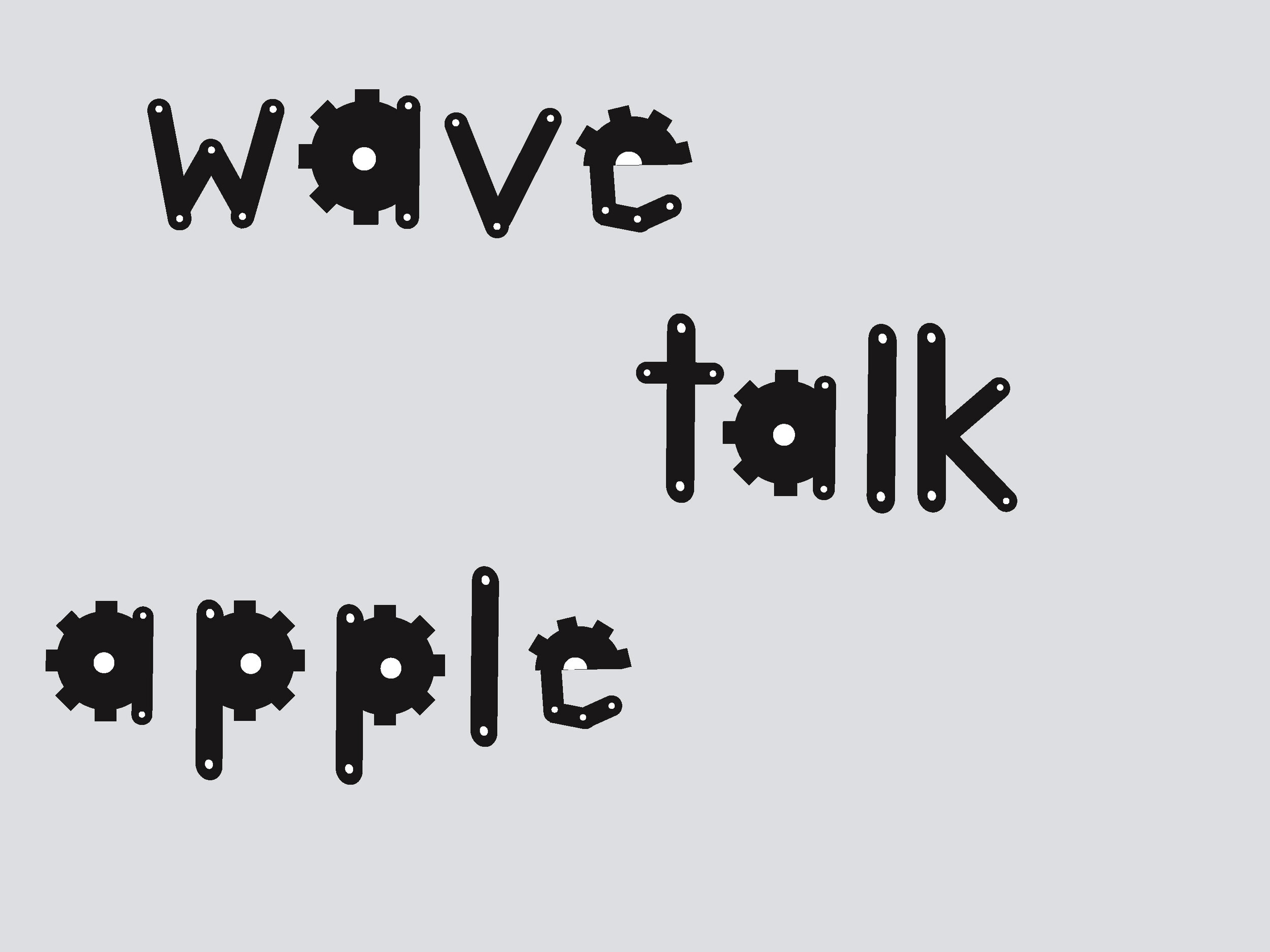
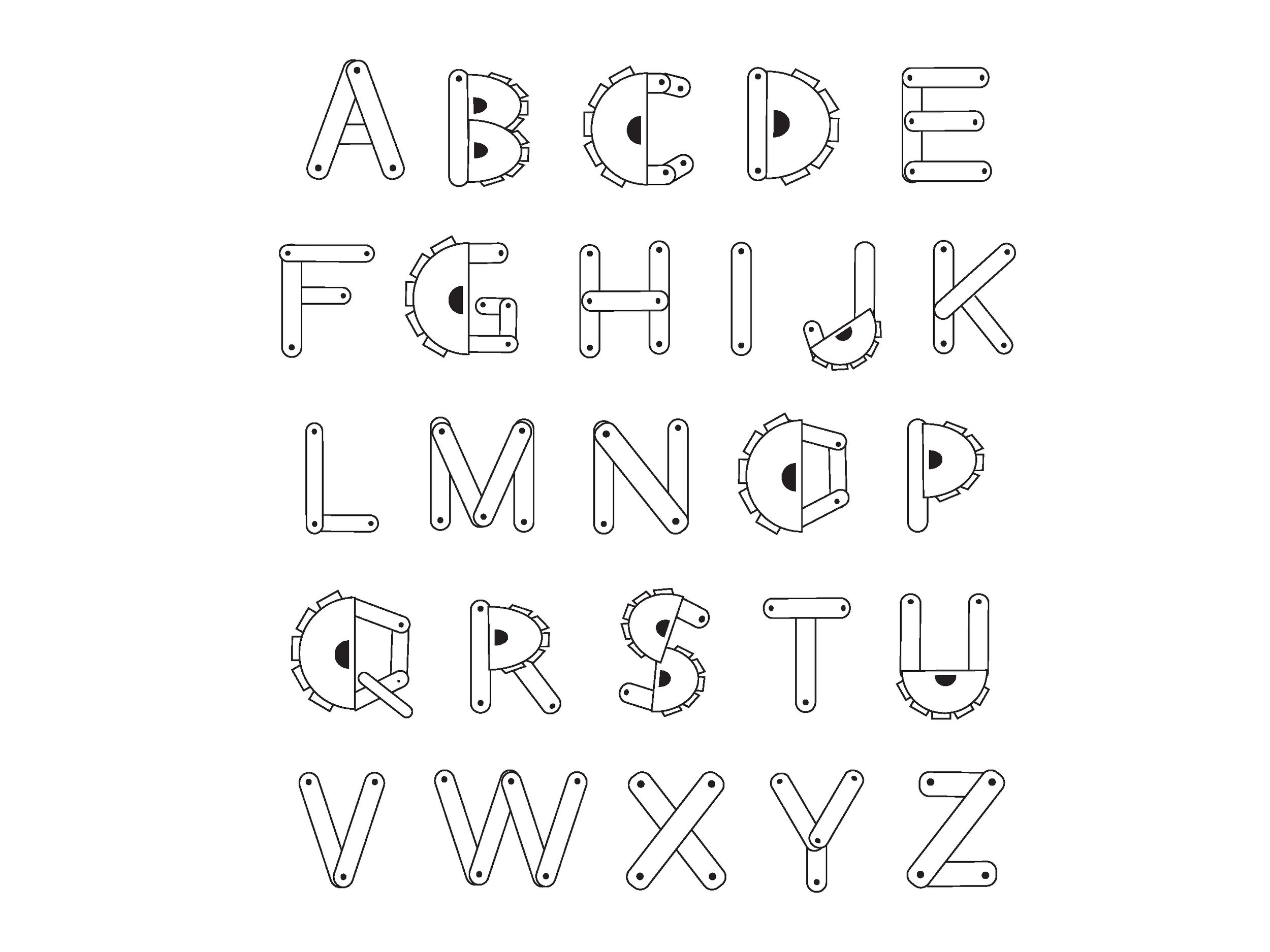
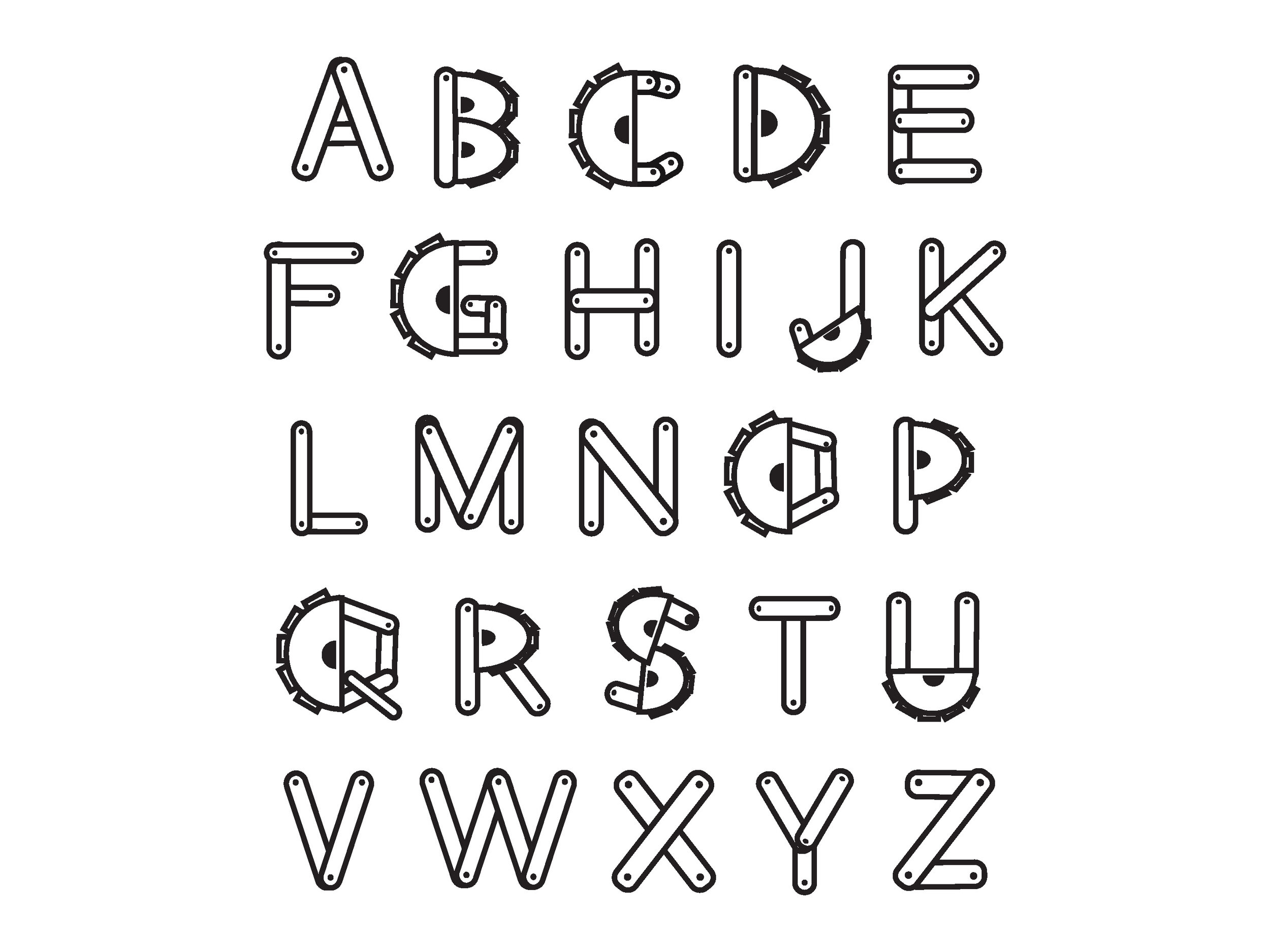
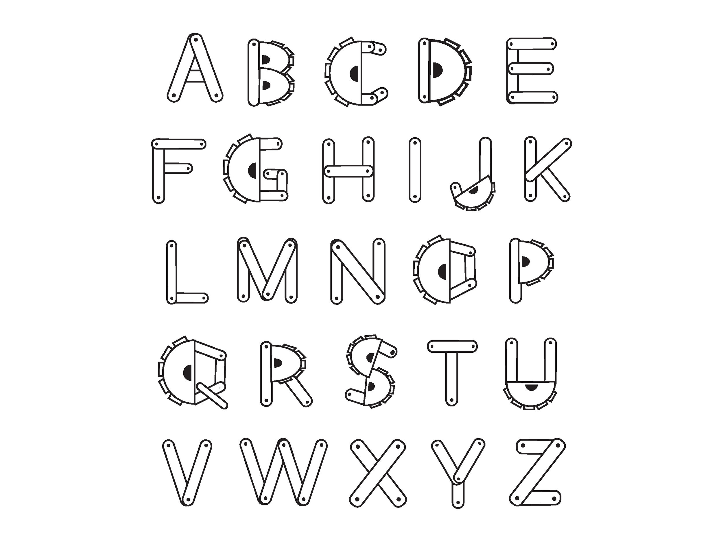
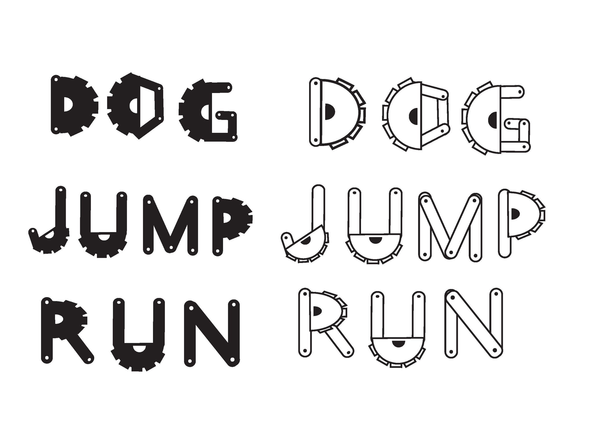
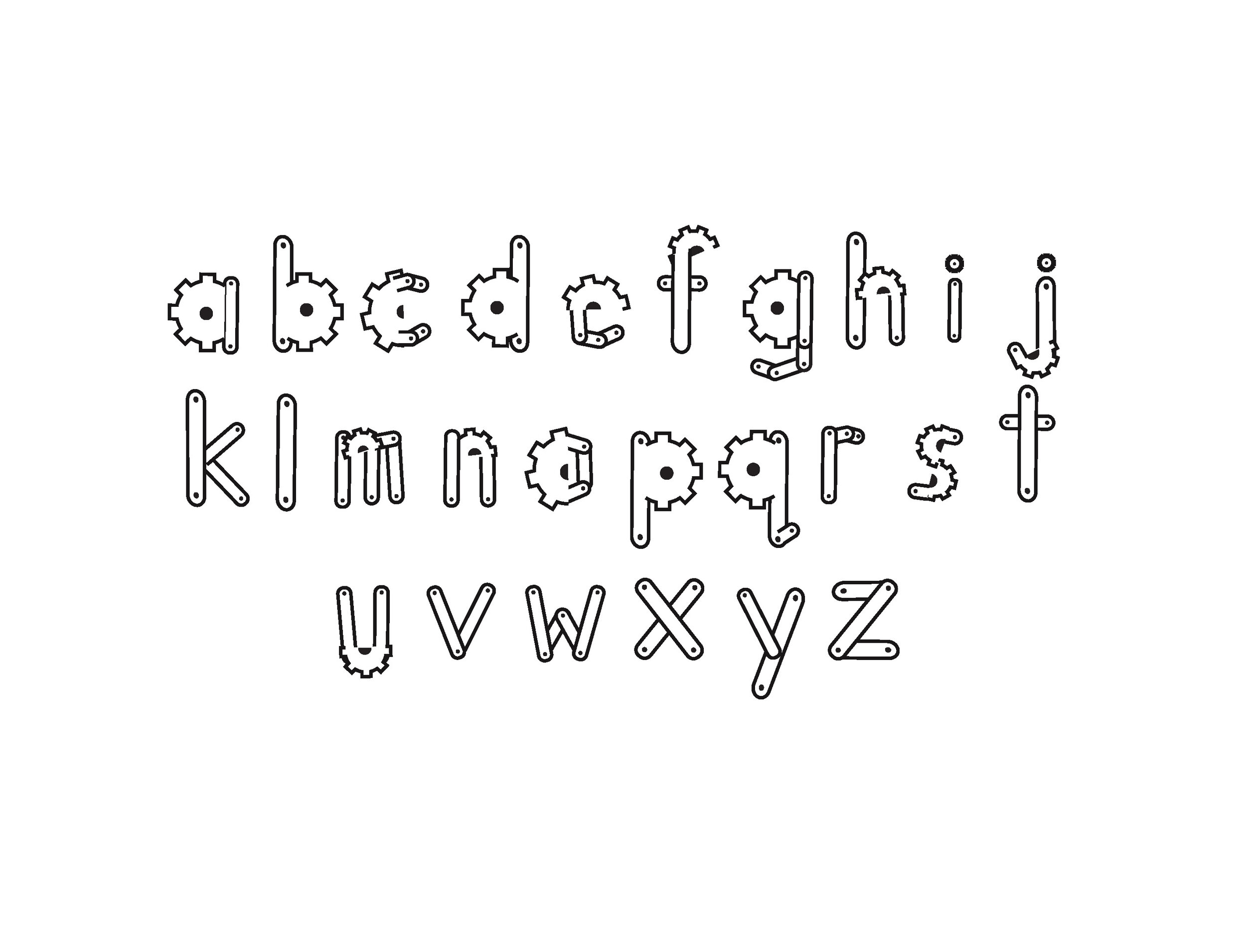
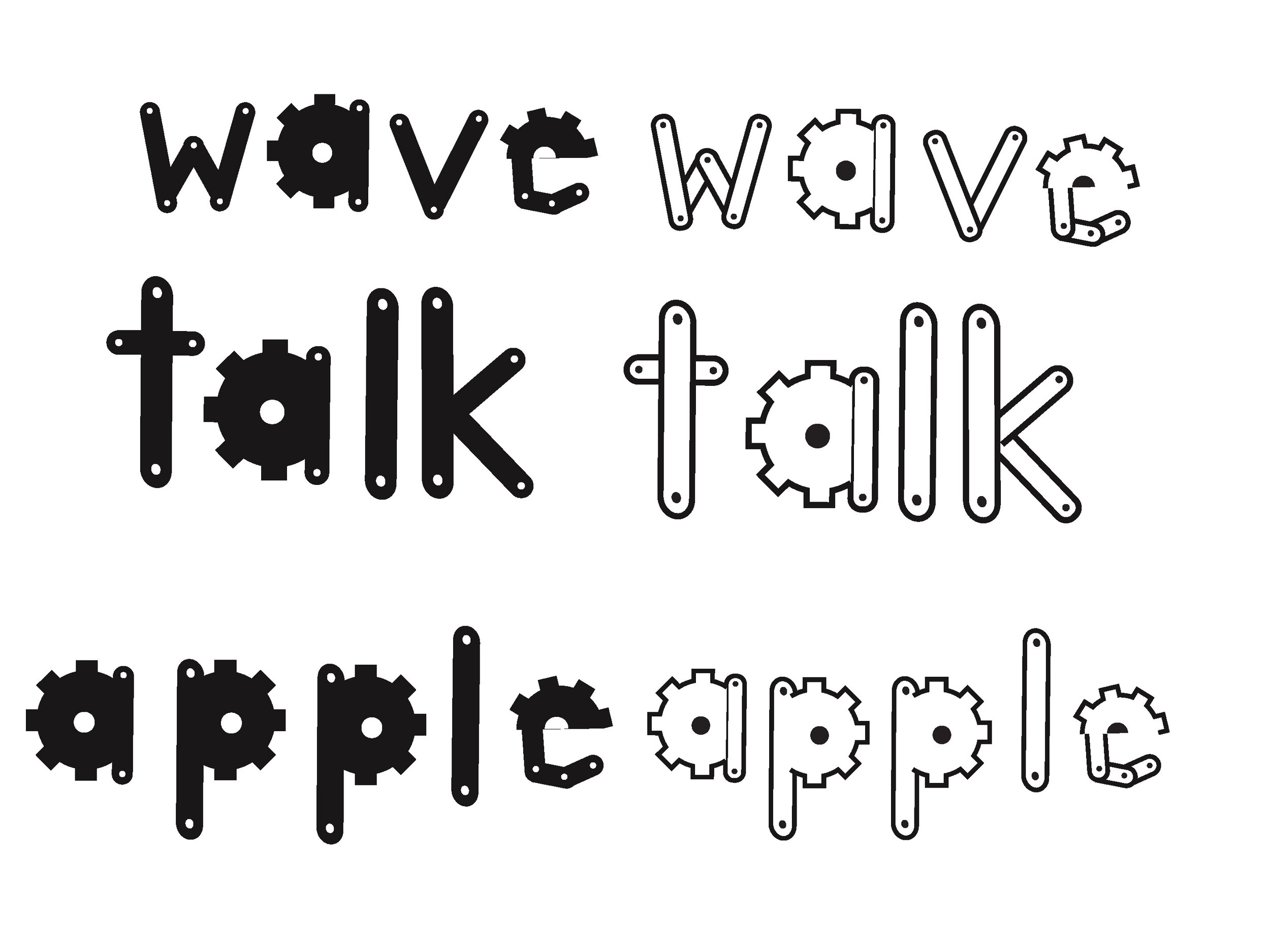
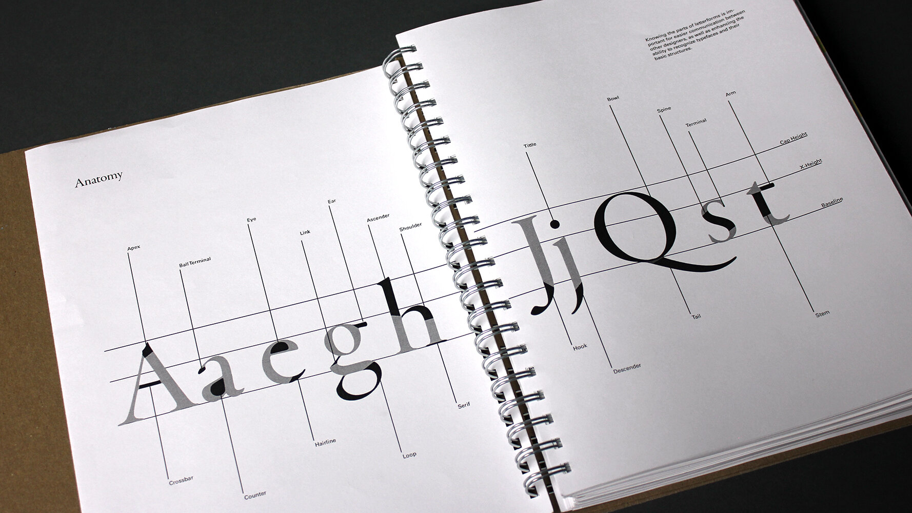
parker seydel – with an interest in lettering, parker immediately demonstrated an eye for detail in his letterform studies, many of which scientifically examine changing single variables to understand their impacts. he also began teaching himself calligraphy as part of this line of questioning.
lecture: what makes a good typeface?
learning summary 2
many students deepened their existing exploration with additional questions, more visual experiments, and more research and reading. at this point, they are starting to hit on something interesting and gain some traction in their explorations. of course, there are changes in direction and ideas that peter out but the majority of students are learning a valuable range of ideas as this point.


kelsey mack
learning summary 3

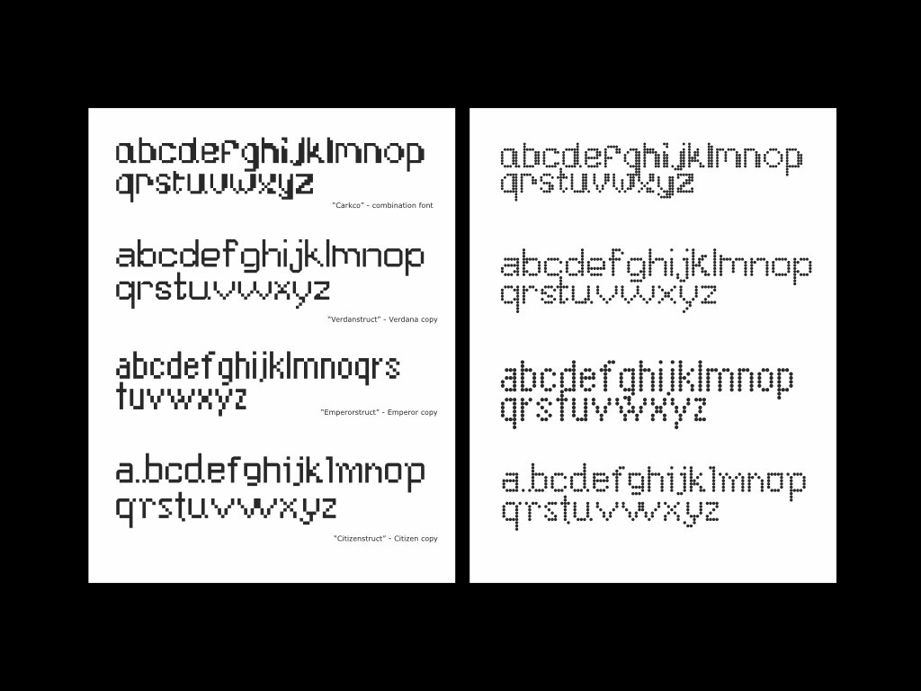
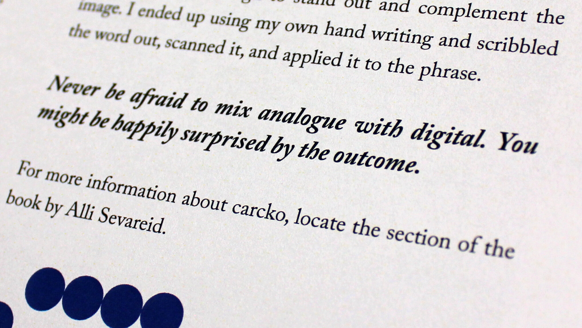
alli sevareid – by the third phase, alli is showing a deep understanding of the motivations of typeface designers, their relationship to technology, and how to play with repurposing and combining existing visual forms using contemporary technology – in this case, the online font-making tool “fonstruct”.
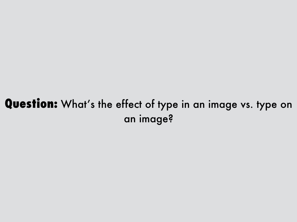
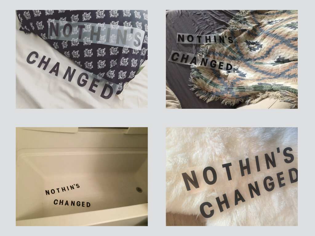
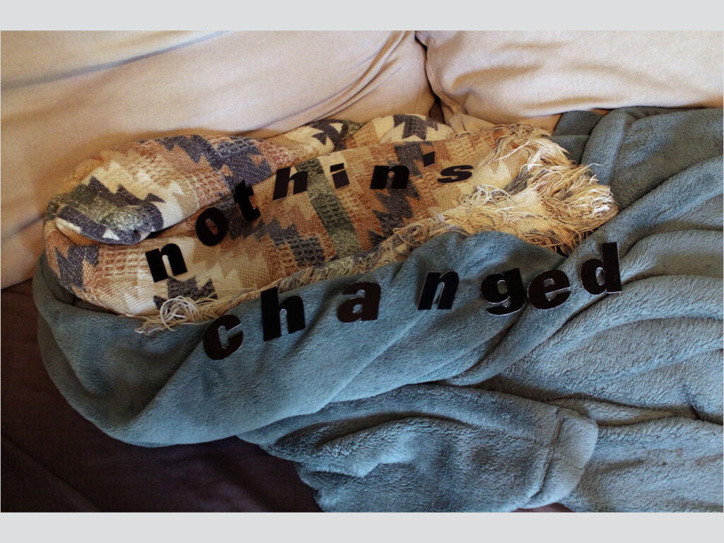
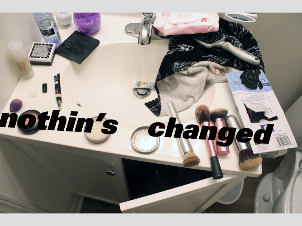
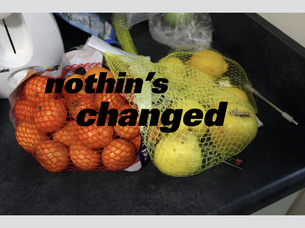
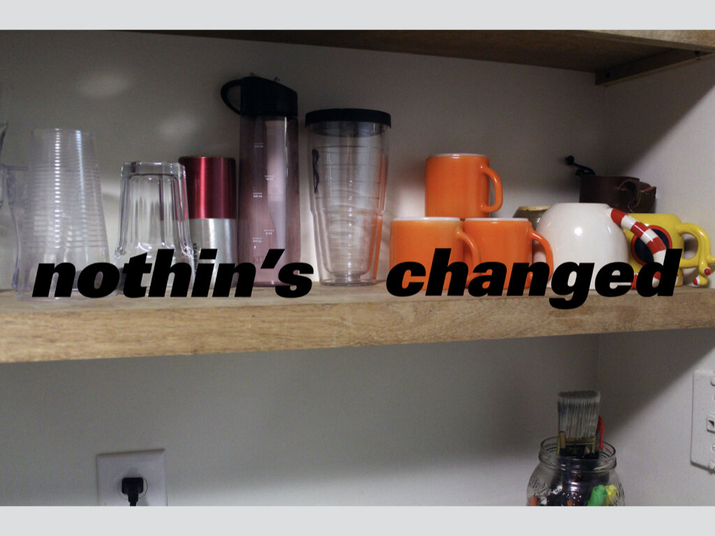
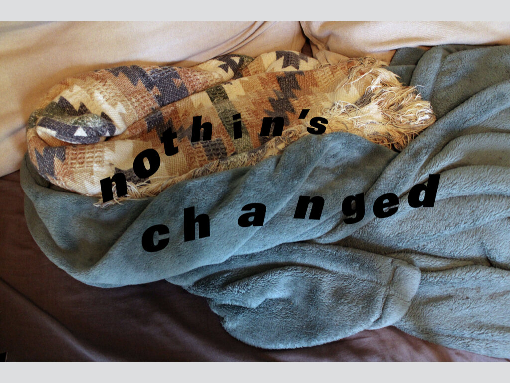
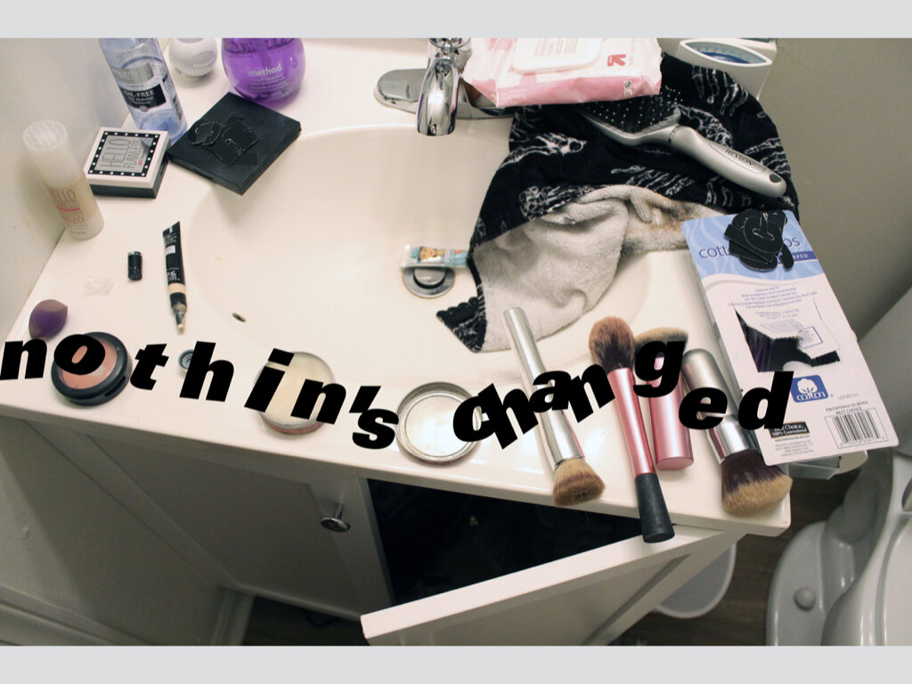
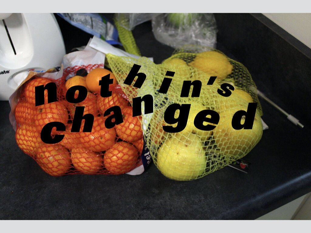

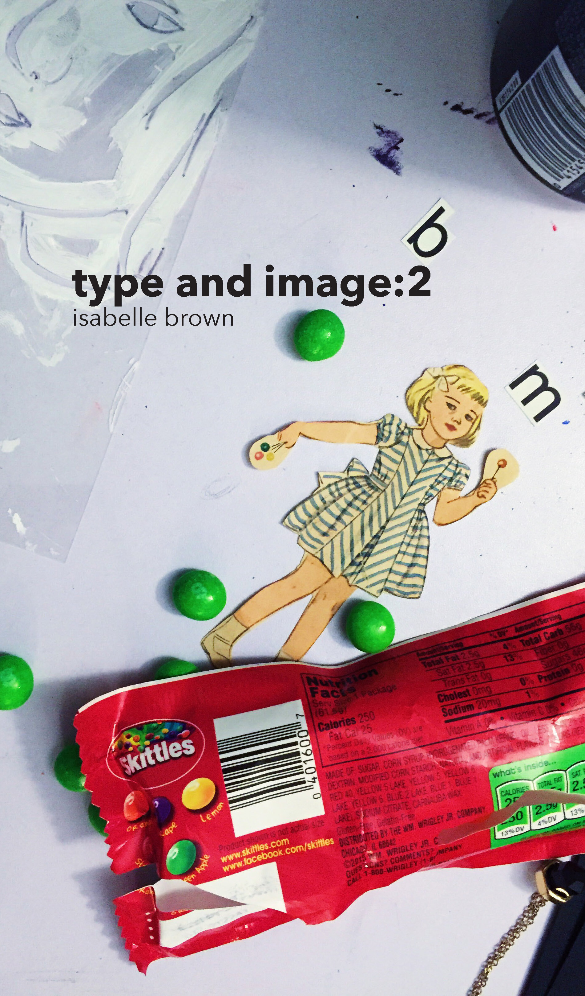
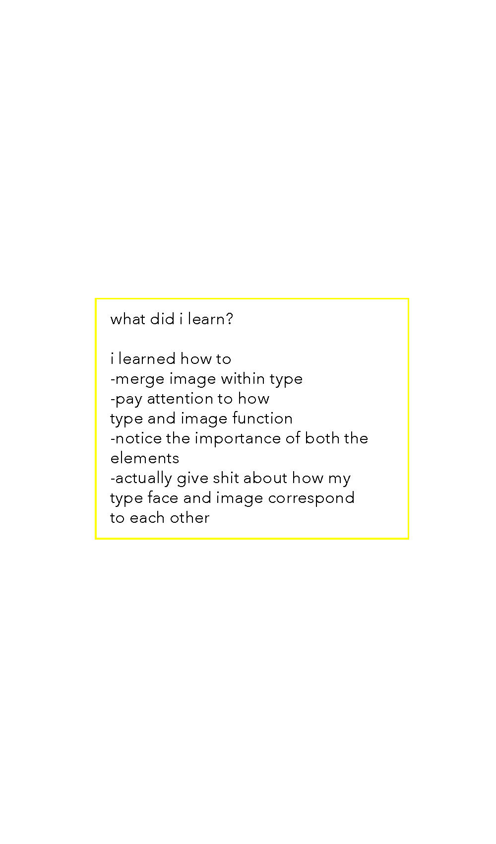
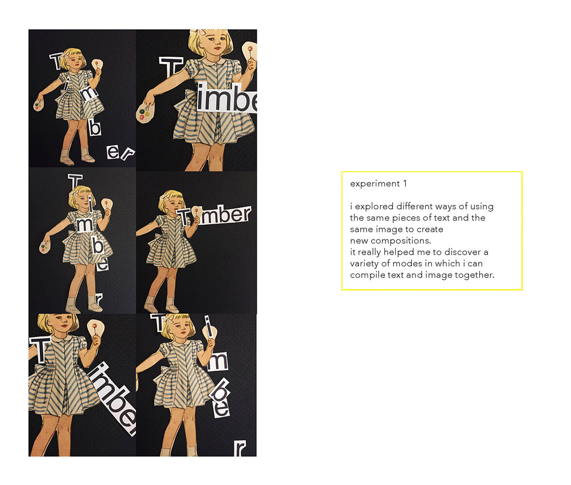
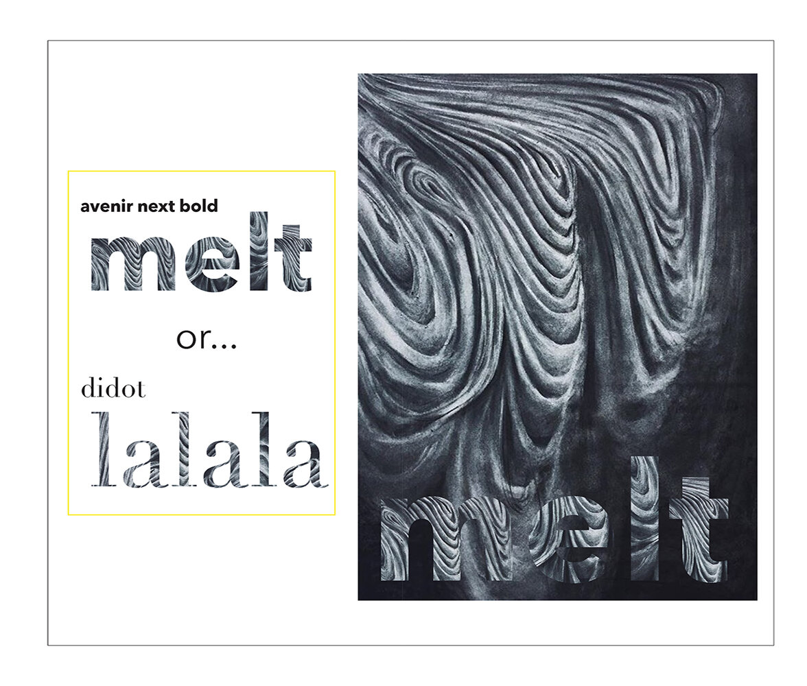
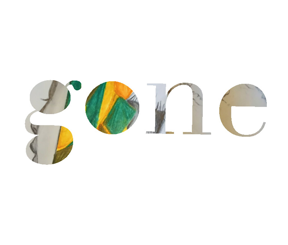
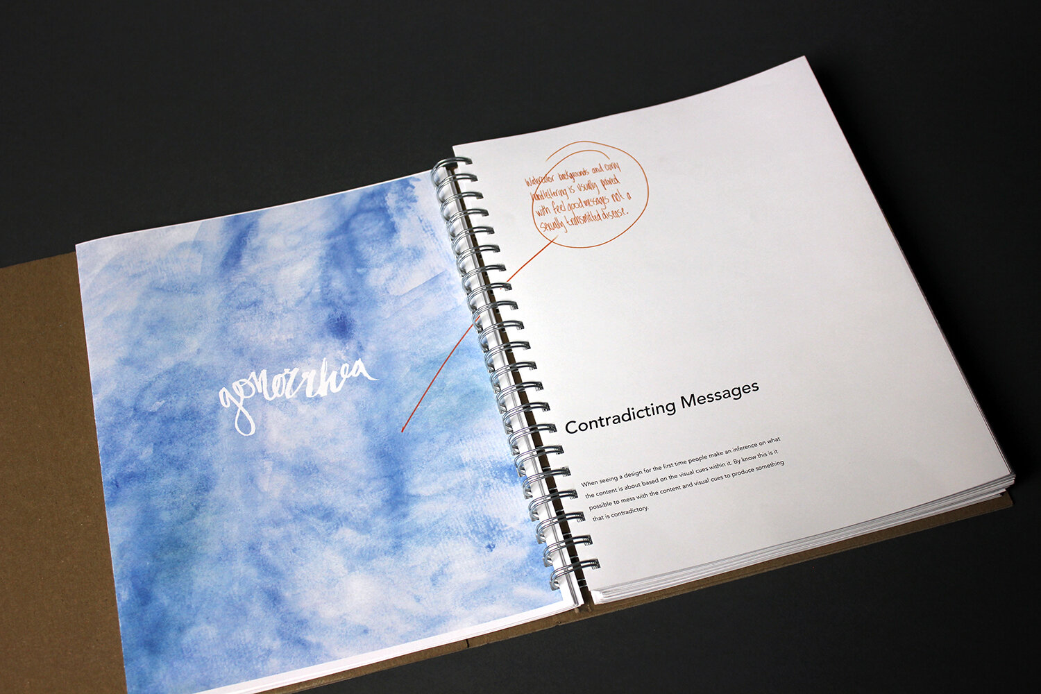
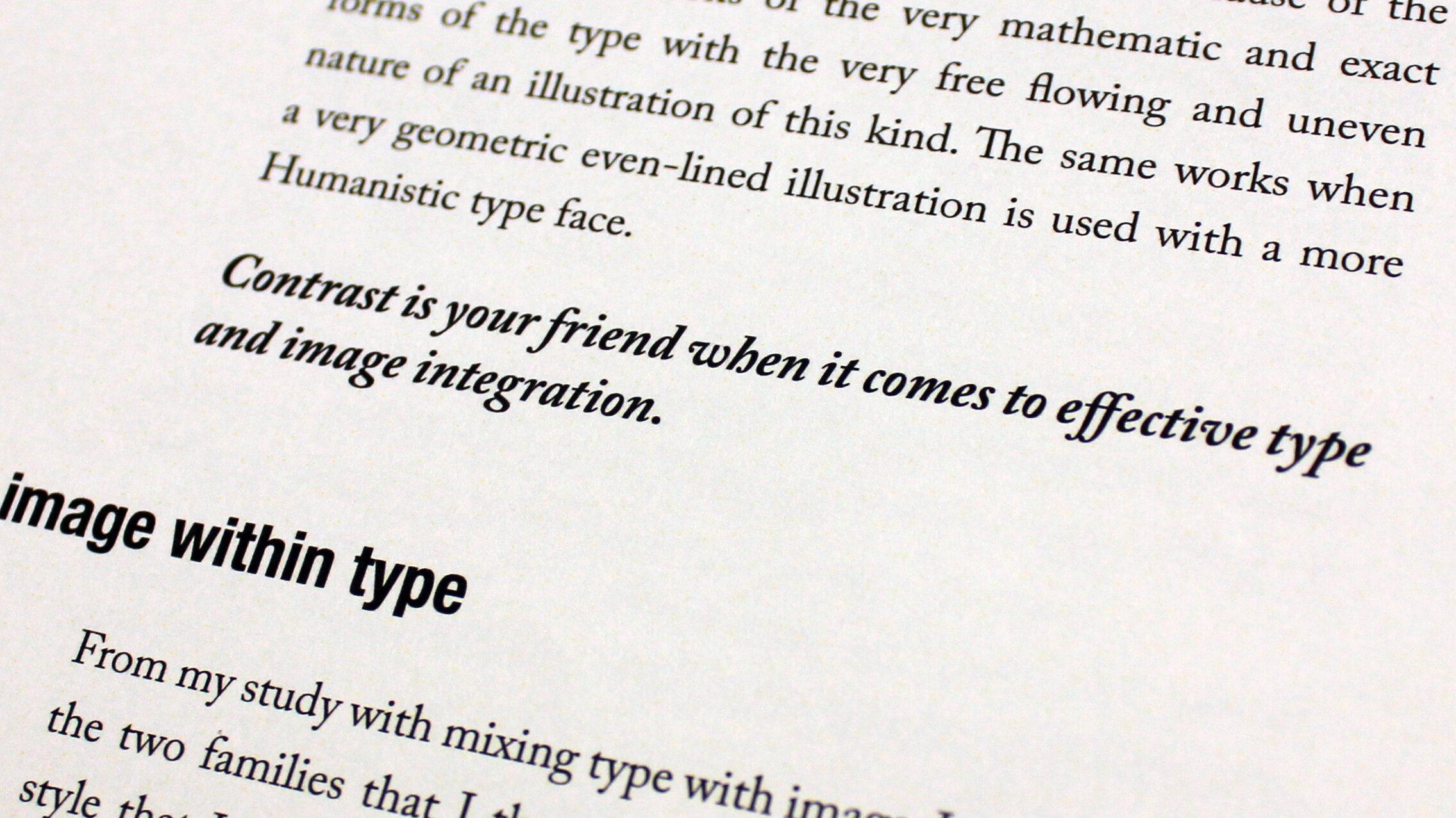
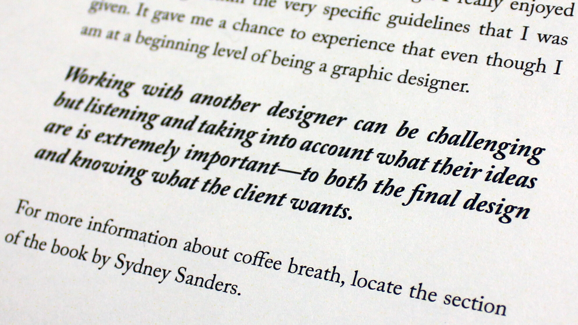
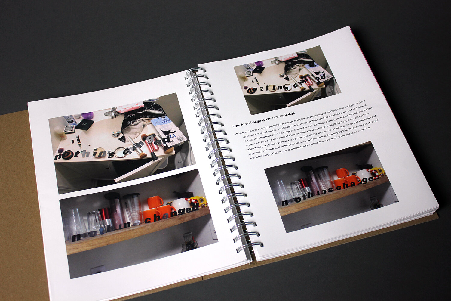
baillie hughes – after examining typeface categories and pairings, baillie moved to type and image relationships in their second phase. this third phase shows their sophistication in understanding a range of possibilities for how type and photographs can co-exist – type in vs on an image and subtle issues of layering and dimensionality of typography within an image.

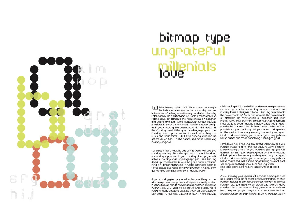
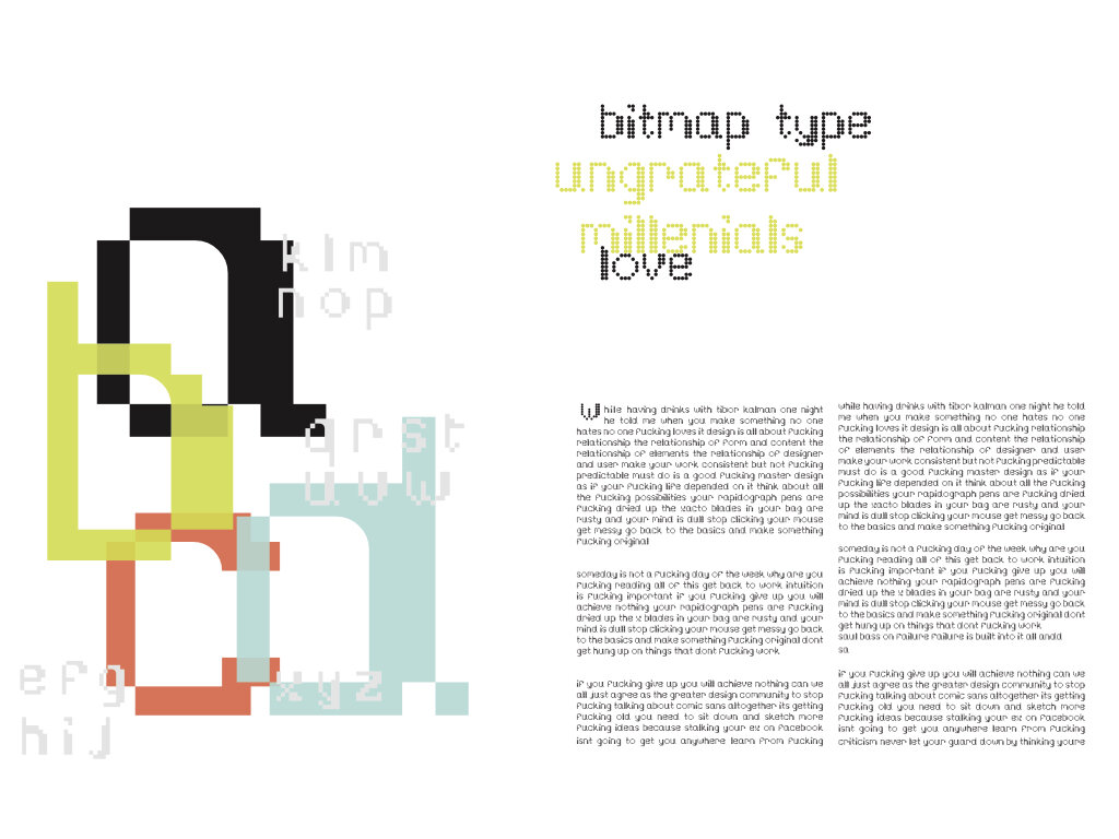
z lisenbee – after initial, and continued, studies in “microtypography”, z took their studies to the next level in learning to manipulate html code in the “inspector” panel within the google chrome browser. they then created the above animated gifs as a time-based demonstration of the impacts of taking typographic spacing issues to the extreme.
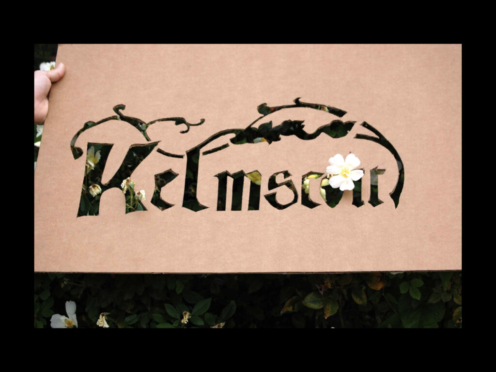
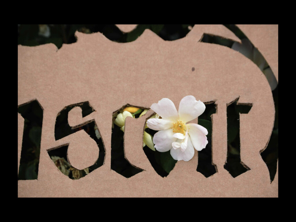
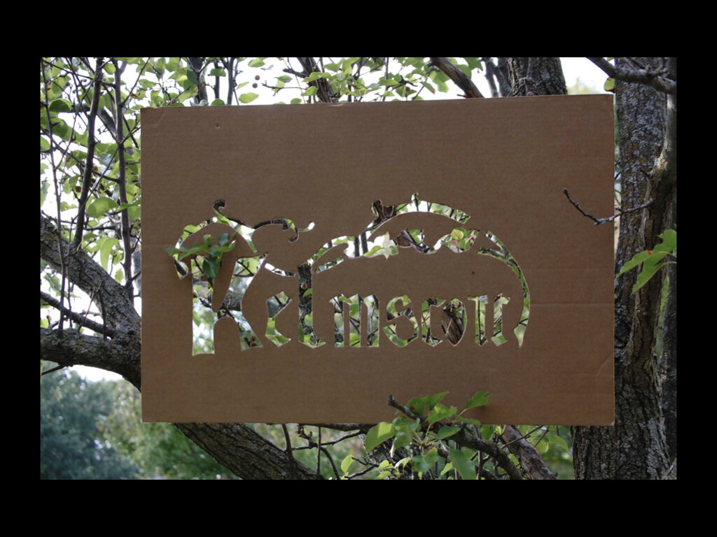
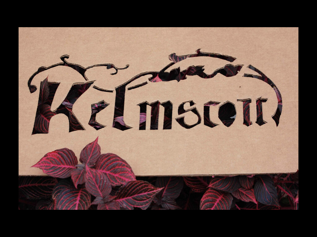
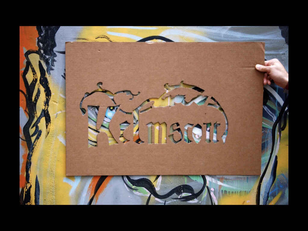
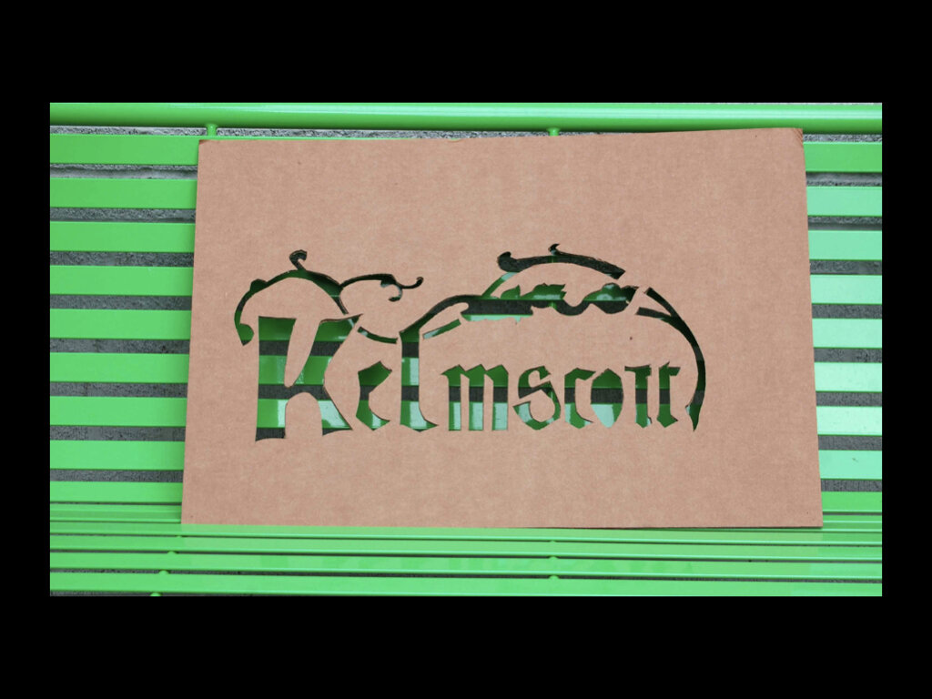
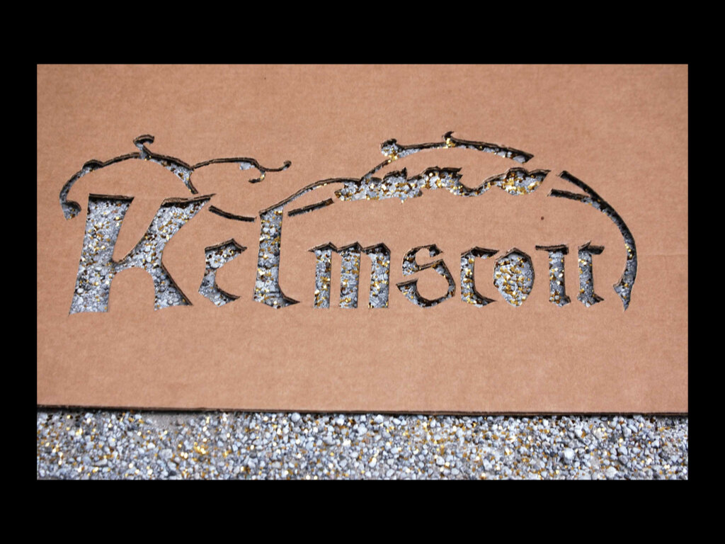
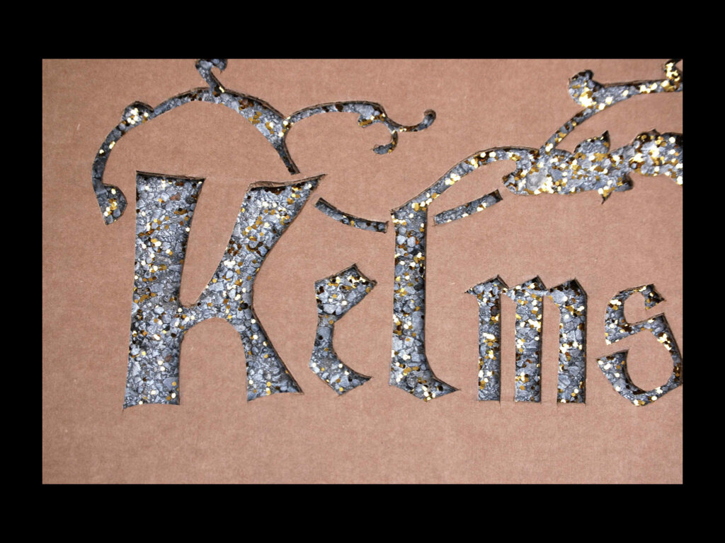
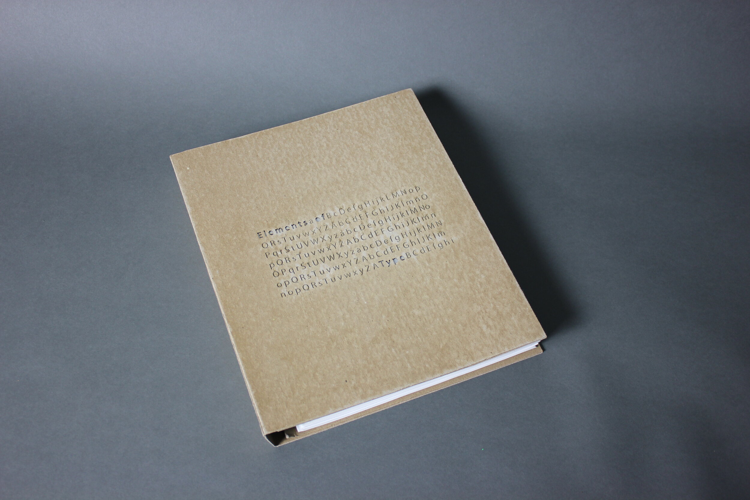
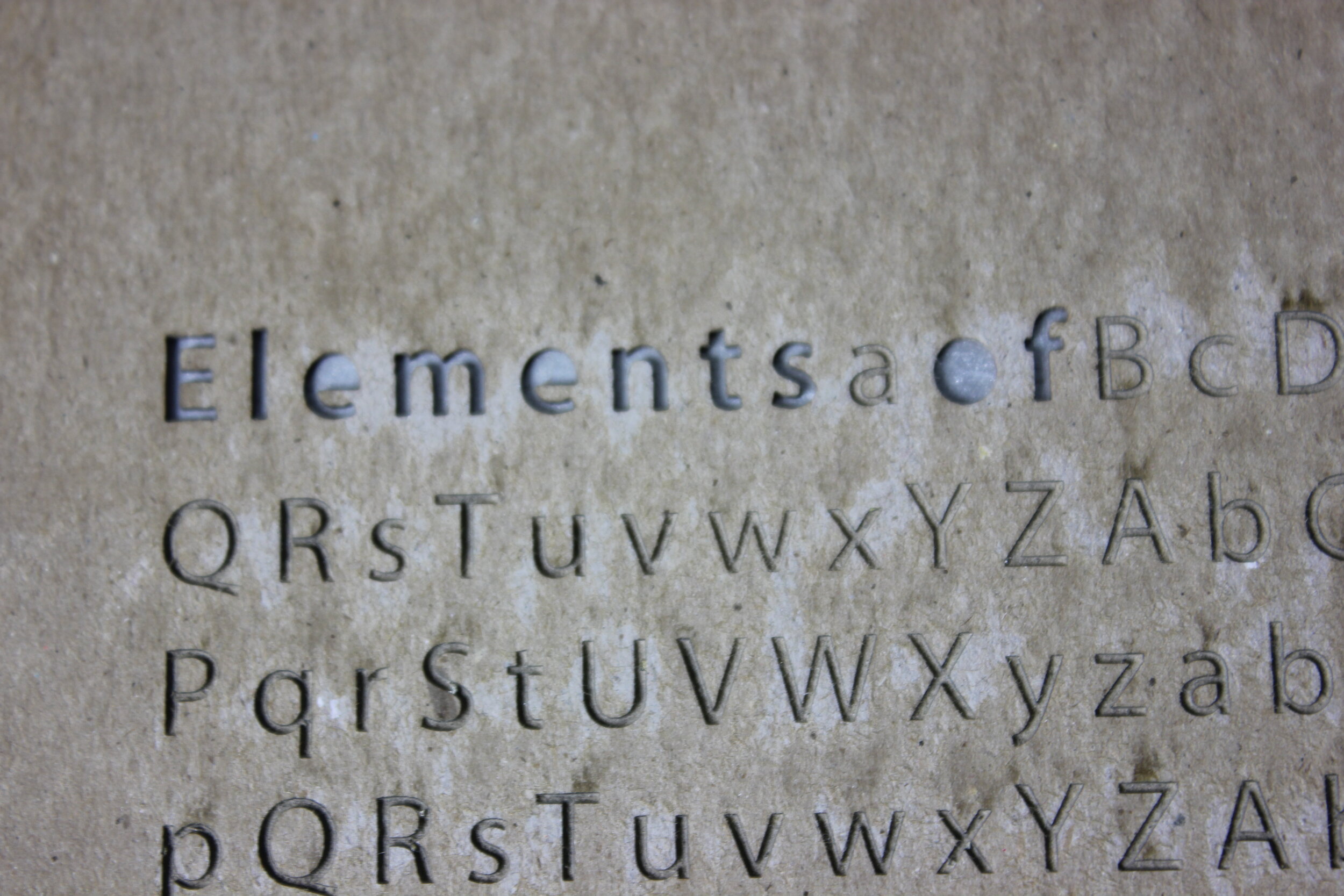
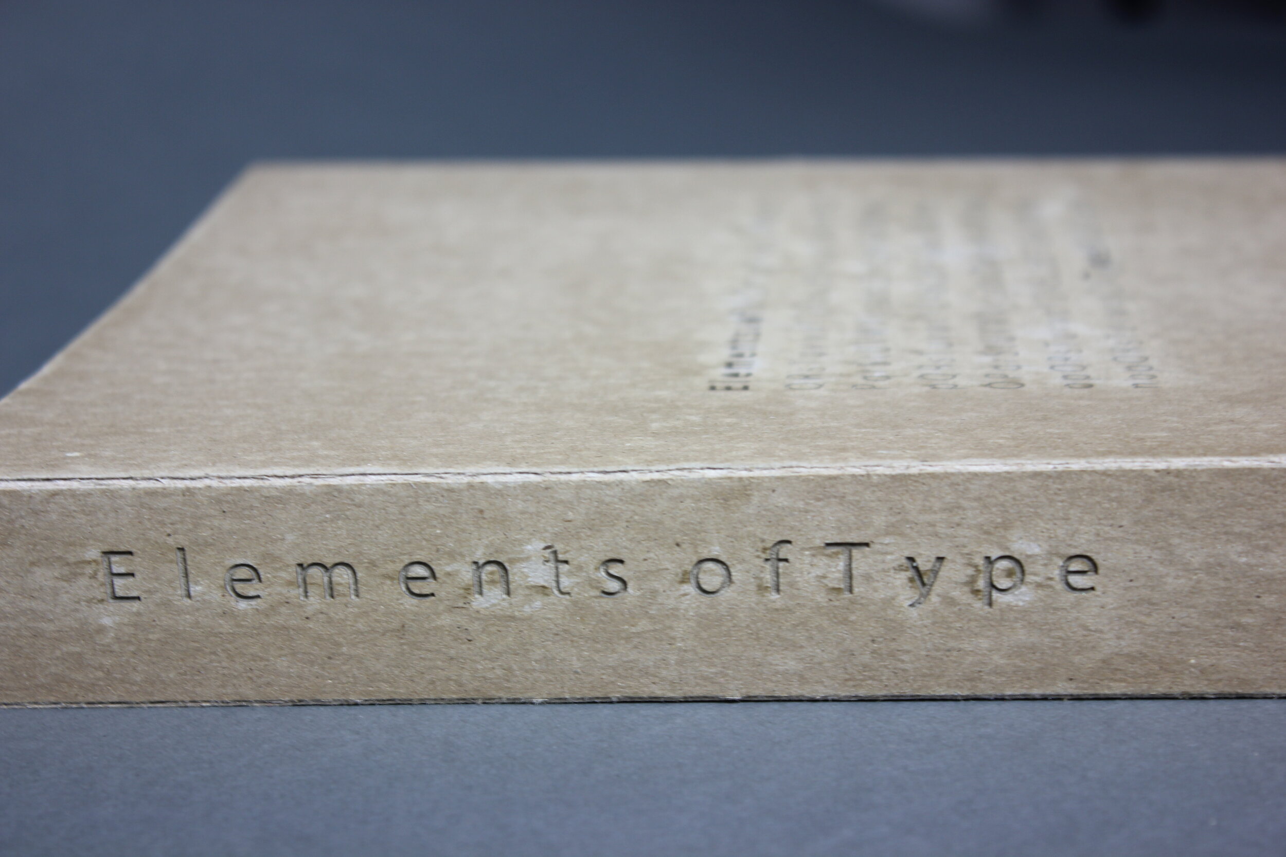
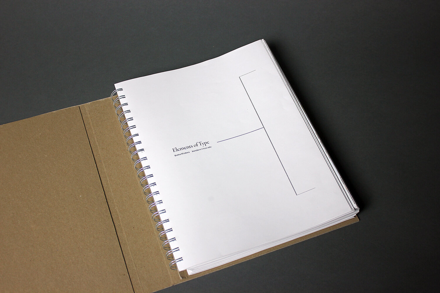
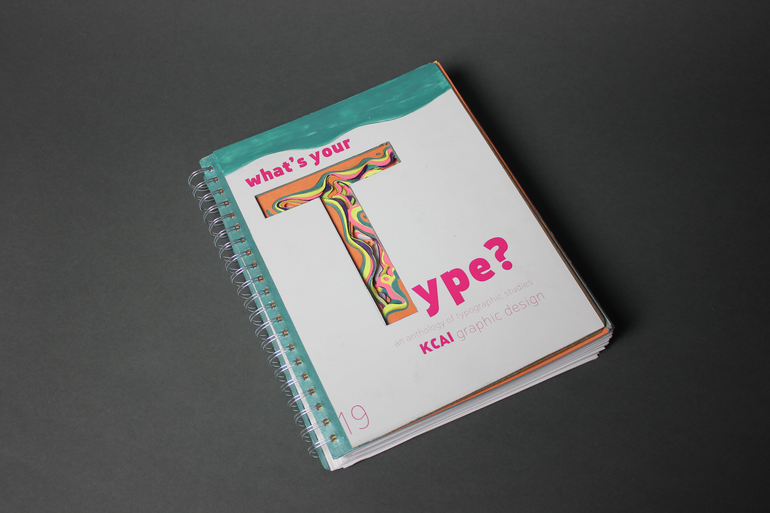
final project: typographic resource

first photo: after the final critique – they survived! alumni guest critics, lauren taylor and jessi wilson, far right, front row.