experimental typography
university of kansas // elective // 2016
have you ever hit on an exciting typographic idea during a project but never had the time to develop it? well, that time is now! through largely self-directed processes, this course will teach you how to ask provocative questions about what typography and letterforms can mean, what they can do, and how they might function in a wide variety of contexts. from animation to quill pens and from 3d printing to type design, you will be encouraged to form researchable questions and build a unique body of work based on them. prior typography coursework is useful but not required.
view online course documents: syllabus // daily blog [tumblr]
objectives
by the end of the course, students will be able to:
create unique typographic form rooted in unexpected inspiration;
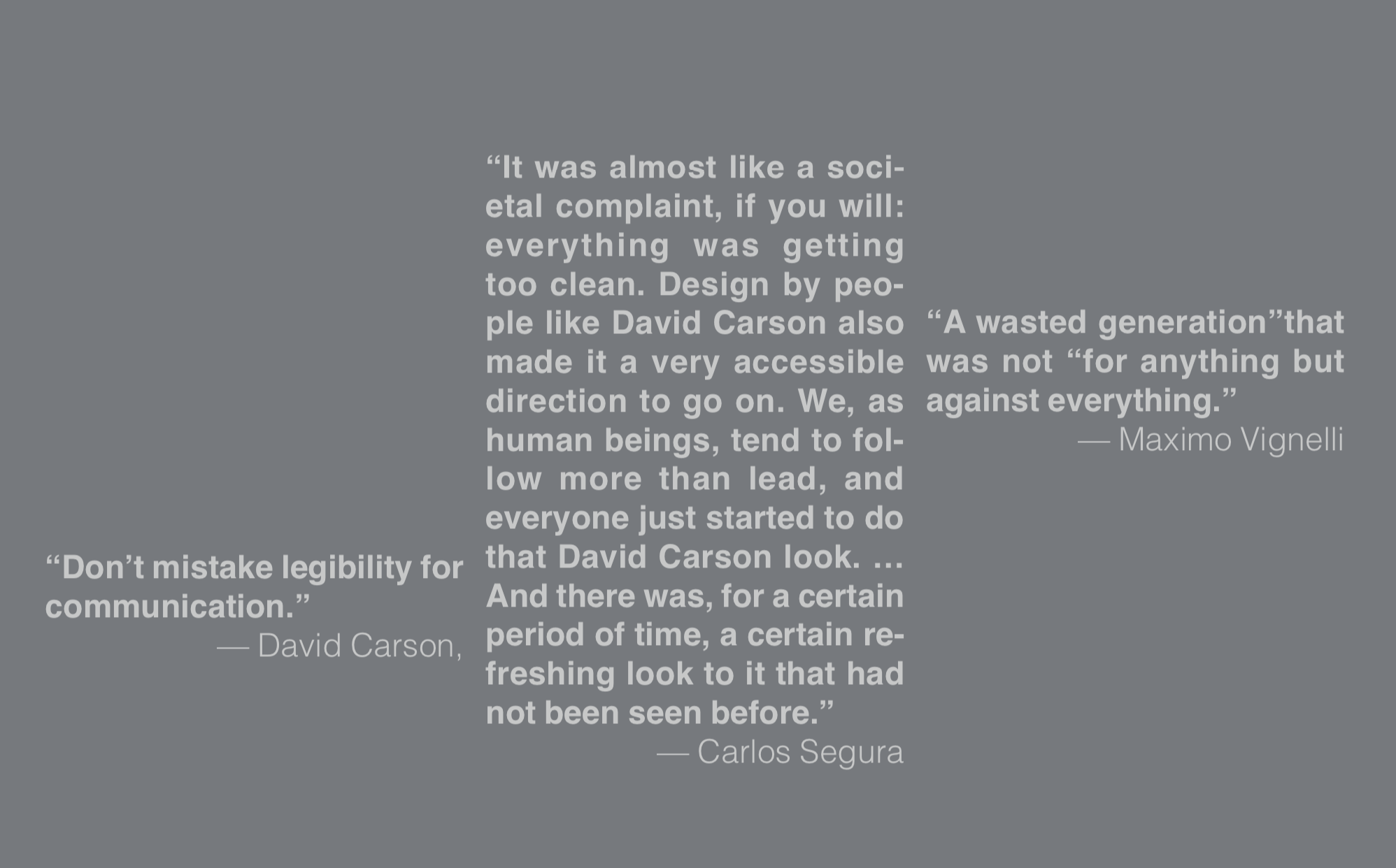
demonstrate a basic knowledge of significant typographic experimenters and their contribution to typography;
identify, catalog, organize, and focus personal interests as visual research;
raise interesting and sustainable questions about the fundamental aspects of typographic form;
create typographic form as an intellectual response to inquiry and curiosity;
apply your individual visual / verbal perspective to projects through research, writing, and visual content development at a basic level;
expand upon visual ideas through a range of media at a basic level;
document visual work in a professional manner for presentation and portfolio.

defining the study. students worked in pairs, then shared ideas with the group.
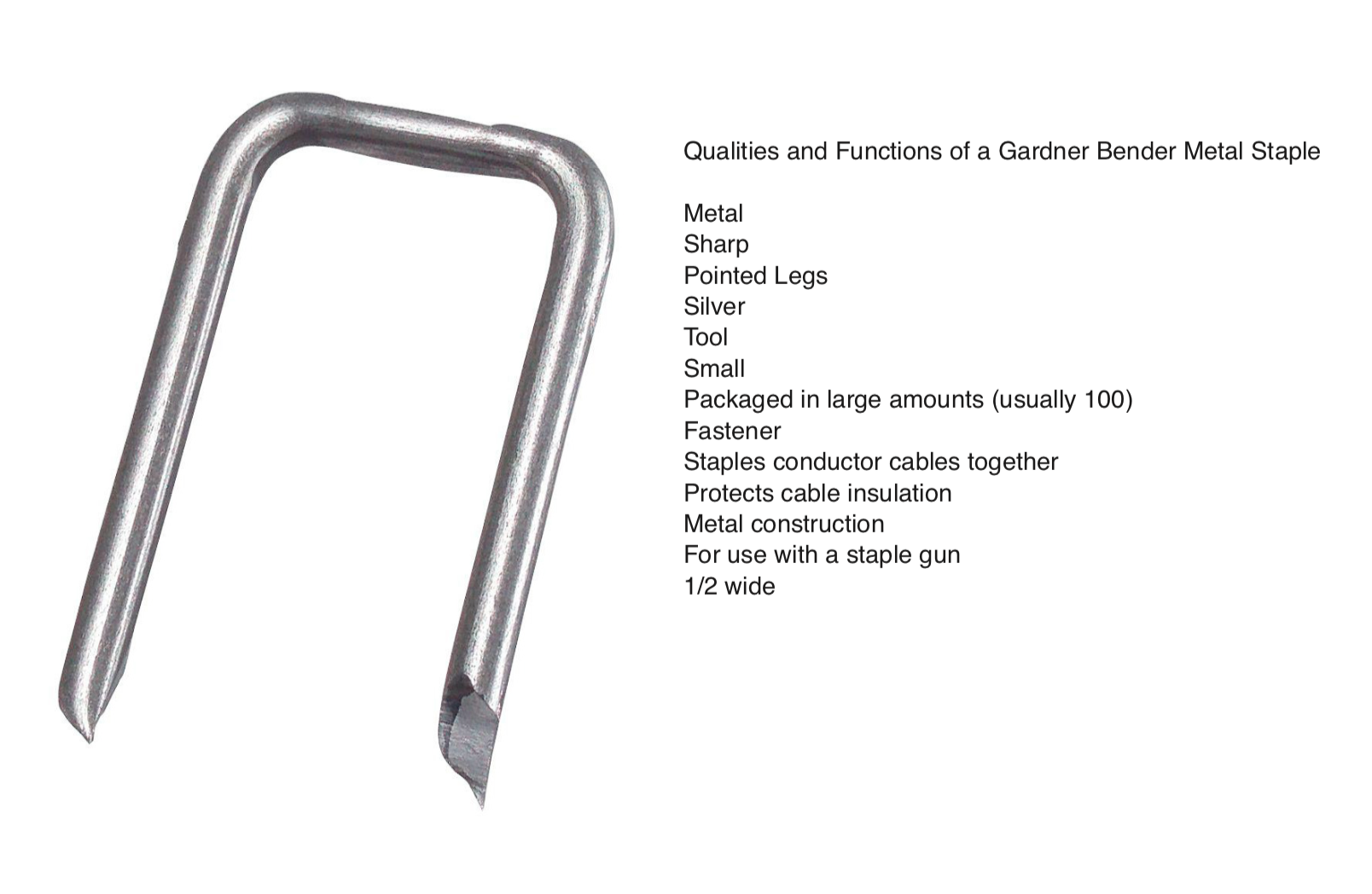
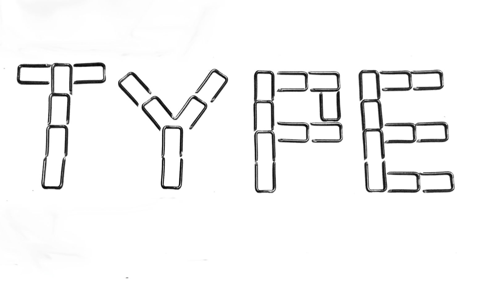
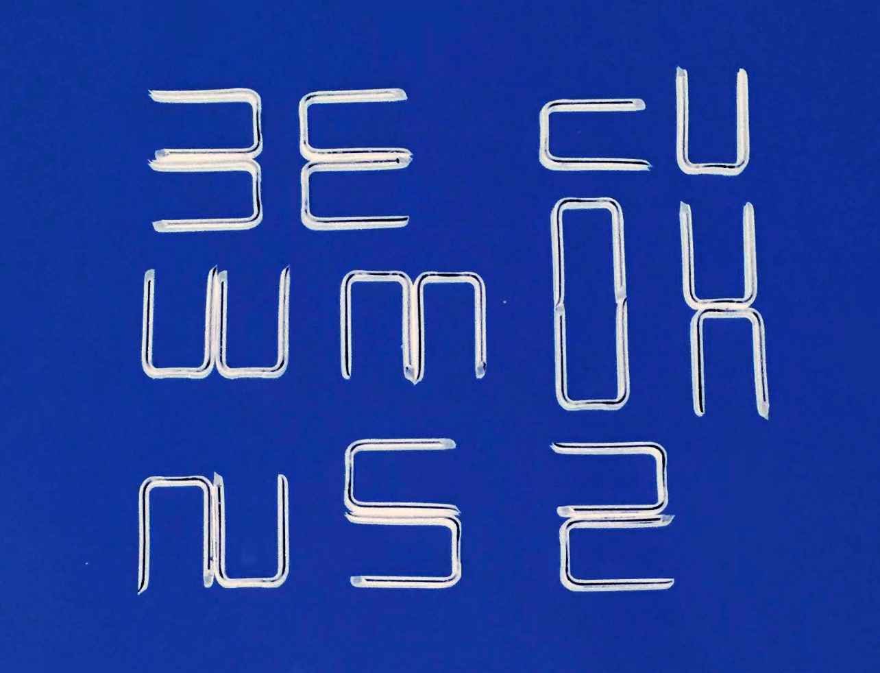
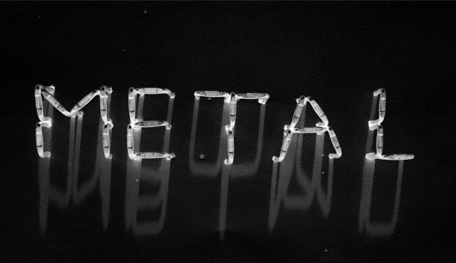
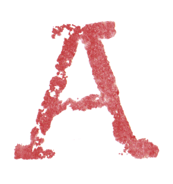
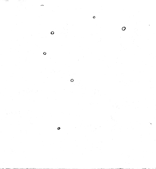
project 1: type from anything
view project brief
project 2: identifying typographic interests [process book]
view project brief
this initial document was added to throughout the semester and turned in at the end to document process and final experiments. see the end of this page for results.
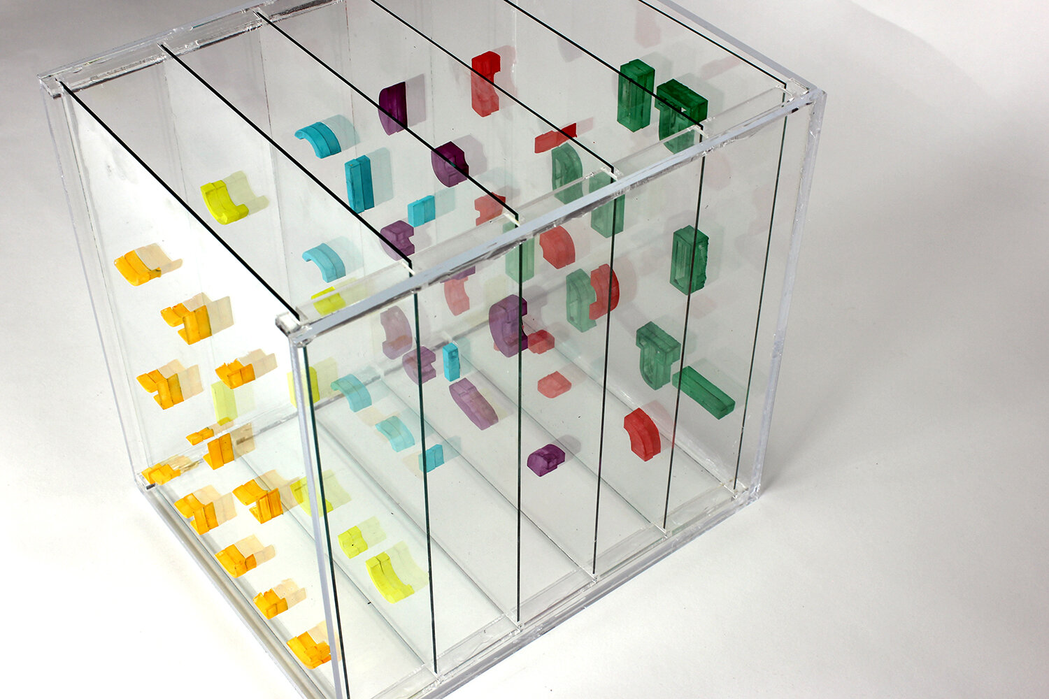
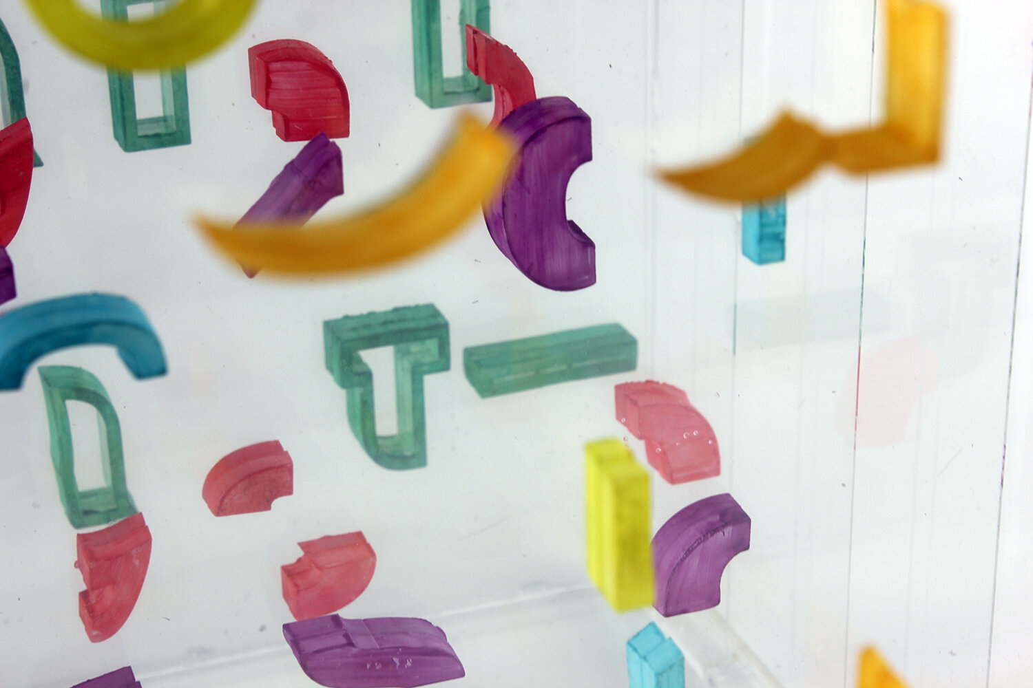
project three: experimental typographer report
view project brief
![janie hirschbuehler [above and right] // view report](https://images.squarespace-cdn.com/content/v1/560b3fc5e4b0bc213aa89d42/1574573184213-BSXDTZLHIQ88GT2LGYPV/hirschbuehler1.png)
janie hirschbuehler [above and right] // view report

![gabrielle javier [above and right] // view report](https://images.squarespace-cdn.com/content/v1/560b3fc5e4b0bc213aa89d42/1574573275504-12067FK4UFUNSKWMZWWC/image-asset.png)
gabrielle javier [above and right] // view report

![michelle merino [above and right] // view report](https://images.squarespace-cdn.com/content/v1/560b3fc5e4b0bc213aa89d42/1574573343243-O3LNQNWAGCBA9L2Y7WDE/merino1.png)
michelle merino [above and right] // view report

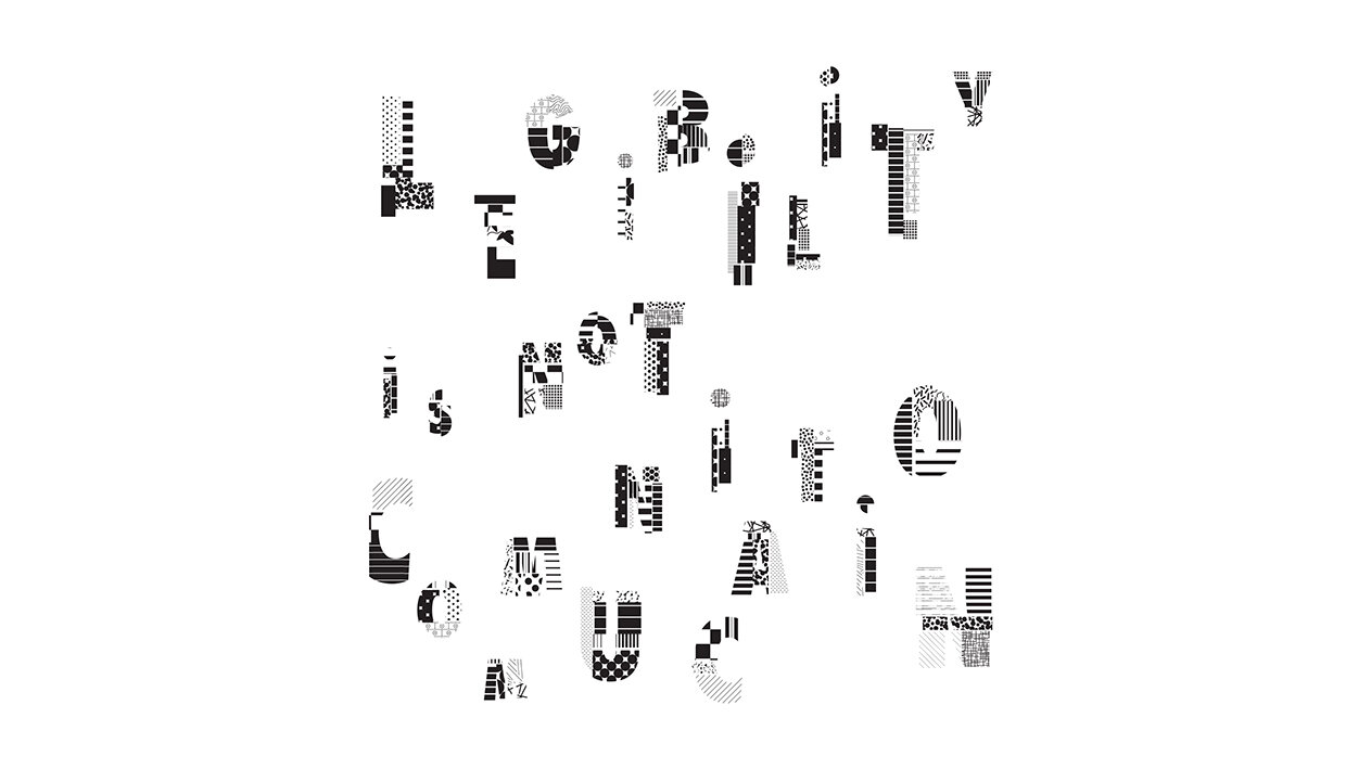
project 4: questions + experiments [initial thoughts]
view project brief
michelle merino – view full slide deck
project 5: questions + experiments, round 1
view project brief
view full project presentations
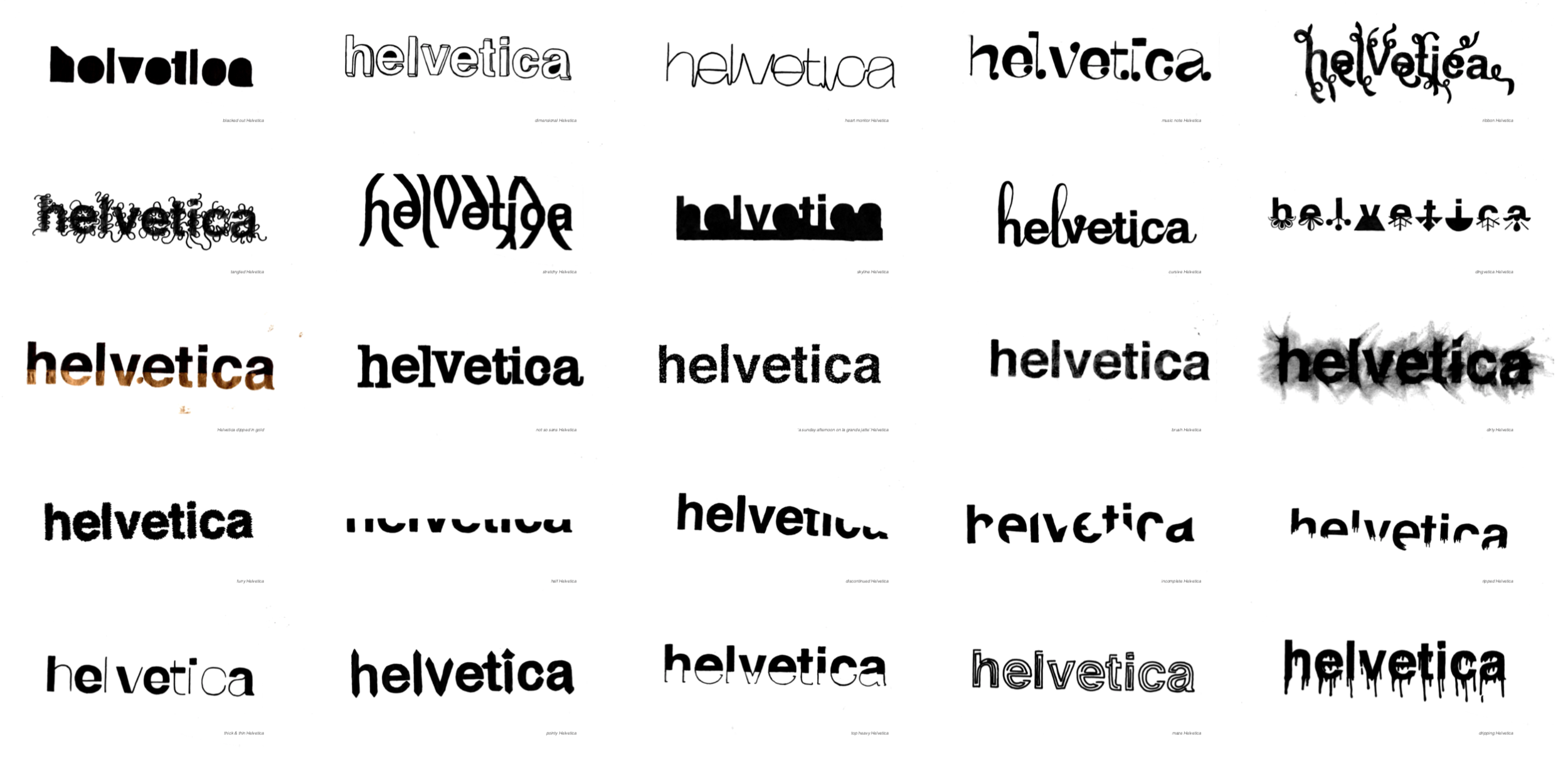
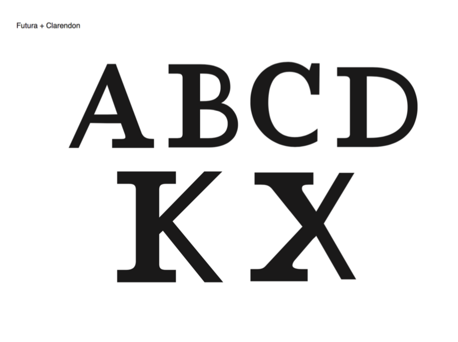
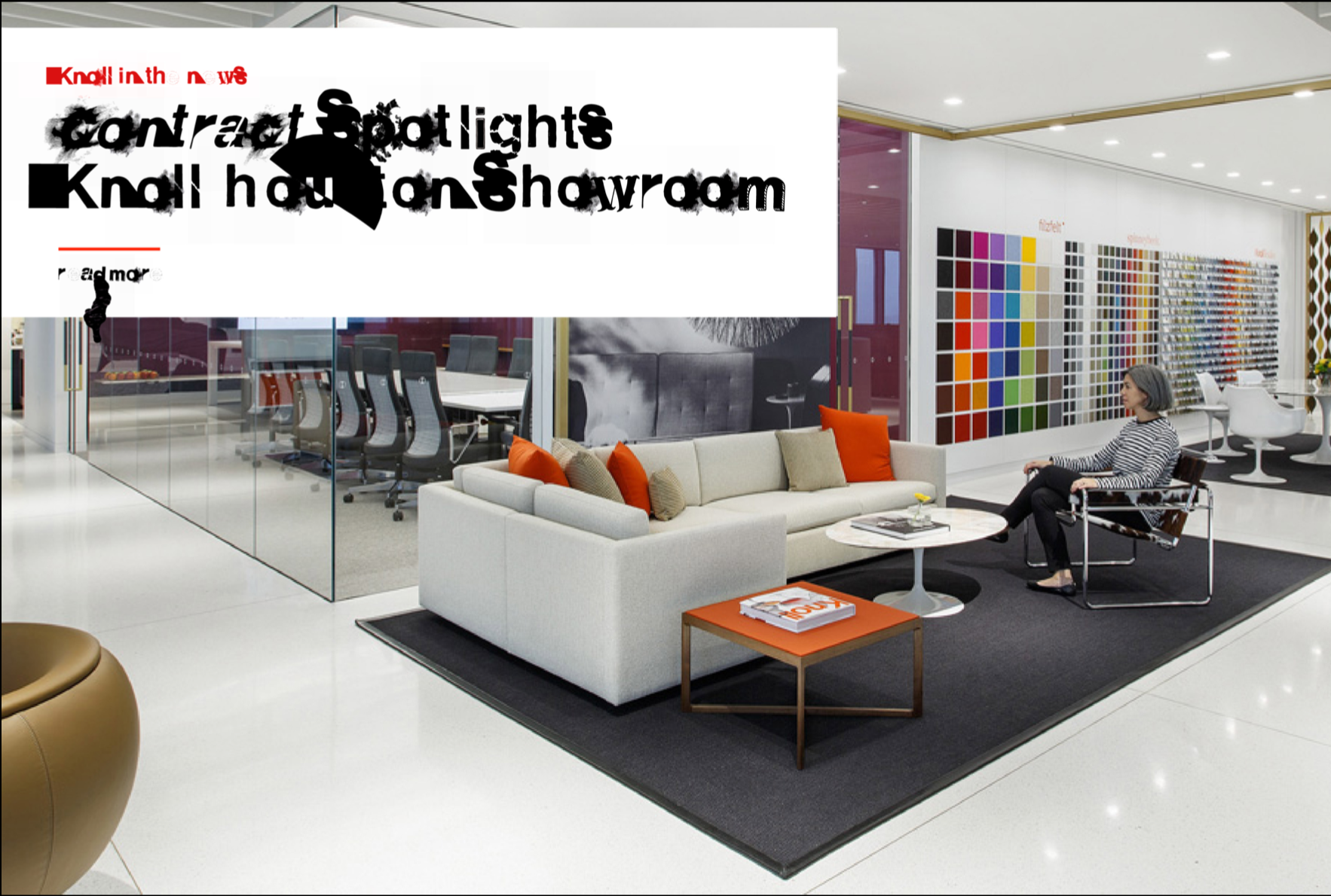
michelle merino – manipulating helvetica
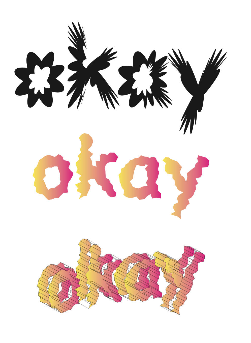
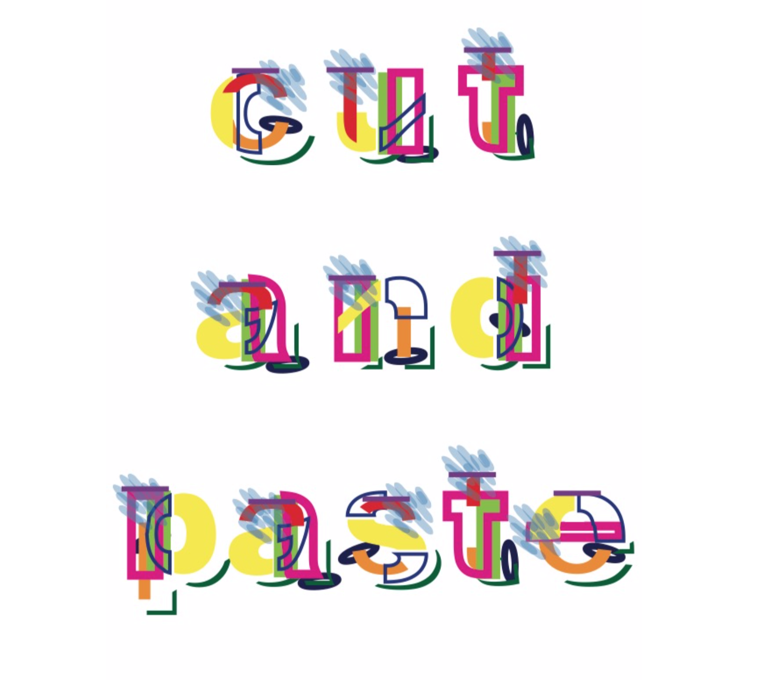
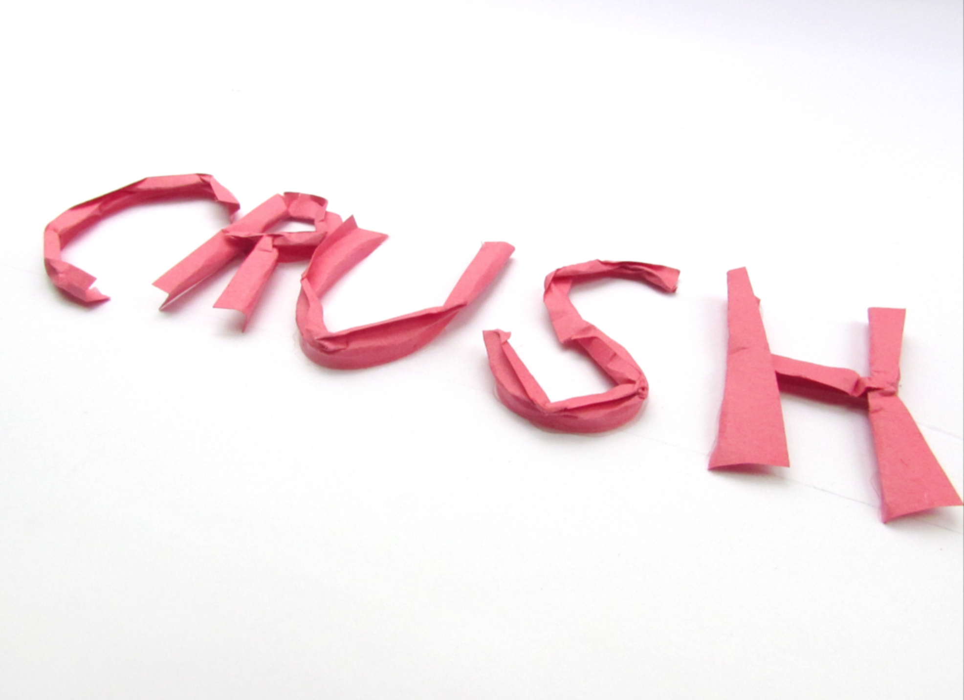
erika ruiz – paper typography [various questions]
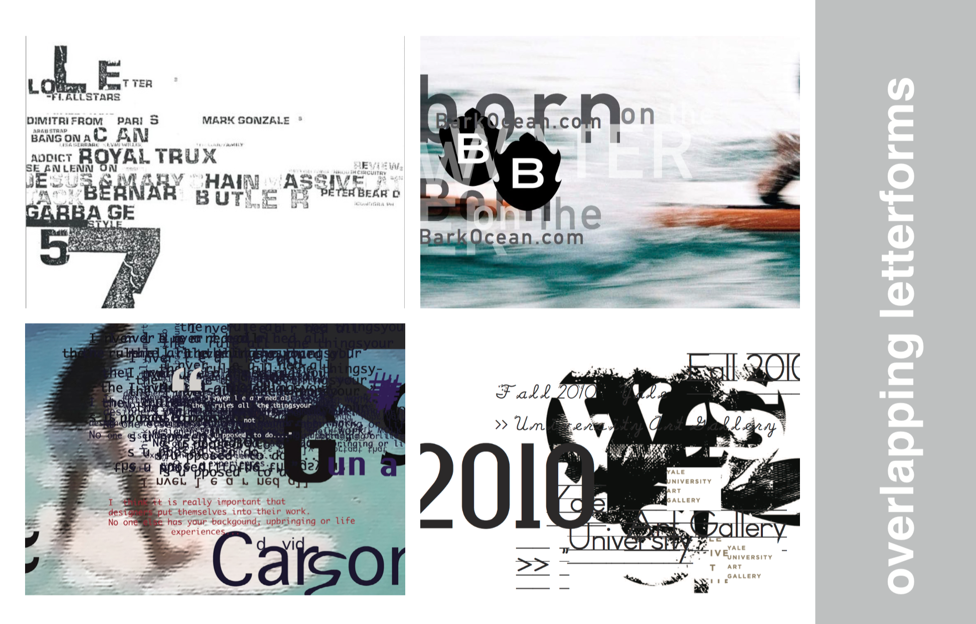
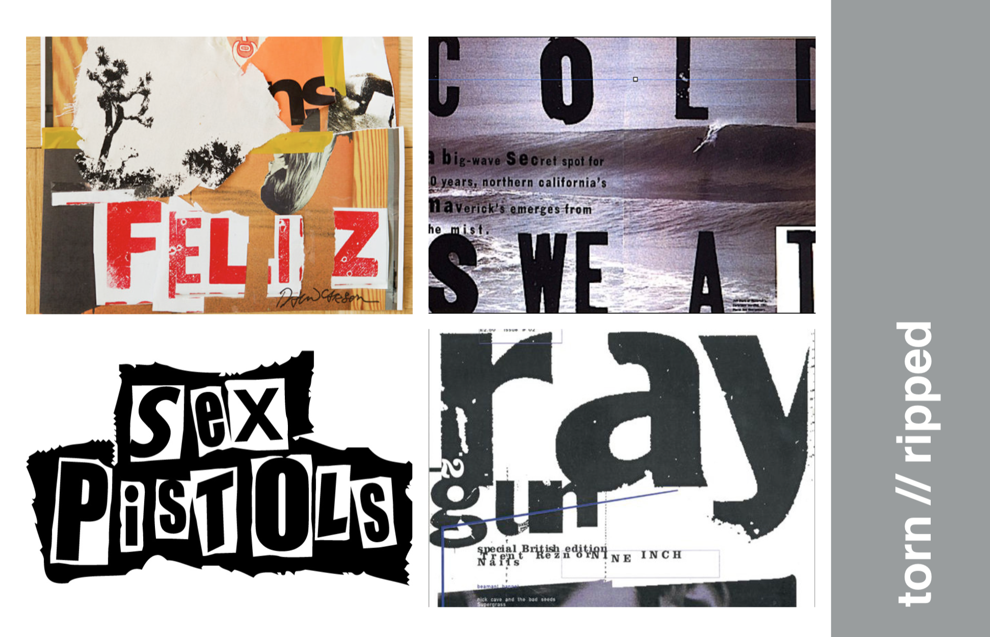
alex tatro – collage typography [various questions]
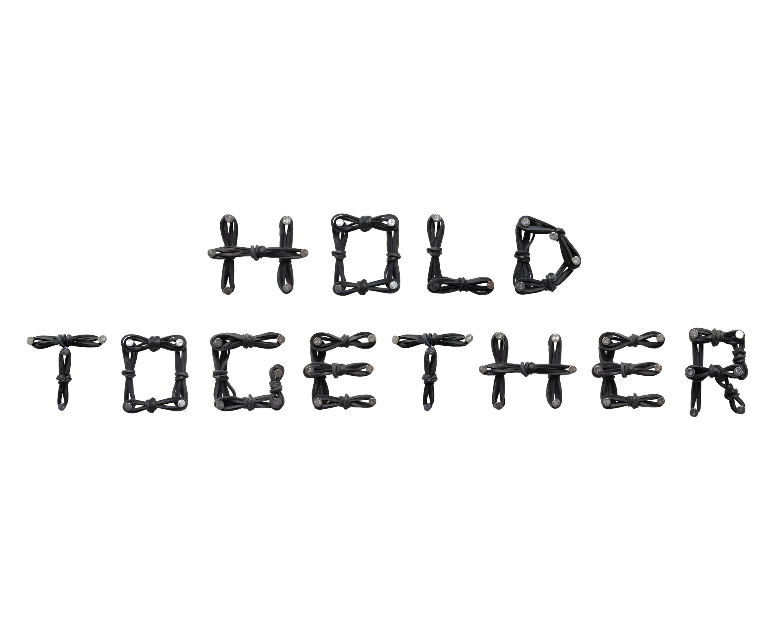
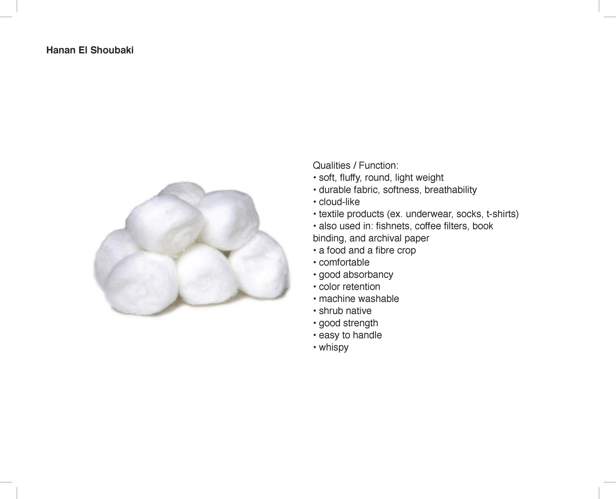
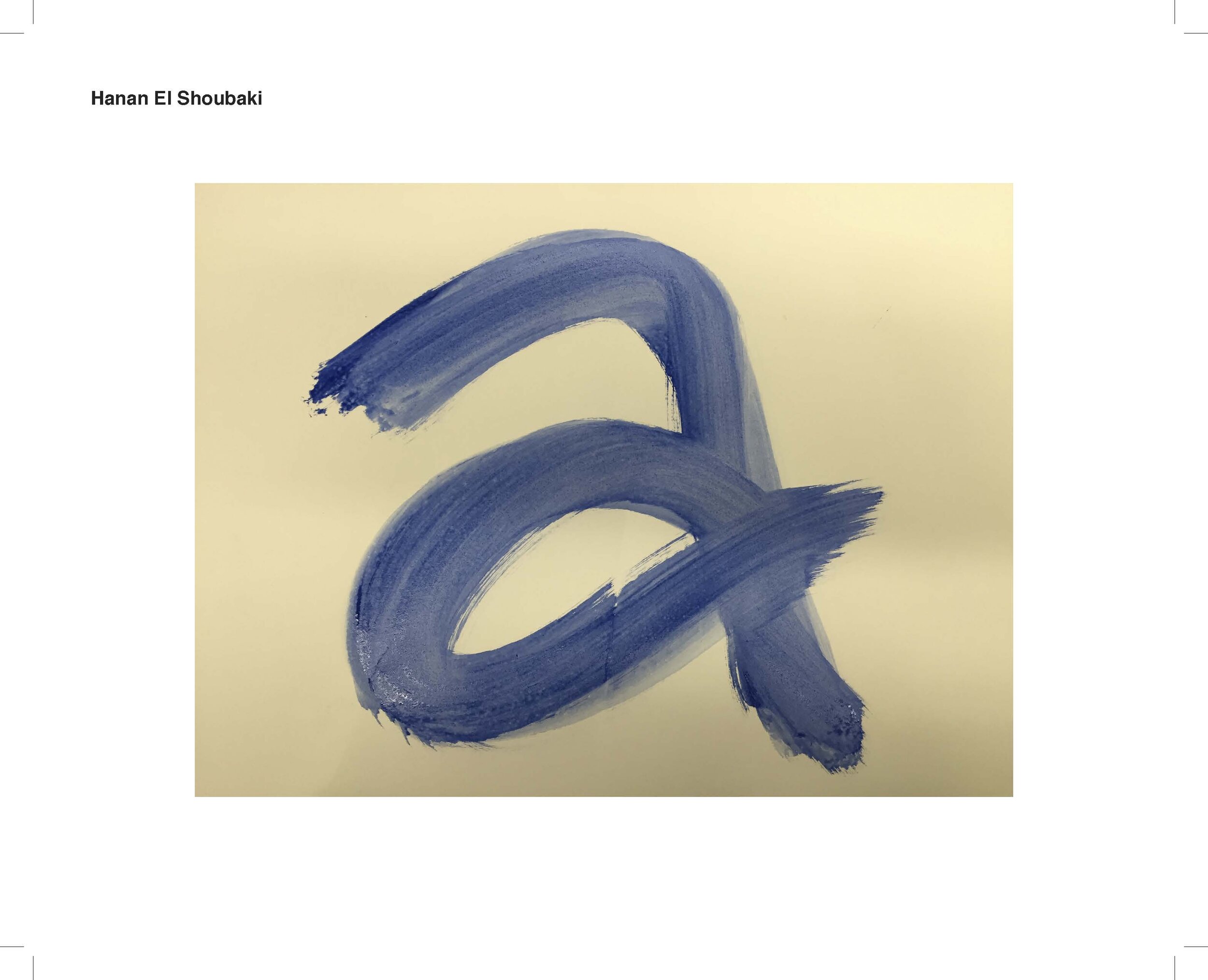
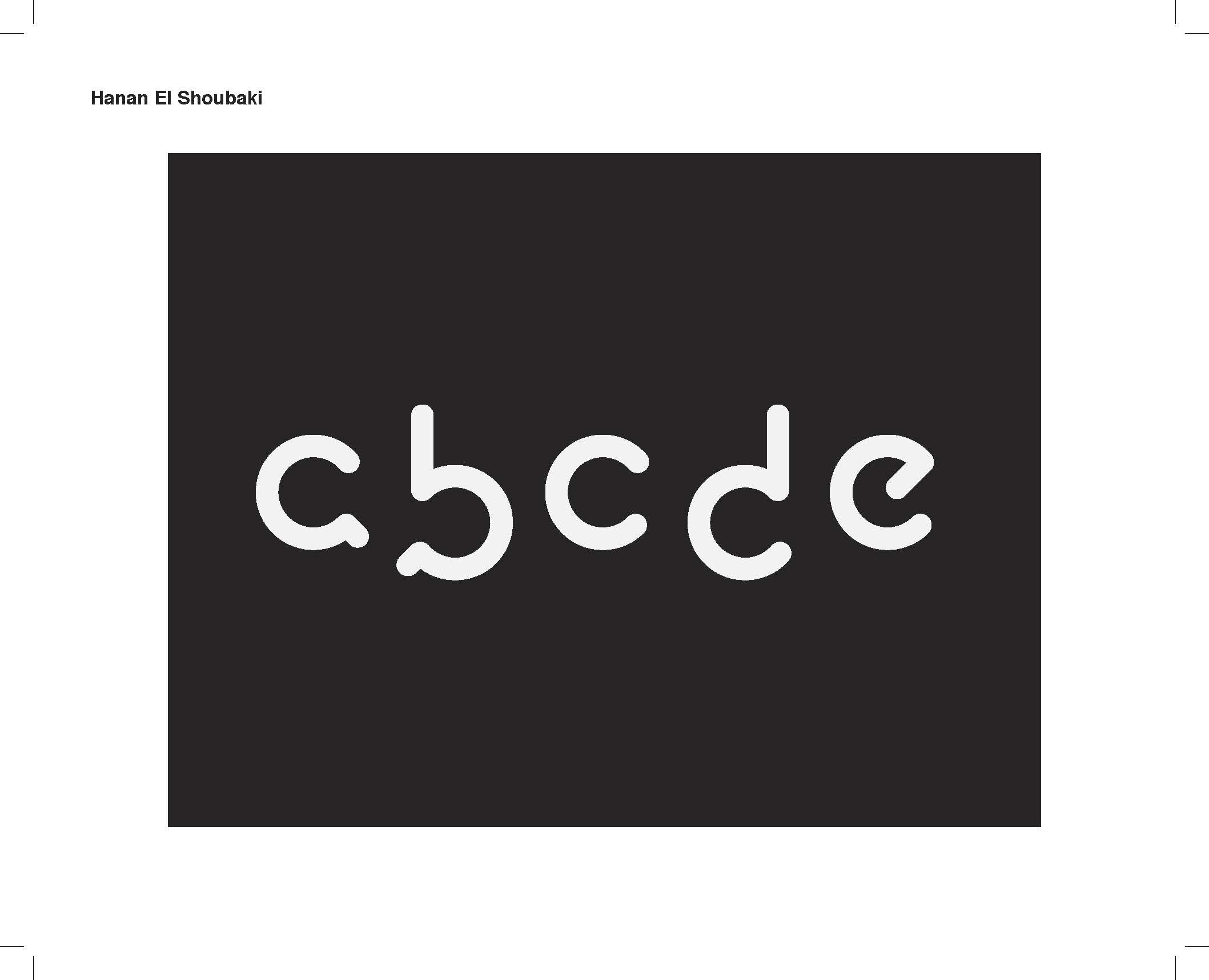
hanan el-shoubaki – how can you use bad type to make it look good?
erin keltner – what techniques and textures can create contrast?
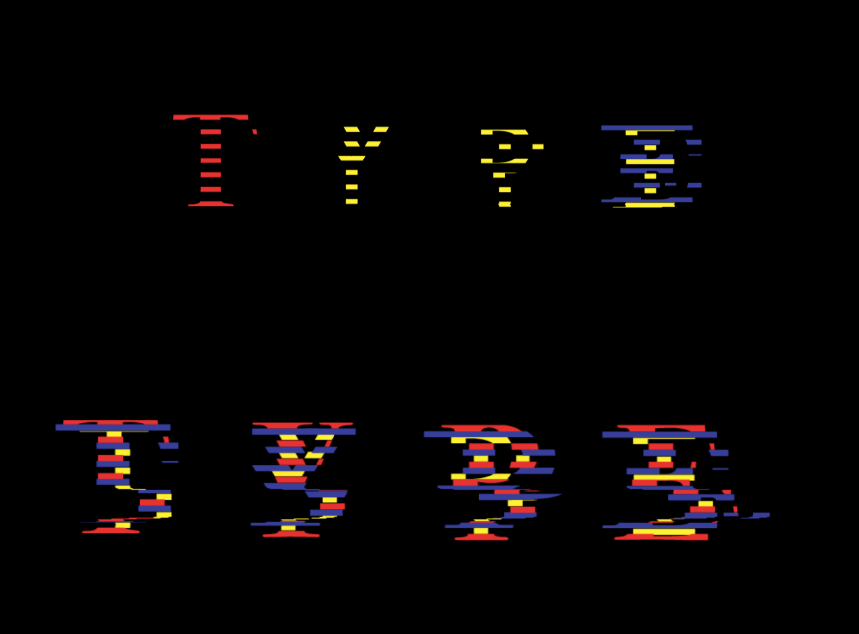
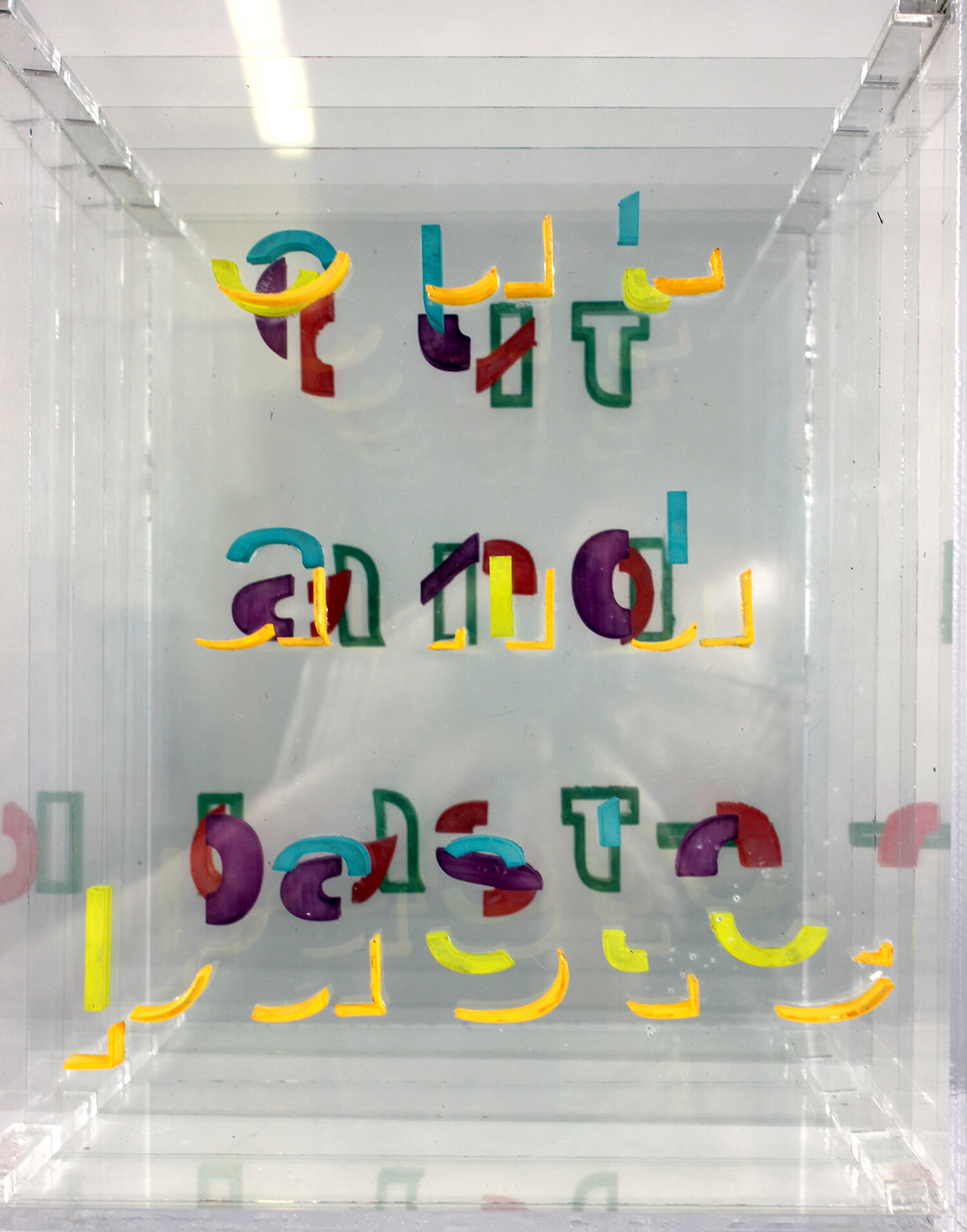
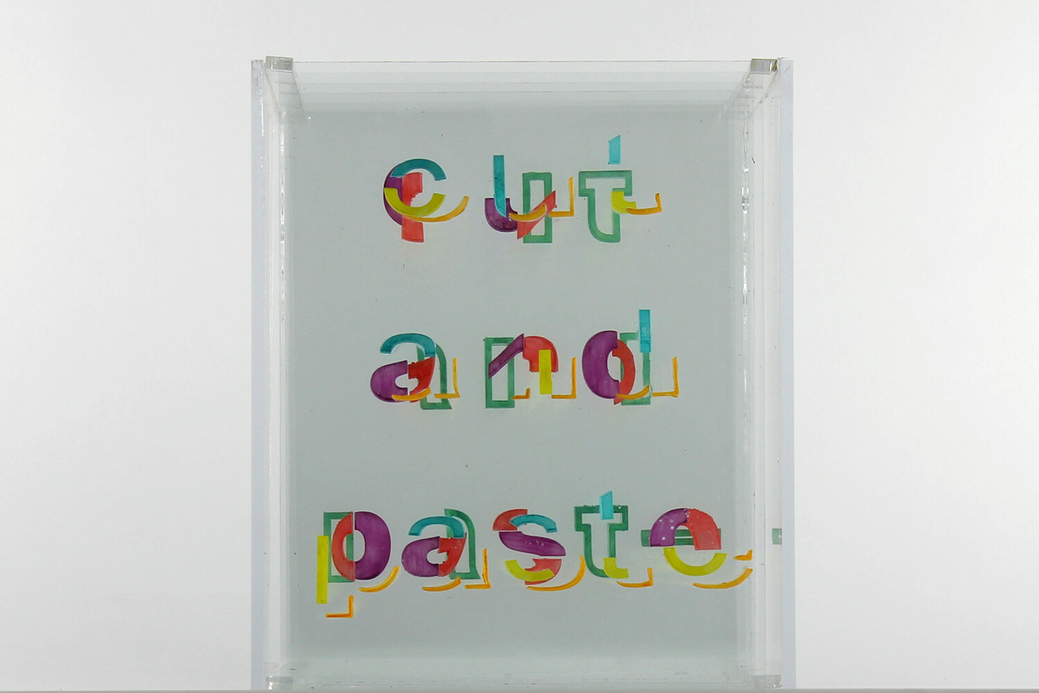
project 6: questions + experiments, round 2
view project brief
view full project presentations
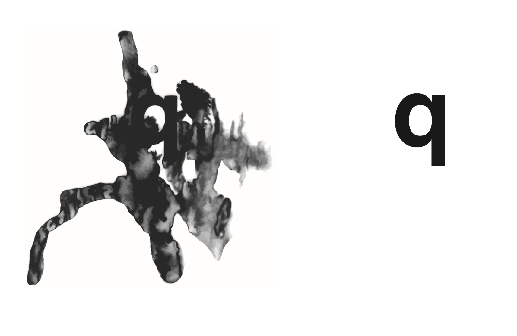
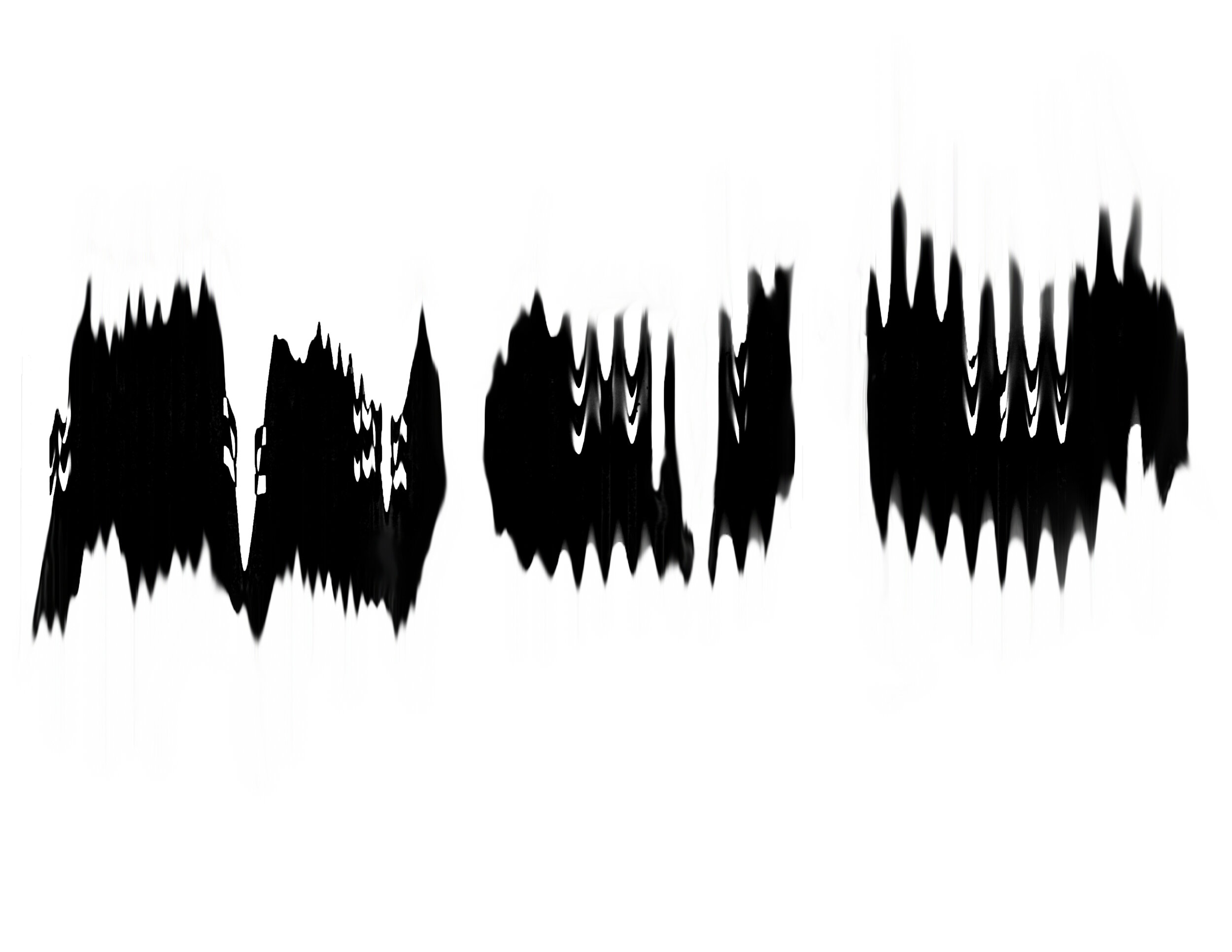
zak wohlschlegel – can i embue typography with emotion?
michelle merino – defying helvetica’s neutrality
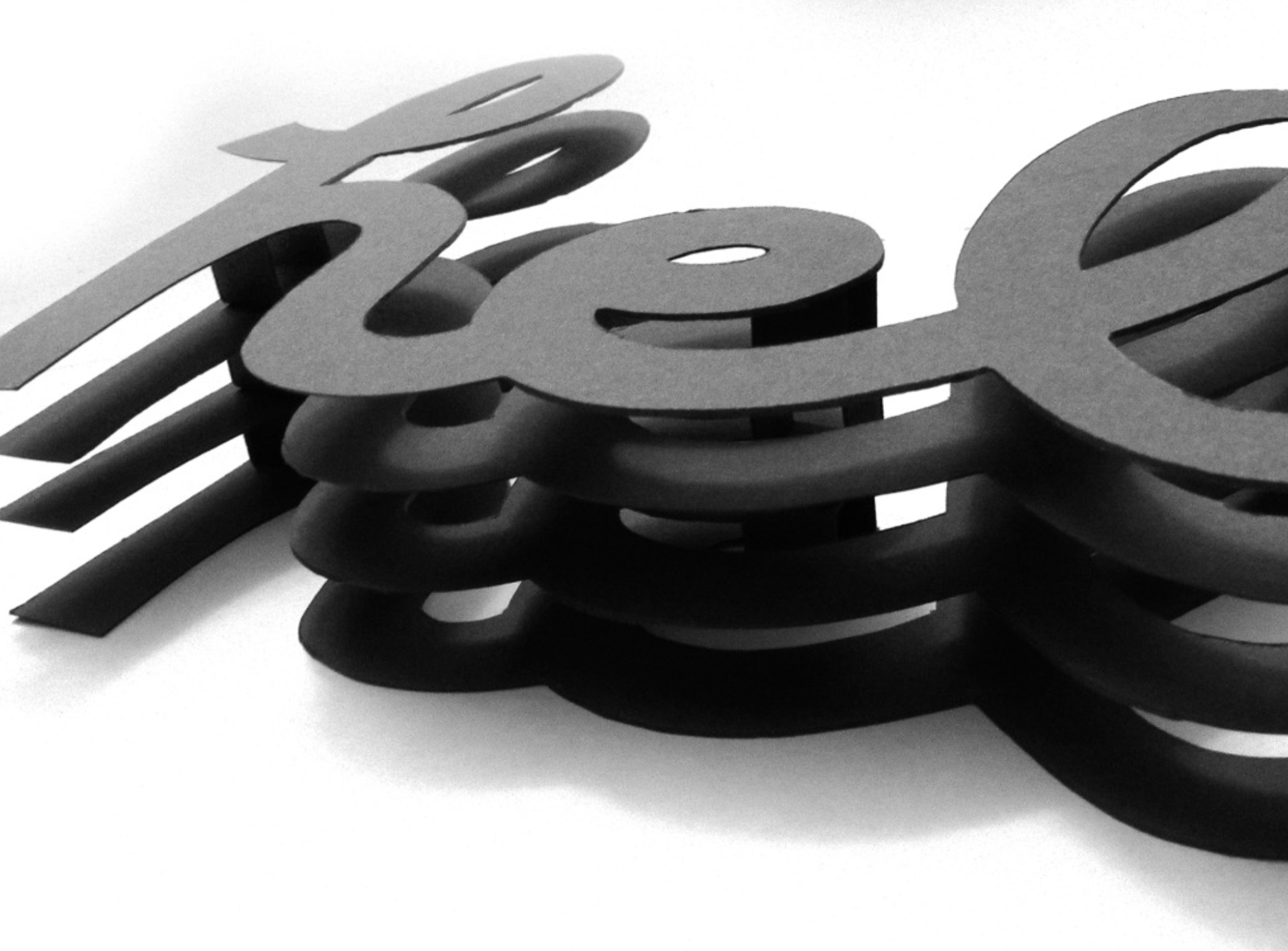
janie hirschbuehler – how could i utilize layering by placing each part of the letter on different physical grounds?
project 7: you tell me
view project brief
view full project presentations
erika ruiz – paper typography [various unstated questions]
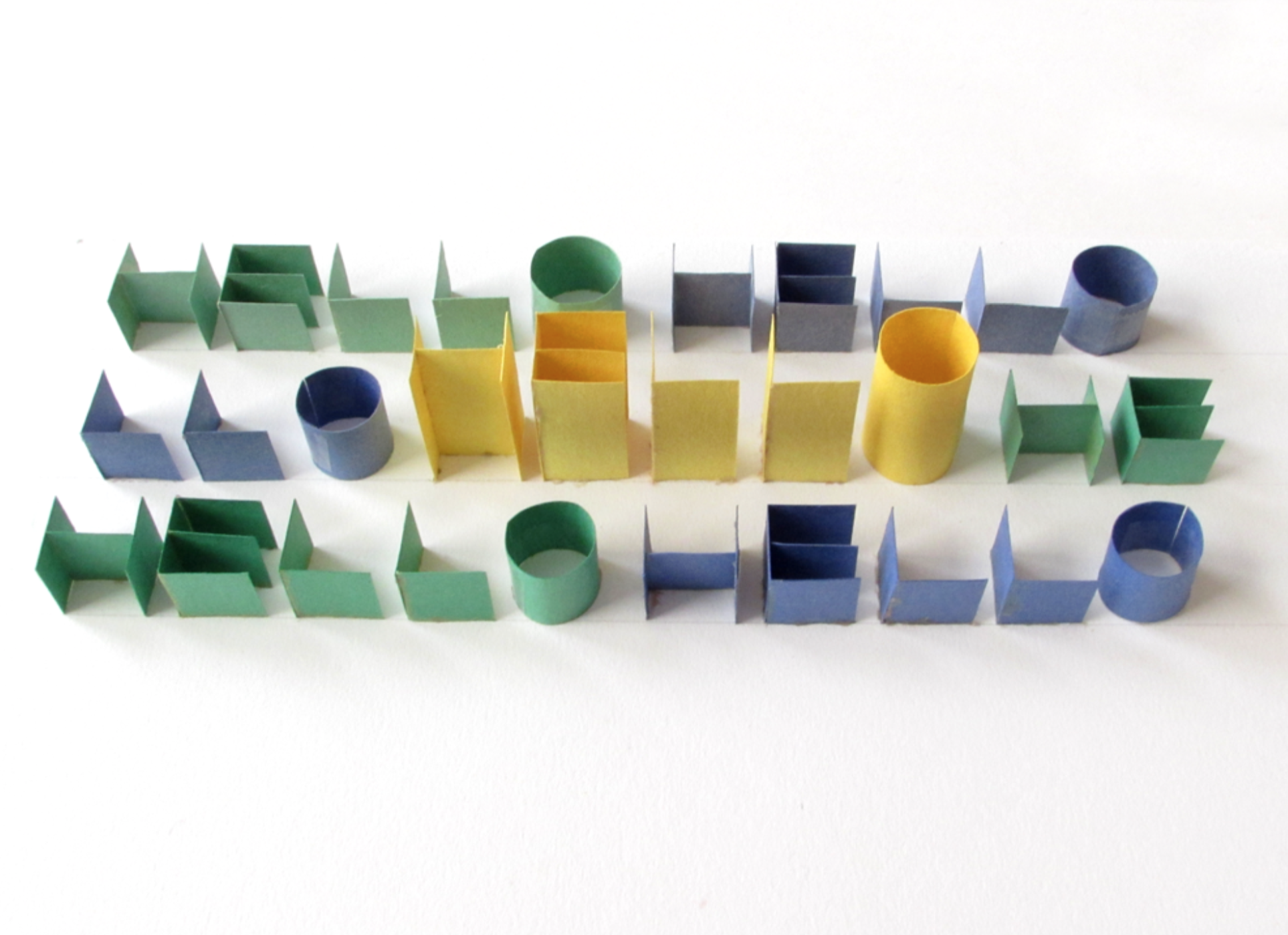
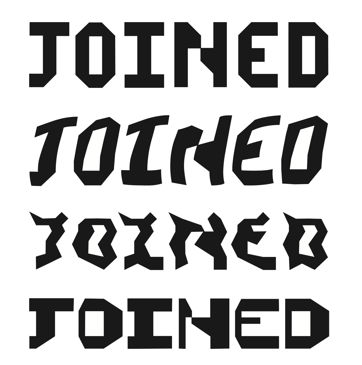
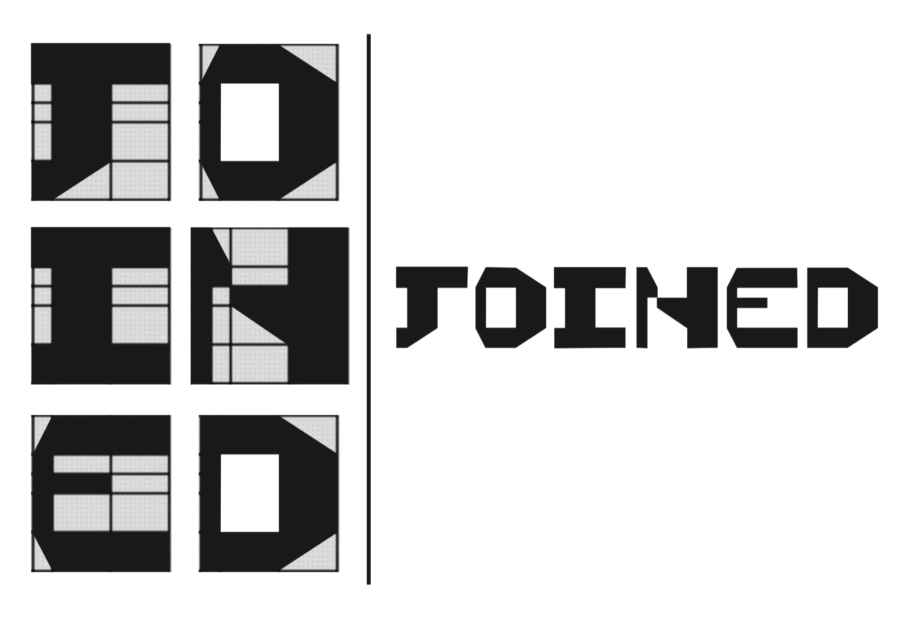
kevin baynham – can different warped grids create a consistency in letterform? [and other questions]
michelle merino – replacing “official” helvetica with grungy, hand-lettered helvetica [and other questions]
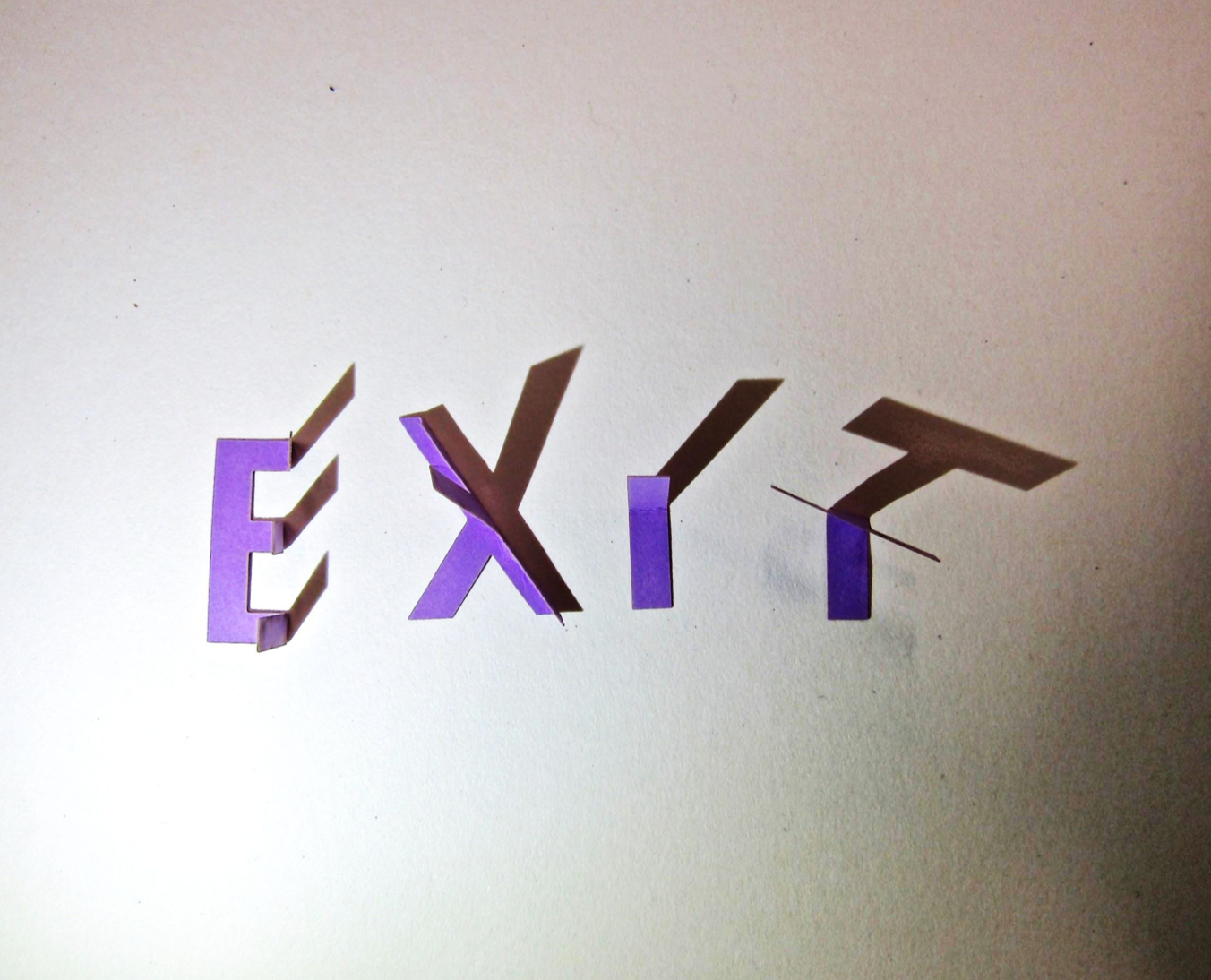
katelyn stewart – how can 3d typography be manipulated by shadow?
project 8: final process documentation


view full project presentations
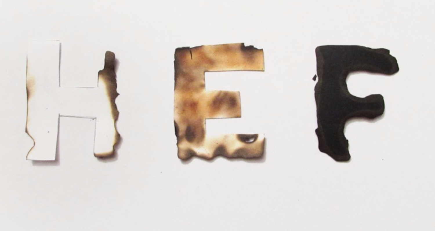
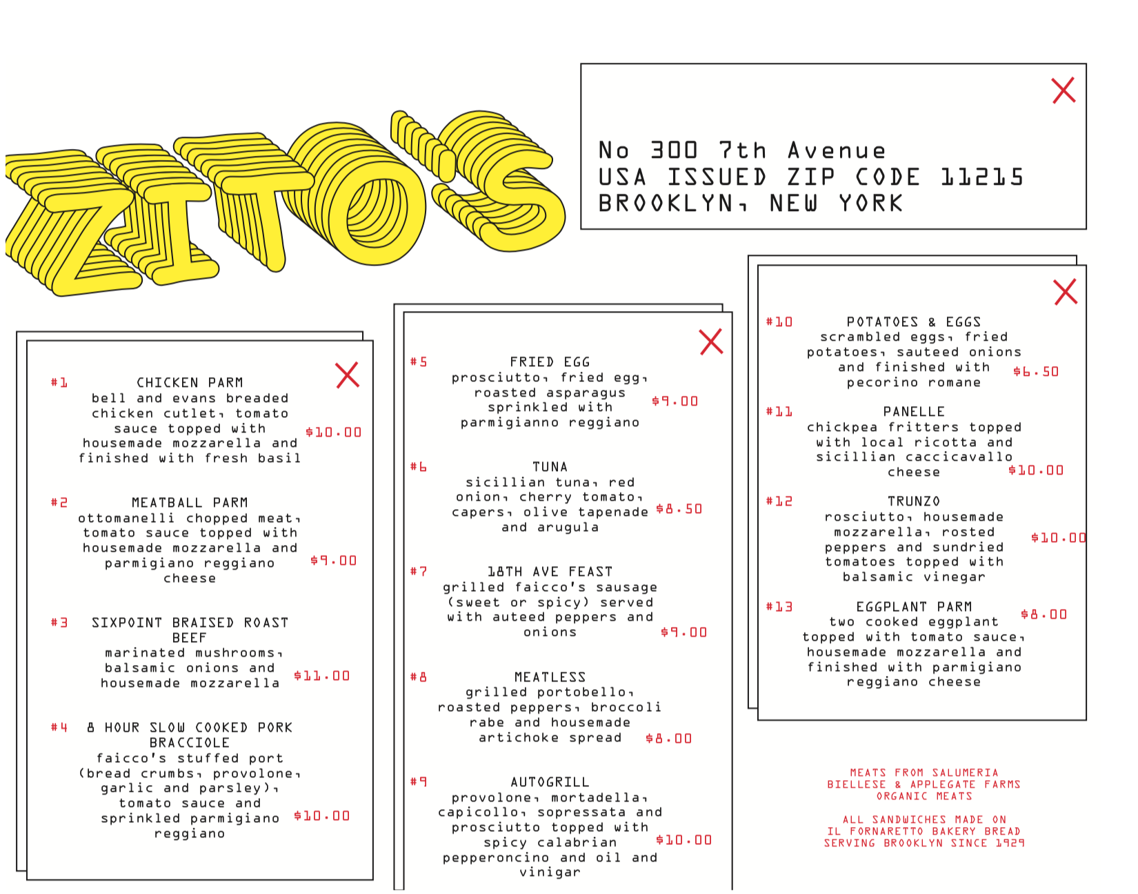
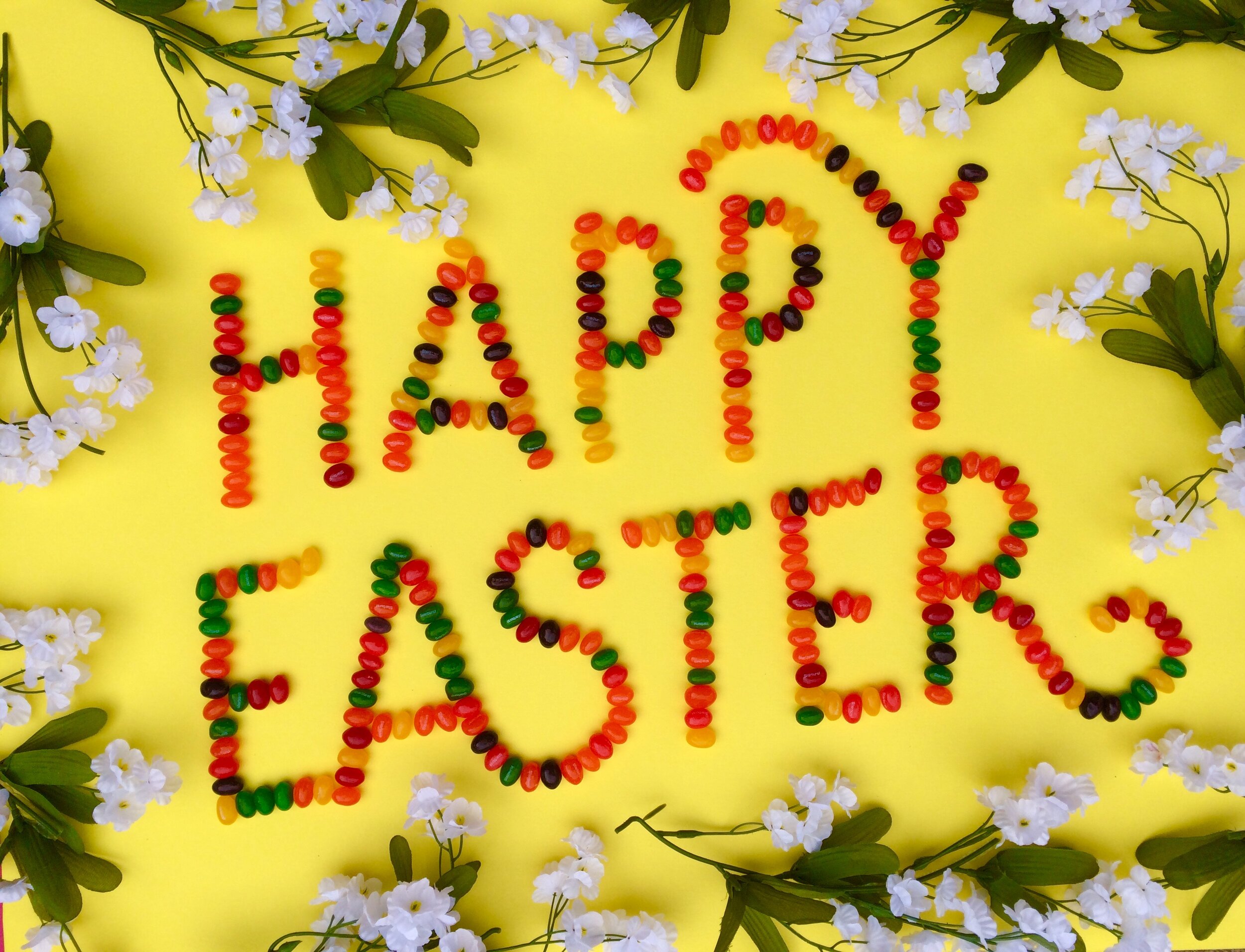
annika anderson – food typography
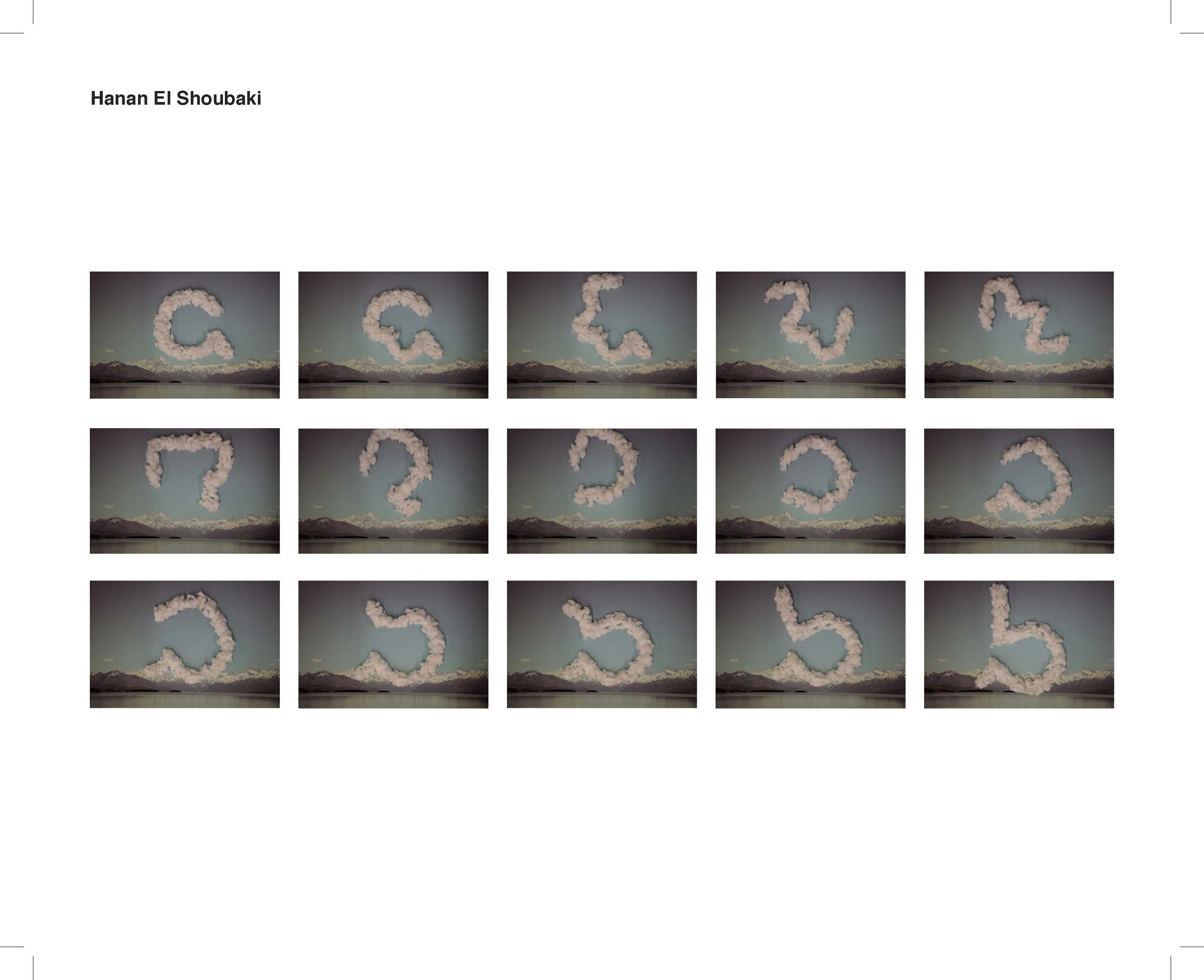
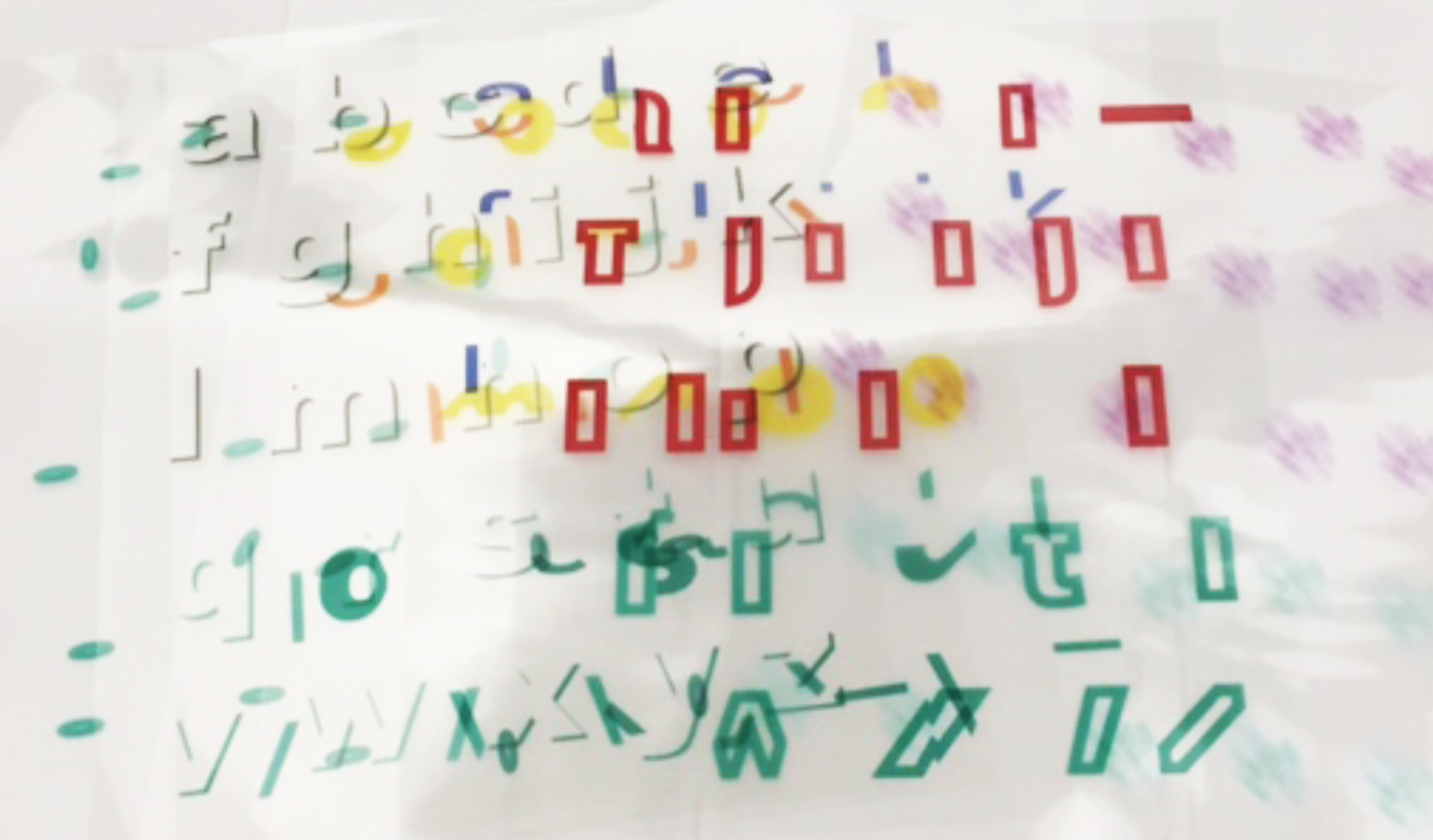
elle javier – smoke text
zak wohlschlegel – type with feelings: the sad typeface

alex tatro