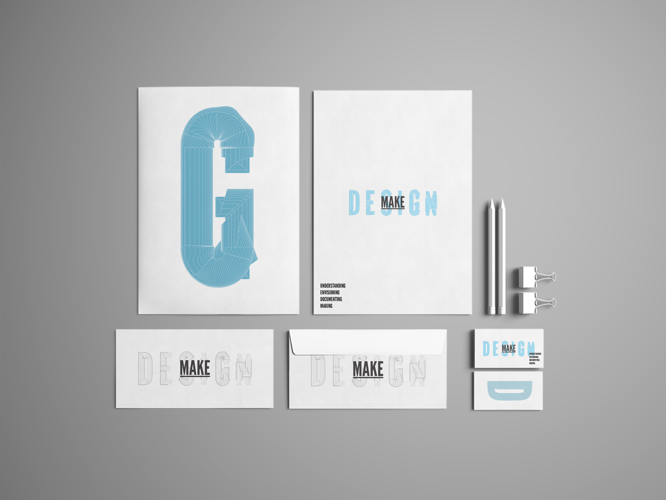
design + make by tyler galloway

final application list:

  1. business card
  2. letterhead
  3. six-page book spread (documenting project work)
  4. drawing sheet template - black and white 
  5. brand (as in animal brand) or stamp for subtle marking of building materials, incl. coffee cups and loose sheets of paper like napkin sketches
  6. button for appropriating other clothing logos
  7. carpenter's pencil

all work needs to be delivered as final physical mock-ups and final packaged production files. 

final strategy and branding document, including the following content:

  1. initial writing including mission statement, brand attributes, etc (build off of the initial document you started a while back)
  2. type specifications
  3. color palette in pms, cmyk, rgb
  4. brand usage guidelines

thoughts on expressive typography [as applied to the "next steps" project] by tyler galloway

from an email to the "next steps" crew:
one thing i would encourage you all to think about is how to move beyond the expected level of typographic manipulations that designers think of when we use the term "expressive typography". you have encountered this a bit with your first project for emmy -- it is a similar challenge. sometimes designers will refer to this as the "slice and dice" method of expressive type, where it simply becomes a formal exercise of destroying the type in various ways, irrespective of the semantic content of the words.

doing this in a conceptually relevant way first involves knowing the content well, which you all are doing already by reading this stuff multiple times. 

next, it involves making some decisions about the nature of your interpretative task on multiple levels. again you are doing this in examining the larger-scale relationships between the "reported" or "documentary" text, which attempts to be a neutral carrier of information, and your personal interpretations. you looked at the right-side-up/up-side-down option, the left-page/right-page option, and the left-column/right-column option. then we discussed how those may change throughout the longer publication to maintain interest and create variety. but there may be more options that are not yet in play, or hybrids of the above options. the design decisions in the more experimental books that tony has shown you, like "the telephone book" are not arbitrary decisions -- they arise from an understanding of the content and a desire to make the reader experience it in a very particular way. this leads me to my next point...

the interpretative task also occurs on a conceptual level, where you are figuring out what the heck it is you want to say through the act of interpretation. are you simply saying "hey, this idea is really important" or are you saying "this idea connects to this other idea, which is also related to this one over here", or are you saying "look at how jumbled this conversation is" or "let's count the number of times 'gentrification' is actually uttered"? you can certainly perform all of those tasks, but they are all very specific and should arise from the content itself, reflecting your understanding of it. you may be able to do any and all of these things in one book simultaneously, but they would need to be carefully orchestrated so we can follow each trajectory easily. this can be done through space allocation (page numbers always occur in the same area on a page), through color application, through typeface choices and scale, etc, etc.

a couple of the visual moves that you all made that stand out to me are the use of the vellum with the color highlights and the various gray tones of the text. the vellum makes me look at the connections between the straight text and the interpretative text, almost like a map key, so i want to flip it back and forth to find those connections. the layout with the vertical line dividing the two columns of interpretative text made me look for those connections as well, because it seemed to mimic the layout of the straight text. the text grayed out at various levels seemed to indicate vocal levels or levels of recording fidelity, which struck me as a novel thing to comment on. 

whatever it is that you choose to focus on, it is better if it is specific, rather than just saying "well, i'll make some type really big and jumbly to show how people are talking". how can you express ideas about the straight text that people will want to not just look at, but read and experience in a way that is different from reading the straight text? what new ideas, relationships, emphases, commentary can you bring to the original transcription? 

you are starting to do much of this and the part of your conversation that i heard wednesday was good, so basically, just keep pushing hard to go deeper with this exploration, considering the book as a whole. you are doing some very interesting things with tony's book project too, so let those design principles flow freely across the two projects. that not to say just use the same ideas for both, but take the concepts you are learning and apply them appropriately to the unique content areas you are dealing with.

design+make final directions by tyler galloway

the two directions are steven M's and david's. 

the five application are as follows:

  1. business card
  2. sheet template (24 x 36 drawing sheet (see set on basecamp in WAH project folder) and 8.5 x 11 for field design modifications) NOTE: currently waiting on a link to this specific location on basecamp, or the actual file from ksu. 
  3. brand (as in animal brand) or stamp for subtle marking of building materials, incl. coffee cups and loose sheets of paper like napkin sketches
  4. button for appropriating other clothing logos
  5. carpenter's pencil

these two directions need to be applied to these five items by friday at 5pm in order for ksu to review and have a final decision by monday before our class.

good type comes from good foundries by tyler galloway

taken from the days when hot lead was poured into molds to cast type, "foundries" of today are almost entirely digital -- or at least their products are. in order to use good type you have to know who has a reputation for making good type. here are a few to get you started.

DISTRIBUTORS [larger retailers who sell type by lots of different foundries]

vllg
steven M, check out brooklyn and brooklyn stencil for design+make

fontshop

youworkforthem

myfonts
a bit like wal-mart for type but some good stuff. you just have to be discerning about what you are looking for. tons of tons of tons of type here. often very good sales, sometimes up to 80% off for brand new families. 

FOUNDRIES

type together

emigre

hoefler & co

darden studio

process type foundry

letterror

house industries

latinotype

typotheque

design+make // moving forward by tyler galloway

you have all been making a very wide range of things in an open-ended way to try and get at these brand attributes of "passion driven", "collaborative", and "innovative". out of this mix are emerging multiple ideas that visually embody those words and several other relevant ideas that speak to "design+make" in specific ways. here are a few (not all) of the ideas i see emerging. 

"passion driven" warm or intense colors in general – high saturation. warm colors in contrast to cool colors. iconography from steven M and nicole. intense shapes, lines, splashes – anything that looks energetic. steven A's most recent paint marks but those are perhaps on the cliché side. 

"collaborative" analogous colors that are on the same team, but still individualized (various shades of blue, etc). iconography from steven M and nicole. daisy's DM shape studies where the shapes can reconfigure in little groups. pieces obviously working in concert, connecting. using multiple line types or multiple shapes to form a unified whole. daisy's pushpins marching along together. 

"innovative" iconography from steven M and nicole – things going their own unique direction against the norm. the wire "make" that uses unexpected materials. possibly defamiliarized objects and surfaces that force a new understanding, such as this photo from david. nicole's iconography taken into dimensionality by daisy. making flat things dimensional seems to get at the "unexpected" idea behind innovation. 

going back through the work on basecamp, here are some of those other relevant ideas that are worth pursuing. 

materiality - any and all physical surfaces that are visually relevant and interesting to look at. compare and contrast. set side by side. david has a lot of "materials" images, as do others. how might these be used? also, type made out of metal, solder, wood, etc. 

"make" not "made" - type from david and steven M showing typography in process, not totally finished. or type that speaks of physical materials like david's metal embossed type. stencil type of various kinds. 

process - linework from daisy and david -- orange string, pushpins, dotted lines. going places, diverging, converging, changing directions, etc. orderly, disorderly, and everything in between. 

here's what i recommend:

go back through everything the group has made and create "stuff clusters" around the ideas mentioned above. add your own ideas if you feel i've missed something. edit somewhat the images you select for these areas. you want to be inclusive but true to the ideas. leave out anything that is not obviously embodying the idea. you should start to see commonalities in the things you are clustering. i recommend printing these out on large or small sheets so you can post them, re-arrange, and add / subtract as needed. feel free to make wall space for this, as the folly stuff is basically done (unless tony would have a fit). 

use these "stuff clusters" to inspire more focused making. ask specific questions that you can answer through exploratory making, such as (these are just examples. use these or make your own):

most basic question: how can i focus the meaning more in these areas; make it more clear? 

a bit more complex: what happens when you start to combine attributes: "making innovation", "collaborative process", "collaborative materiality" etc?

what does a "passion-driven" block of text look like? is that expressed through typeface choice, color, alignments, or some other way? 

how do i create new methods for generating typography, compositions, and imagery that are advanced, original and unexpected (innovative)?

what might a passion-driven process (combining two ideas – passion-driven and process) look like? 

how might overlapping elements (per steve A's most recent letterpress studies) in a composition communicate "collaboration"? 


schedule / deliverables

i have not seen (or cannot find) your schedule, but no big deal. your current task here is to determine what end deliverables you think will be useful to you as students in type 3 and also useful to the client. some ideas to ponder:

  • brand book with existing strategy/positioning, identity elements, sample applications
  • project documentation book/booklet detailing a past project. could be used as a model for future project documents.
  • presentation template with type specifications as outlined in the brand book, sample screens such as title screens, content screens, etc. 
  • presentation posters for physical meetings to show ideas and process
  • website screens that indicate content areas for primary naviation/structure of the site and a few layouts that may be possible within those content areas.

dialogue with ksu about their needs for deliverables. it may be possible for everyone to focus on their own deliverable or you could work in your two teams or whatever. i'm open. 

next steps // idea formation + schedule by tyler galloway

the next steps team put together a set of ideas for how to extend the ideas of the initial panel discussion about artists working in the community:

  • intro video
  • business cards
  • mural
  • hashtag and social media presence

i would recommend giving a little more time and space to ponder the functions, possibilities and impacts of each of these ideas, and more. this stage, much like what i suggested for the design+make team, should range very widely and try everything conventional and non-conventional. i don't want you to land on an idea until you know it's better than everything else – because you thought of and considered everything else. some things to consider that came to me after reading your descriptions:

my basic assumption is that each of these forms is fairly brief and geared toward "getting the word out" about next steps. can any of these forms go deep? how deep? how might you transform a "shallow" form like a tweet into a "deep" form, like a book? how might a mural engage a reader like a book would? 

what is the relationship between the forms you are proposing and the notion of "documentation"? how is documentation defined? does the documentation or transcription need to be complete, or are summaries acceptable? 

what is the relationship between each of these forms? how might they work as a system? 

selfishly, how might you use this project to learn more about typography at a "type 3" level? 


schedule: looks good, if you land on the final forms you are proposing. i would recommend holding the specific forms and due dates a bit loosely so you can flex if needed. i think it's smart to keep things loose and open-ended right now, with an eye to the future, before deciding too quickly on any set of final deliverables. what value will these things have a year from now? will someone new be able to look at them and understand the issue or take away something valuable from it? 

wed oct 19: mid-term talks. further brainstorming, dialogue, diagramming out of the system, rapid mock-ups/prototypes. try to see in a very fast sense what these things might look like – thumbnail-sketch level. at the opposite end of the spectrum, you could be looking at details like typeface choices – what sorts of typefaces would provide an appropriate voice for this content? 

mon oct 24: abbott miller lecture noon to 1pm / 2pm. 

wed oct 26: tentative meeting with jim woodfill to review concepts. move forward with ideas based on his input. 

mon oct 31: establish a more detailed timeline based on known deliverables. 

mid term review by tyler galloway

bring any and all evidence of your work for this 15 minute discussion — process and final products you authored or played an obvious role in authoring. group work makes it hard to determine individual grades so this is your opportunity to describe your various conributions, tangible and intangible. be prepared to identify strengths, weaknesses, and personal areas you hope to focus on for the back stretch of the term. this brief review will inform my final decision about the mid-term grade, which will be emailed to you as a pdf once all reviews are wrapped up. 

monday oct 17
12:15 jarkece huffin
12:30 steven mcdonald
12:45 chris chavez
1:00 david tillema
1:15 steven aranda
1:30 nicole stone
1:45 daisy escamilla

wednesday oct 19
12:15 y pham
12:30 caylie hausman
12:45 ashley castillo
1:00 sarah dean
1:15 debbie dixon
1:30 emma petitjean
1:45 erin konomos

"next steps" needs list by tyler galloway

"next steps" logotype: given that this discussion series is called "next steps" and the creators are literally developing and shaping it as we go [it is a living process], it seems appropriate that the design process reflect that. so, the question: how can a visual identity be evolutionary, iterative, and accurately reflective of an ever-evolving public dialogue?
EDIT: looking to decide on a single direction on wednesday that has potential to evolve, shift, or develop into a narrative in some way. the speed of this process is quite unorthodox, but we will make something smart of it. trust our collective gut and then build on it. 
due: wednesday oct 6

spatial design of the event: develop a floor plan [to scale] of how everyone will be seated. guiding principles: casual conversation, welcoming, everyone on the same level. plan for three primary "speakers" and around 30 guests, although we have no idea how many people will show up.
EDIT: from jim,  "We have room for around 70 to 80 in the main gallery, and we can add space in the side gallery if necessary. We discussed some seating layout ideas last week that should accommodate our 'unknown' quantity of guests."
email michael schonhoff to see if plan drawings are available: mschonhoff@kcai.edu
be sure to draw all chairs and other elements to scale. 
due: oct 10. upload pdf to basecamp. i will email a link to jim and amy. 

typesetting of "debate vs dialogue" comparison from "animating democracy" organization.
EDIT: try for a pocket version. how big is a pocket? be sure to precisely credit the source of this info. 
document can now be found on basecamp
due: near-final draft due oct 10. upload pdf to basecamp.  i will email a link to jim and amy. 

terms list: a pdf of basic terms to be uploaded to a google drive for participants to download. content to come from jim, hopefully soon.
due: TBD

live typographic mind-mapping: a kind of visual note-taking during the event. can be done with a projector in illustrator. meant to capture big ideas and the relationships between them. 
due: at event oct 15

graphic landscape: typo/graphic representation of the "landscape" of the topic, with positions of the participants within it. this is a bit murky. looking to jim + amy for help here. 
due: at event oct 15

team assignments for monday oct 3 by tyler galloway

due at noon, ready to roll. you will need to sort out what team is taking on what task. if you cannot do that, let me know and i will assign randomly.

team 1: design+make strategy doc revisions. read through meeting notes and decide what needs to be changed/added/deleted/improved to create an improved version to send to ksu for hopeful final approval. 

team 2: AV prep and planning for oct 15 event. contact aldo in the media center for help. how to coordinate the documentation? do you need to go visit that space to ensure proper set up for oct 15? what will need to happen to ensure we get usable content that can be transcribed?

team 3: a boatload of logotype ideas for "NEXT STEPS" – the name of the roundtable discussion series happening at the kcai center for contemporary practice gallery. find a working description of the program here on basecamp

team 4: manage final edits to 100&change docs, which are due to us by noon thursday. upload by friday 5pm. message david+team to let them know they're uploaded. get illustrator docs from classmates as needed to make changes. 

new teams and role definitions by tyler galloway

creative directors
caylie
jarkece

project manager
Y

teams
david [art director]
daisy [designer]
steve m [production]

ashley [art director]
debbie [designer]
sarah [production]

emma [art director]
erin [designer]
Y [production]

nicole [art director]
chris [designer]
steve a [production]

terms
creative director: A designer responsible for communicating strategic goals into actionable design solutions, establishing the conceptual and stylistic direction for design staff and orchestrating their work, as well as the work of production professionals. Creative/design directors typically engage in a good deal of supervisory and administrative work. The role ensures the right resources are in place, from designers to developers to copywriters and more, so that the interactive produced is visually compelling and able to drive revenues. [via aiga salary survey]

art director: The art director establishes the conceptual and stylistic direction for design staff and orchestrates their work, as well as the work of production artists, photographers, illustrators, prepress technicians, printers, and anyone else who is involved in the development of a project. The art director generally selects vendors and, if there isn't a creative director on staff, has final creative authority. [via aiga salary survey]

designer: A designer is responsible for creating and executing design concepts as well as maintaining visual appearance, usability and brand continuity. Areas of work may include: branding, graphics, communications, interaction, research/strategic, or environmental design for print media or digital delivery. [via aiga salary survey]

production: a designer responsible for professionally organized, proofed, and properly-built final documents. this includes all aspects of physical and digital craft, adhering to proper file delivery requirements, naming conventions, etc. production designers may also work closely with designers to create any predetermined visual assets needed to complete a design, such as image correction and manipulation, specific illustrations or typography, etc. 

project manager: A manager responsible for coordination and administration of both individual print/Web and interactive projects which may include: scheduling, developing budgets, procurement and acting as liaison between the client and the design team. Areas of work may include: branding, graphics, communications, interaction, research/strategic, or environmental design for print media or digital delivery. [via aiga salary survey]

how to cook up some typography by tyler galloway

for the "100&change" grant report, consider the following suggestions:

read the text to get a general sense of the content. 

read the text again, making notes of the concepts embedded in their language – what are they talking about in a big picture sense? stability, health, success, architecture, buildings, cities?

consider the design elements you have to work with – line, shape, color, texture, form, space, etc – and which might be applicable to this application. 

ask questions of those elements: how might linework communicate concept X in the text? how might color communicate concept Y in the text? how might typeface choice(s) communicate concept Z in the text? see what you can do...

combine some of the above choices and get to work with some fast visual design approaches. set some body copy, select typefaces, color text, push the block around on the page, add hierarchy, play with scale and placement. 

at this point you are composing; dealing with principles of design – center of interest, harmony/unity, repetition, balance, hierarchy, proportion, etc – so ask "how can design principle X communicate concept X from the text? example: how can balance show a sense of stability? these things are fairly subtle and not literal. give it a try and see where it gets you.

just like working a drawing, step back and look at the whole thing. print it out, see what you have. then fuss with details. macro to micro, macro to micro. 

do what you can to fill in "graphic gaps" take some simple guesses and put in placeholder things, then we can ask k-state to provide that content. 

regarding the diagrams and infographics, read the content that you do have and make as much sense of it as you can. give it some form. try to clarify processes, remember the infographic lecture notes from the other day. 

have fun and enjoy playing with typography. 

thoughts from wed sept 14 class by tyler galloway

real-life design projects with real-life clients can be messy. a project with a bunch of students as clients can be messier. that project, done as a large group, can be really messy, but it is not impossible. i have managed projects like this before, and we will work through it with great success in the end. 

i have tried to keep at arm's length on nearly every aspect of this project because i want you all to learn how to self-organize, how to handle yourselves in a group situation, how to schedule a project, and how to construct a design process for yourselves. i saw hints of struggle before, but today it became clear that there are too many variables in the mix and i need to provide more guidance and structure to allow you all to concern yourselves more directly with the visual design process. but make no mistake, communicating with a client, managing a timeline, and doing research/documentation, etc, are unavoidable parts of "the design process". but i stepped in today and set a requirement of at least three directions for this grant application because you all need additional structure to produce something we (as a class) and the client can respond to. i will continue along this path of additional structure and big-picture guidance through the process so you have more time to focus on the core "visual design process" and its attendant components. 

many of you are rightly frustrated with a lack of content or direction from k-state. this is fairly common with clients, and something to get used to. this is also good practice for us to provide leadership and education to them about how the graphic design process works -- who plays what roles, where one skillset begins and another ends, what the logical steps are in the design process, and so on. k-state has only managed a very skeletal structure for their grant application so far, but are asking us to "pretty it up" with graphics when we have little or no content. if we take that minimal content they've given us, read it, visually organize it in a sensible way (read and develop a concept – don't arbitrarily "style" it) , and then show that to them, it will quickly and literally "show" what large gaps there are in the application. then the ball is in their court. it's up to them to fill in those gaps and give us more content. then we can plug that in and return the work for review. back and forth, back and forth, until it's completed. what was once a skeletal structure now is fully fleshed out and hopefully beautifully smart. 

work output has been very hard to gauge so far, in terms of individual work, or even small groups. four weeks in (a fourth of the way through the term) and, class-wide, i have seen only the minimum of what i have directly asked of you, which is not much. there has been some clear leadership happening from a few, an okay amount of research – again from a few – and this strategy document, which is fairly well put together, but that's about it so far. all of this from 14 students. 

my hope is that with a bit more structure in terms of daily deliverables and an overall schedule which we should work out together on monday, that quantity and quality of work will increase. you are juniors, so the training wheels are off. i am not going to tell you to give me 30 sketches or 3 revisions in gray and yellow and i am certainly not going to art direct you. you will have the freedom to deliver or not deliver, to explore widely and try new things or to do the same old thing you found on pinterest. it's my job to call you out when you are doing the same old tired thing and encourage you when you are pushing yourself, making new form, clearly teaching yourself. let's use these two awesome project opportunities to make amazing and smart things, to learn more about what typography can do in these contexts, to ask questions, to learn. it will be good and you will be surprised come december.

k-state strategy by tyler galloway

i know we left class in a less than ideal place today, regarding a solid plan for monday's "gotomeeting" call. i do not want you all to fret about how to get this information organized -- i am here to help each of you figure out how to articulate the research in a clear and organized manner.  

just to re-cap, (and this is from my memory/experience, without the benefit of Y's resource) here are some important things to consider including:

  • vision (look this up. it's basically "how do we want to change our corner of the world? what does that world look like?")
  • mission (look this up. "what will we do to achieve that vision?")
  • why are we doing this? (what's the larger motivation for doing this work?)
  • how? (building on the mission, it states the specific actions the group undertakes to achieve its vision)
  • values ("what ideas does our group hold as valuable in the work that we are doing?")
  • audience(s)
  • brand attributes (typically derived directly from values. these are descriptive words that may be visualized or symbolized in some way)
  • etc etc

each of these things can be expressed in written language, but can just as effectively be expressed visually. words typically have a more focused meaning (but not always), whereas images are usually a bit more ambiguous. 

look at multiple sources for advice and ideas for how to make this a creative and informative document that can be useful for future reference. it may be built upon as you start to add identity elements that give visual form to the "big ideas" for this organization. 

please email me if you want me to look things over and comment as you develop them. i am happy to help out as much as i'm able between now and monday. i am out during school hours on thursday though (volunteering at my daughter's school for the day). 

finally, as i said to some of you at the end of class -- be proactive in contributing to this work. do not sit around waiting for someone to tell you what to do. i am keeping daily track of who is actively participating and moving this work forward, which will be reflected in your grade. make work, propose solutions, help wherever you can, bring stuff to respond to. 
 

visualizing design research by tyler galloway

keep in mind that the more visual you make your research, the more likely it will be reviewed and understood. it is your job as designers to communicate this information clearly and in an engaging manner. as i mentioned in class, it is much more useful to visualize your research in ways that show patterns, similarities, differences, and any other relationships you discover. consider the lowly list vs a mind map:

the list shows no relationships between items -- it is simply linear organization. this mind map, simple as it is with its "mini-lists" at least starts to show relationships between foods. you can certainly go beyond this mind map in how you might show patterns, similarities, differences, and other relationships in the content you are finding. 

so, how do you clarify and organize your thoughts on a] what branding is and how it works, b] architecture brands in general, and c]  the current state of k-state design+make branding in ways that show [with minimal "telling"] the depth of your understanding on these topics? 

how can you visualize your research and annotate/comment on it in ways that make sense to others, even in your absence? 

a quick word about research sources
i mentioned to some of you [most of you?] the alina wheeler book "designing brand identity" and to a small group of you the usefulness of looking for information [e.g. architecture brand identities] beyond what google can get you. i am serious when i make those suggestions. if you expect to do quality work sitting inside your studio with a laptop, you will find yourself ill-prepared for serious design work. besides, all other average designers already work that way. i expect to come into studio wednesday to see lots of things culled from the real world in addition to internet searches -- identity design books, logo books, architecture firm collateral, photographs, and anything else you think will help you in this pursuit. use the library -- it's their job to help you research. call up architecture firms, tell them you're a student, tell them what you're doing, and ask for promotional pieces or even a sample of their stationery set. go take photos of the signs on architecture studio façades. find the stuff k-state has already made and look at it. if you have not already, actually read some of the material that david sent us. generally act like a sponge at this point so the visual design work you are about to do is the smartest it can be. and have fun doing it!

visual research to consider by tyler galloway

look at architectural identities. "bring them in" [in some form or fashion] to start a collection.

  • IAA, BNIM, helix, populous, etc [local architecture groups]
  • big international names like diller scofidio+renfro, steven holl, zaha hadid, frank gehry, etc]
  • ku architecture studio 804
  • generally searching for "architecture visual identity" or similar

what do you notice about the type?

what is architecture?

in what ways can typography communicate about architecture?

how can typography look like architecture? should it try?

what are commonalities between letterforms and architecture, between typography and architecture?

what is the difference between letterform and typography?

k-state design+make information by tyler galloway

the following information will prove useful in understanding the current state of affairs of the design+make studio. 

here is an archive file of tons of different material to read and contemplate:

  • description for the course
  • past presentation files and physical boards
  • project book
  • etc

k-state design+make website

email info from professor david dowell [do not take these ideas as gospel. spend adequate time getting to know the problem, the people, and the possibilities before jumping into "let's design a logo!"]: 

"...there are a host of ways to engage:

  • studio website & other social media platforms
  • Design+Make Studio mark & associated visuals
  • KCUR feasibility study research & programming document
  • Waldo affordable housing research & programming document
  • video for 100&CHANGE application featuring Mayor Sly James
  • On the experimental front, if you like, the focus this year is on whether or not architecture can actually participate in the process of solving major societal problems - homelessness, the degradation of civil discourse and the notion of objective journalism, affordable housing.  Could get at this in some kind of graphic way.
  • open to any ideas or approaches that you feel are good for your students

the schedule as i know it by tyler galloway

monday aug 22 - syllabus, get to know each other. introduce kansas state university [ksu] project.

wednesday aug 24 - what do we need to be doing today? how can we be forward-looking, forward-thinking and as prepared as possible for the coming days?
EDIT: i have to leave class at 2:15 to get to the airport for a conference. just so you know...

monday aug 29 - k-state here at 1pm for "get started" meeting. 

wednesday aug 31 - ??

monday sept 5 - no class [labor day]

wednesday sept 7 - ??

monday sept 12 - james woodfill here at noon for ccp "get started" meeting. 

welcome by tyler galloway

hi there! [t]here is the syllabus

we have a lot of great work ahead of us in this class. basically all of our work will consist of two outside partnerships -- one with a design/build architecture studio at kansas state university and another with the newly formed "center for contemporary practice" [ccp] at the kcai crossroads gallery on grand ave. both hold an amazing amount of potential for making some great design work and asking a lot of questions about what design and typography can do. i'm super excited about these projects.

our primary contacts are david dowell for the k-state project and james woodfill for the ccp project. both are super smart, kind, "get it" on many levels, and are being very open about what they expect of our work. that's an amazing gift because it will allow you a lot of leeway to practice exploring and pushing the boundaries and expectations for typographic communication.