reading (and listening) on design by tyler galloway

books

you will eventually be required to purchase "the elements of typographic style" by robert bringhurst, so might as well dive in now. an excellent book on the details of typography, primarily oriented toward books and longer-form text setting.

i am contemplating requiring "Graphic Design Theory (Graphic Design in Context)" by meredith davis for our applied comm theory class. it will be a great addition to your design library, as it covers a lot of ground on the ideas underpinning how design functions in the world. 

a related book that you may end up having to buy is "typography (graphic design in context)" by denise gonzalez crisp. very thorough and looks at type as a series of systems -- a system of language, a system of production, etc.

most stuff by ellen lupton is well written, engaging, accessible and informative. it's not super deep in terms of theory, but still very smart. check out "thinking with type" (highly recommended from my T1 class), "graphic design thinking: beyond brainstorming", "participate: designing with user-generated content", "beautiful users: designing for people" and "graphic design: the new basics" 

donald norman is an excellent writer and thinker. check out the design of everyday things and basically anything else by him. 

in terms of information design, anything by edward tufte is excellent and well-researched. 

unit editions is cranking out some amazing books on design these days. beautifully designed and well written. fairly pricey but well worth it. 

i'm a big fan of design monographs. here are a few:

"How to Use Graphic Design to Sell Things, Explain Things, Make Things Look Better, Make People Laugh..." by michael beirut (another pentagram partner)

"victore, or who died and made you boss?" by james victore

"make it bigger" by paula scher

/ / / / / / / / / /

i haven't read this one, but it looks good: 
Women Designers in the USA, 1900-2000: Diversity and Difference

if you are interested in design and social change, as i am, here are a couple of suggestions:

designing for social change by andrew shea (bonus: it has a couple of projects from kcai students in it) 

graphic agitation by liz mcquiston (there is a "one" and a "two" in this series)

design for the real world by victor papanek is an awesome perspective on product design but the attitudes and outlook are very relevant for graphic design. i love this book. 

blogs and podcasts

aiga eye on design
short form reportage on mostly fresh and trendy design stuffs. some good projects and info in here. good for an up-to-the-minute understanding of the designosphere. 

design observer
essays, images, podcasts about all sorts of design topics from some of design's heavy hitting authors. 

brand new
critical reviews of contemporary branding and corporate identity work. 

design matters
basically a bazillion podcast interviews with lots of amazing designers (and other creatives) of all stripes. very well done and great for drive time. 

fpo (for print only)
pretty pictures of all sorts of printed projects that take advantage of the printing process – special inks, papers, folds, die-cuts, bindery, etc. lot of beautiful work, not so much writing.

typographica
type reviews, books, and commentary. smart stuff here.
ideas vs variations/iterations by tyler galloway

when looking at many typography book cover ideas today, i noticed a good amount of iterations on one, two, or three ideas, rather than the requested minimum of ten ideas.

an idea (as defined by wikipedia) is "the aim or purpose" of something.

an iteration (as defined by wikipedia) is "the repetition of a process or utterance." which is to say, variations of the idea mentioned above. in graphic design process, this looks like one idea with shifts in composition, scale changes, color, etc. 

 a few examples of distinct ideas (not iterations), based on your challenge of making a cover for a typography book:

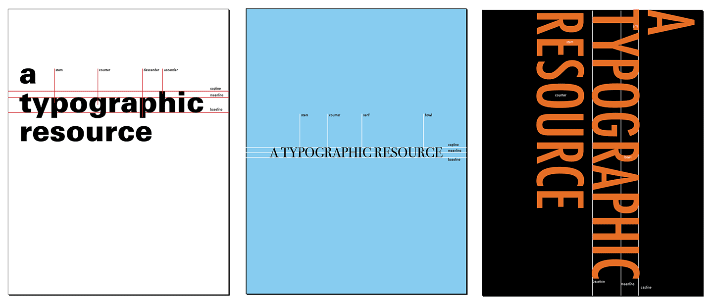
  1. "a typographic resource" set simply across the front in black, with small type labeling all of the pertinent anatomy
  2. "a typographic resource" made to look as if it were embossed on a cloth-bound hard cover book, like a weighty tome one might find in the reference section of the library. this would be a photo of said book, perhaps photographed from above, sitting closed on a table top. a photo of a book cover as the book cover, if you will. 
  3. "a typographic resource", each letter being "found" from some interesting location and set inside a grid of equal rectangles, filling the cover of the book. 

each of the above ideas is unique and independent of the others. the process of conceiving ideas is oftentimes painful but one that is well worth pursuing because it is largely what determines the resulting quality of your creative pursuits. 

if i were to develop iterations of my first idea above (the anatomical one), it may look like this:


notice they all have the same "aim or purpose" as stated in the idea definition above – they all seek to teach typeface anatomy while also titling the book. granted, these are fairly wide ranging iterations, but iterations nonetheless. i might be able to do three or four variations of each of these ideas, netting twelve iterations of a single idea – title as anatomy. if i managed 12 iterations from each of my other two ideas, i would have 36 iterations total, from only three distinct ideas. pretty cool how it can add up.

bottom line: strive to develop as many unique ideas as possible when beginning on the visually creative aspect of your design process. you can iterate later on the best ideas you want to pursue.

mid term meetings by tyler galloway

bring any and all evidence of your work for this 15 minute discussion — process and final products. be prepared to identify strengths, weaknesses, and personal areas you hope to focus on for the back stretch of the term. this brief review will inform my final decision about the mid-term grade, which will be emailed to you as a pdf once all reviews are wrapped up. 

wednesday oct 13
tori green
alexis lorenz
baillie weibers
alli sevareid

monday oct 17
9:15 devon wolfe
9:30 z lisenbee
9:45 alex cutler
10:00 anthony bennett
10:15 parker seydel
10:30 kelsey mack
10:45 bré bullock

oct 19
8:00 isabelle brown
8:15 quentin laurent
8:30 brooke cirone
8:45 sydney sanders
9:00 bailey hughes
9:15 abby crawford
9:30 cassandra wegenka
9:45 jasmine zehner
 

learning summaries, round two by tyler galloway

keep in mind the contextual issues of presentation that we discussed. consider audience size, scale of the work, the ability for everyone to lay eyes on it clearly and easily, ability to hold/touch if necessary. the presentation goal is to demonstrate what you've learned so far. the goal of the commentary is to analyze how well the work visually communicates and demonstrates that learning. 

for this round, be very clear on the question(s) you are asking. that should frame and direct your studies. there should be a clear correlation between your question and the things you are making in search of answers. 

each student will have eight minutes total; two minutes to explain the work and what you've learned, six minutes for peer feedback. if you spend your eight minutes talking, no feedback. 

deliverables

  • a copy of the work for me to evaluate – digital file named "yourLastName_yourFirstName-learningSummary2" or physical thing i can look at for a few days.
  • an updated course blog or process book. all blog posts should be tagged "t1", "type1" or similar, so i can search your blog easily. let me know if you need help tagging. process books should be presented with a sense of craft and organization. i will not accept a random stack of papers. 

easy enough. don't forget that i need both – process and final product. 

collective learning resource part 2 by tyler galloway

questions to consider about your system:

  • what is a good balance of practicality and innovation?
  • what are the possible detail-level organizational strategies?
  • how easy is it to aggregate information into a single source?

questions to consider about your 11x17 presentation design:

  • how clear is the idea?
  • how is typographic hierarchy contributing to that clarity?
  • what is the relationship between text and image?
  • how is your illustration helping to clarify or exemplify the concept?

due next monday, oct 3: one 11x17 of your best idea for this system, improved in quality and detail from last week.


questions - current status of... by tyler galloway

where do you see your question in relation to a micro/macro view of the typographic world? how might you map that out? 

what are you currently doing to expand/contract/build/extend on your questions? are they getting more micro, more macro, or sliding into adjacent territory?

speaking of macro, have you defined what typography is? i highly recommend doing it in a precise and carefully considered way. how do you do that? where do you find that information?

in what ways might you take your peers’ knowledge into account in your own work? 

if you are not learning what you want to learn, how do you pivot to dig into what you are excited about in the typographic world? 

bonus existential question of the week: in “the information age”, where you can find anything you want to know about typography with relative ease (trust me, it is waaay easier than in the past), how do you “get wise” about type? what is the difference between wisdom and information? can you define each one?

designing a collective learning resource by tyler galloway

how can you design a usable and engaging system for aggregating typographic knowledge that is being captured within this class?

priorities [prioritized. ha!]

  1. a highly usable and functional format
  2. a level of innovation, delight, and/or engagement that makes the information attractive to readers/viewers
  3. the ability to cross-reference related areas of knowledge

audience [prioritized]

  1.  graphic design sophomores
  2. other graphic design students at any institution
  3. high school students interested in graphic design

DUE MONDAY SEPT 26, 8:00AM
two separate ideas for this system [this does not mean two variations on a theme]
rendered onto two 11x17 sheets
pinned to the wall by the start of class, sorted by media type [put similar media solutions near each other on the wall]

make these as visual as possible. show examples if necessary. make diagrams. show inputs, show a task scenario [what's that? hint: it doesn't just apply to web design] if that's helpful. 

basically, "what's the quickest and easiest way to communicate your concept for this learning resource?"

next step
we will review all the work in small groups and select a few of the best ideas. i will review those [and the others] and figure out the best way to proceed. that path will depend on the strongest idea. 


learning summaries // deliverables by tyler galloway

forgot to mention what you need to turn in when you present your learning summary:

  • a copy of the work for me to evaluate -- digital file named "yourLastName_yourFirstName-learningSummary1" or physical thing i can look at for a few days.
  • an updated course blog or process book.

easy enough. don't forget both!

learning summaries + critique requirements & considerations by tyler galloway

the learning summary presentation schedule is below. forgive me if i've oversimplified your topic or got it wrong altogether. feel free to email me with any necessary corrections.

monday sept 12
tori green - type history
alexis lorenz - type history
baillie wiebers - letterform anatomy
alli sevareid - type from the past working in a modern context
devon wolfe - type transcending language
z lisenbee - kerning in context and larger spacing issues

wednesday sept 14
alex cutler - type and illustration
anthony bennett - mograph
parker seydel - hand lettering
kelsey mack - typeface design
bré bullock - typography and lettering difference
isabelle brown - type and image integration

monday sept 19
quentin laurent - type for disabled folks
brooke cirone - type and color
sydney sanders - type and branding
bailey hughes - mixing typefaces
abby crawford - perception of fonts
cassandra wegenka - letterpress and material meaning
jasmine zehner - 

keep in mind the contextual issues of presentation that we discussed. consider audience size, scale of the work, the ability for everyone to lay eyes on it clearly and easily, ability to hold/touch if necessary

each student will have eight minutes total; two minutes to explain the work and what you've learned, six minutes for peer feedback. 

the presentation goal is to demonstrate what you've learned so far. the goal of the commentary is to analyze how well the work visually communicates and demonstrates that learning. 

a few words on critique
the goal of critique is to make the work better -- pretty simple. comments, both positive and negative, are to be about the work with that goal in mind. "that typeface doesn't look right" or "this looks unfinished" does not help to improve the work.  explaining why you feel it doesn't look right is much more helpful [provide rationale] and providing positive support to encourage a peer to invest more time in refining the work is much more likely to be well-received. that said, dancing around issues is not helpful either. we need to be honest with each other about the quality of what we are doing. facing reality is difficult but is the only way to move forward constructively. we are here to improve the quality of our work to the highest possible point, and to help others do the same. we are not here to prove how much we can nitpick and undercut one another. let's have awesomely thoughtful, honest, clear discussions about the work and make it better as quickly as possible. yay!

class aug 29 by tyler galloway

email me your course blogs when ready, if you are doing blog posts for this class. if not, you will need to turn in a process binder after each learning summary discussion. 

resources

  • what is a resource?
  • what are the best resources?
  • why should you believe a resource?
  • how does one know a resource is credible?
  • what is credibility?    

follow up

  • anyone read “crystal goblet”?
  • should warde's suggestion be universally applied throughout typography? why or why not?
  • with what parts do you agree or disagree in her essay? why? 

[discuss in comments below]

campus printing by tyler galloway

first, log in to the kcai artnet.

then read about how to use the p-counter printing system and print to the konica color printer. you will need to put money into your p-counter account in the business office on the second floor of vanderslice.

this page tells you how to add a black and white printer to your computer so you can print to your studio printer. 


welcome by tyler galloway

[t]here is the syllabus

beyond the requisite housekeeping, what shall we do on day one?

what are we expected to do and learn?

what do you want to do and learn?

how do we each squeeze the most out of this time for which you have paid?